 A lot of work went into this project! I really like the creative visuals, music, voice acting, and sounds! Being able to physically move objects when they get small enough is a great touch too, I love that it scales with how small they are.
However I think the game needs a little more clarity. I found it a bit difficult to play. Here's some feedback from me in case ya'll keep working on this:
I wish there was some feedback on what items you can scale and what items you can't. Maybe a highlight when you mouse over them?
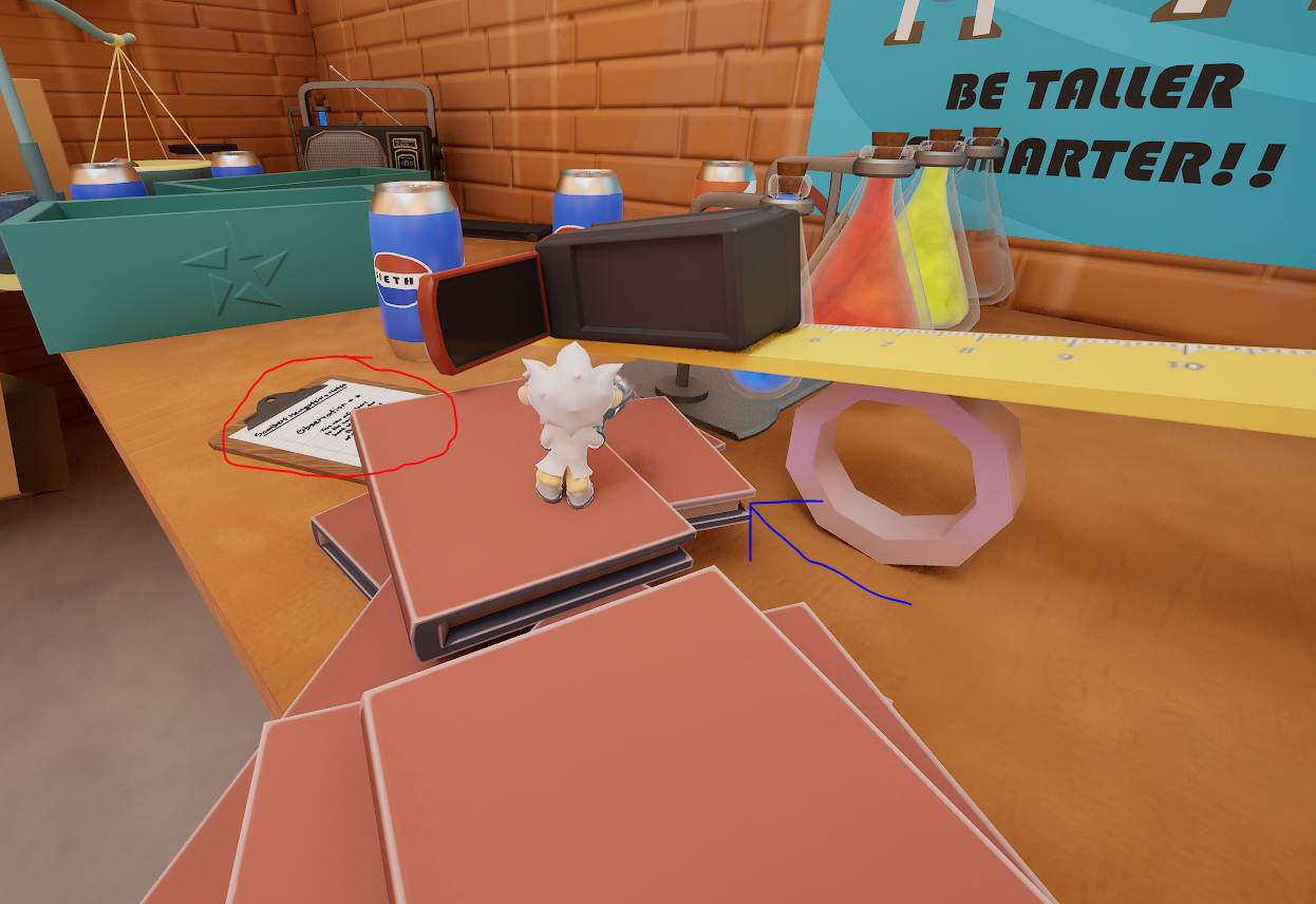
I love the diegetic tutorials on the notepads, however since there are only 4 different camera angles it makes some of them hard to read. The red one in the picture gave me a lot of trouble.
These books with the blue arrow are a great piece of set dressing, but makes it confusing for the player on whats traversable. I was able to jump on that book with some difficulty, but at first I thought that's what the solution was. I'd move the second book in the stack so it doesn't look like a platform, or move it one book higher so it's clear you cannot jump that high.
I fell off the table and had to start all the way back at the beginning. This made me sad, it would be great to have a checkpoint system!
This game is really cool and I'd love to see more of it, awesome job!

