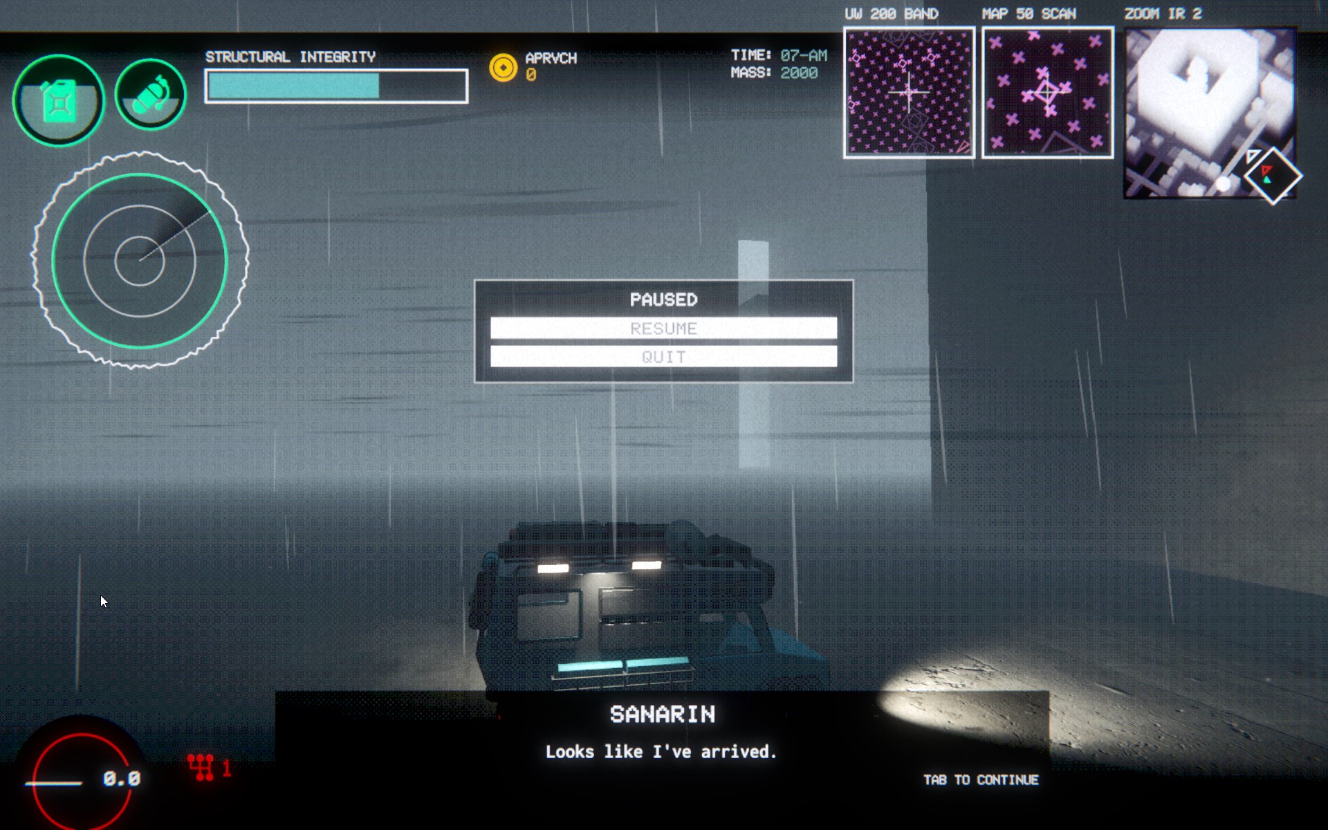
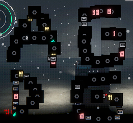
-I like how the fog encroaches on the main menu.
-Game can go fullscreen, but the top dither effect looks wrong on 16:10.

-Looks like debug bindings are still there, I can spawn infinite items and teleport the van, etc. If I do the item spawn with f, I can draw on the screen. Fun bug/feature.
-You can also do inventory management while paused. Not sure if intended.

-If you quit the game then start again, you will be in the clouds and have a constant screech sound in your ear. If you press pause then resume it will send you down to Earth like nothing happened.
-I really quite like the zoom into a cutout of the van when looking inside, it's fun when 3D games go the extra mile for no screen transitions.
-Finally getting out of spawn, I find it odd that there are white boxes I can't interact with, since the first thing I did was talk to a white wall to get a quest. I was hoping they would be item pickups or something.
-Took me awhile, but I guess I found some fuel, neat. Also, the driving is too loose, though I don't play many car games.
-Snow falling in front/behind of radar is slightly annoying, since it kind of looks like white blips and is distracting if you're using it.
-Looting a truck and running from a giant spider was fun. Also, it seems like the wind (black streaks) seem to aid in finding my way to the waypoint, or at least it feels like it so far. It's convenient, I like how it only becomes apparent when you slow down/stop.
-Beat the first mission. Don't think this game is really for me, I'm not feeling very fulfilled. But I imagine someone liking this as a Euro Truck Simulator but with more gameplay beyond the driving as you deliver cargo. It could also be the case that when more systems are in place I could appreciate it.
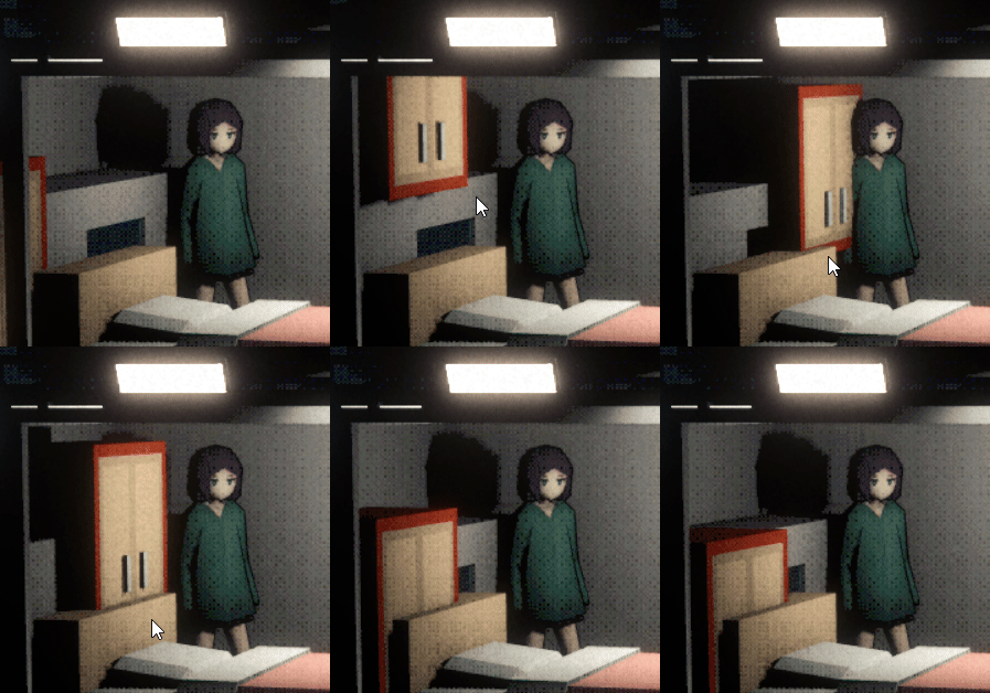
-After the delivery I was playing with the customization, and for some reason it's sometimes jittering like the below gif, it's probably float imprecision? It was more severe when it was at 60 fps.

-The visuals are the best looking part, it has a style and runs with it. Dithering is more than I like, but I got used to it. I think making all 3 maps visible is a bit much. For example, have a button to switch the 200 Band and 50 Scan, since it's rather redundant info. Though, if icons are added to the map maybe it becomes more useful to have both up. On the other hand, it also makes the UI feel more clunky/messy, which could be intentional since the vibe is very much retro inspired.
Keep up the good work.

