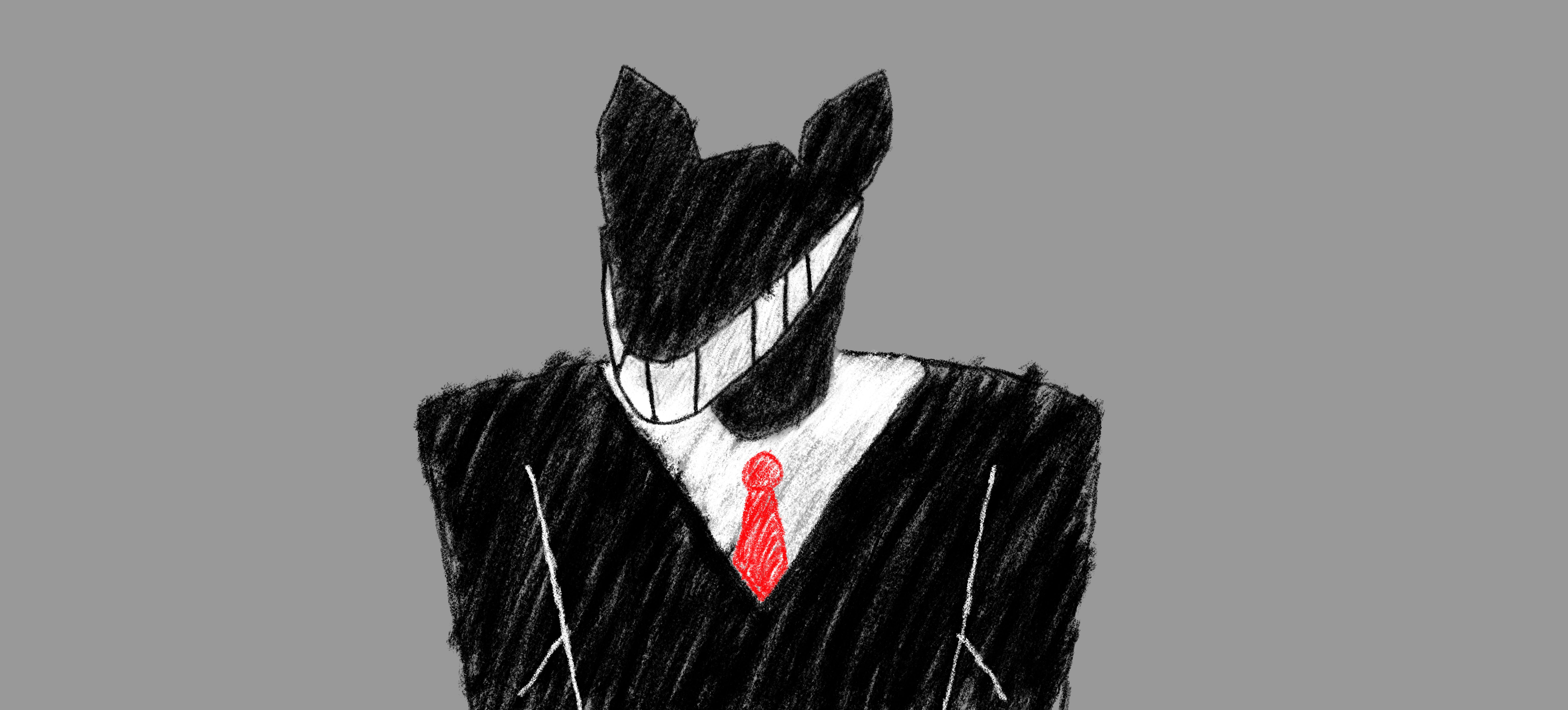
Wow I love these designs :3
I think the first one looks better.
In my opinion, the color of #2's head doesn't match his body.
And for both #2 & #3, the silhouette of the body might be a bit confusing.
yeah I had to redo #2

I think I might use #1, but I really cant decide. For #1, I coated it heavily in black crayon and then used a crayon eraser. The only thing I didnt do the eraser trick on, is the white shirt and the red tie. Maybe I'll redo those too or just keep the red tie and white shirt that way.
For #2, is how I did all the items. Its sort of like how "Yoshi Island" colors it's backgrounds, where you just keep on stroking your crayon in a diagonal line instead of using the paint bucket tool.
I'm thinking maybe I will just have the dealer use this "crayon eraser" style to make him stand out and everything else have the (what I call) "Yoshi Island" style. Or maybe have everything in the Yoshi Island style like #2. Idk what do you think lol? I'm still thinking of using #1 but I'm really debating it.
right now I'm gonna try and make the female Opponent art and see if I can make some kind of animations.

