Indie game storeFree gamesFun gamesHorror games
Game developmentAssetsComics
SalesBundles
Jobs
TagsGame Engines
(+2)

Very cute little game! I like the spooky atmosphere, and love the main character's design - especially the small details added to the animation like the changing of expression when attacking, or the bouncy little idle, the blinking of the eyes, and the secondary motion of the hair buns when using the vacuum.

 I do think though, as other commenters pointed out, that the background can get a bit too busy at times, which distracts from the charm of the spritework. It can also get very hard to parse the UI against particularly complex background textures, like so:
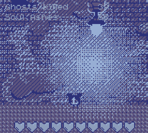

Which is a shame, because there's a lot to like about the sprites.

Gameplay-wise, I feel like there's some room for improvement. Very often it seems ghosts will just pop up right in the middle of the screen, damaging me with very little I can do about it. It feels less like a test of reflexes, and more like a "gotcha" from the game, which rarely feels good.

I also feel like the vacuuming mechanic is underexplored, to the point I wonder if it's needed. As it stands, it's just a clunkier/slower way to get collectibles which I could presumably simply get by walking through. If there was more of an integration of vacuuming with the combat mechanics (like in Luigi's Mansion, for instance), I feel like this would be greatly mitigated.

As for the "meta", I liked the idea spending ghost ashes on the upgrade screen. I can imagine this being highly strategic with choosing upgrades best suited for the mission I'm going for, in a more fleshed-out, non-jam version of this game!

I enjoyed a lot about this entry, and feel there's a lot of potential here should the team chose to keep developing the game. Nice going!

(+2)

I wanted to add lots of detail and intentionally made outdoors ‘hard to see in the dark’ but I may have made the bgs too busy for people’s personal tastes. It’s my third pixel art project and first time using 4 colors, I think reviews could’ve also been nicer towards the gameplay. I appreciate the feedback, and you playing our game!  We did our best and worked hard :)

(+1)

Sorry if my review sounded harsh! It was not at all my intention.

I like to use jam entry reviews to  directly "talk shop" dev to dev, so I might come across more blunt than I otherwise would if I were leaving a normal comment, or a steam review. Please do not take that, and the critiques I've made, as an indication that I did not enjoy your game.

I fully understand jams are hard, things end up less than complete, and that the dev team themselves are often well aware of most of the shortcomings. I am just trying to be honest and direct in my review, because I feel like there's a lot to like, and that there's stuff to refine, and I would love to play a refined version of this game.

Once again: props for the good work!

(+1)

Oh my bad this wasn’t aimed at one person or you, in general just feels like this jam might be getting too much criticism and too little appreciation for little things(on a few games not just here), I get talking shop, just seeing a lot of people being very hard and frankly negative with their words when sharing their opinions and I’m not used to that and find it coming off a bit rude (not you, yours is fine! ) it creates an unwelcome atmosphere and I’ve done a few jams, just never felt this overly critical space before.