

Just wanna say, I love these little icons. It's always a treat when I see an update to this pack in my notifications. Thanks for sharing!
A member registered Jan 11, 2016 · View creator page →
Creator of
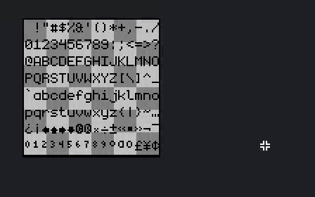
elegant monospace pixel font
Recent community posts
Very cute little game! I like the spooky atmosphere, and love the main character's design - especially the small details added to the animation like the changing of expression when attacking, or the bouncy little idle, the blinking of the eyes, and the secondary motion of the hair buns when using the vacuum.
I do think though, as other commenters pointed out, that the background can get a bit too busy at times, which distracts from the charm of the spritework. It can also get very hard to parse the UI against particularly complex background textures, like so:
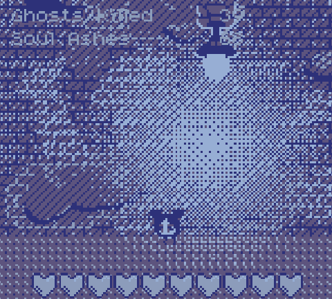
Which is a shame, because there's a lot to like about the sprites.
Gameplay-wise, I feel like there's some room for improvement. Very often it seems ghosts will just pop up right in the middle of the screen, damaging me with very little I can do about it. It feels less like a test of reflexes, and more like a "gotcha" from the game, which rarely feels good.
I also feel like the vacuuming mechanic is underexplored, to the point I wonder if it's needed. As it stands, it's just a clunkier/slower way to get collectibles which I could presumably simply get by walking through. If there was more of an integration of vacuuming with the combat mechanics (like in Luigi's Mansion, for instance), I feel like this would be greatly mitigated.
As for the "meta", I liked the idea spending ghost ashes on the upgrade screen. I can imagine this being highly strategic with choosing upgrades best suited for the mission I'm going for, in a more fleshed-out, non-jam version of this game!
I enjoyed a lot about this entry, and feel there's a lot of potential here should the team chose to keep developing the game. Nice going!
By far one of my favorites from the jam! Incredibly complete package, and really evokes the feeling of the old portable Zeldas. The graphics, audio and gameplay are very well executed.
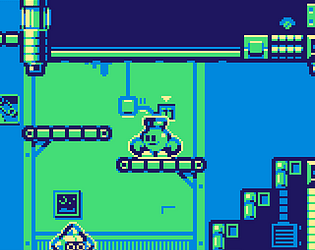
I think I might unfortunately have run into a bug that's blocking my progress: I've blown up a wall, but it seems the collision is still there and won't let me through: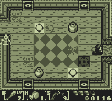
Aside from that, there's also a few couple bugs with screen transitions triggering twice and such, but I bet you're aware of those, and these kinds of things are to be expected in jam games, so they didn't hinder my enjoyment in the least.
Had a whole lot of fun with this one, keep up the good work!
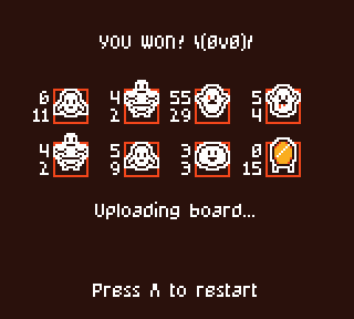
One of my favorites of the jam, no doubt! Had a lot of fun experiment with team combinations and placements around the board. Love how you integrated Halloween staples and made each creature type feel unique.
Graphics are just the right balance of simple enough to be read at a glance and detailed enough to give each creature its own distinct look.
As for gameboy-ish-ness, this feels right at home in the format. Even though it's emulating a more modern genre (autochess), it brought me right back to playing Pokemon TCG on the gameboy, or the casino minigames of the mainline Pokemon series.
Incredible job!
EDIT: forgot to post my winning team: "whoops, all ghosts"
Had a lot of fun with this one!
I was a little stumped at first because I assumed the directionals acted more like tank controls (like, A would always rotate you 90 degrees counter-clockwise from you current orientation). Took me a while to realize how it actually worked.
I feel like a first screen fully lit up where the player could freely get to grips with the movement mechanics, before going into the dark levels would help alleviate that confusion.
I also feel like there's a bit too much information, too scattered and presented too quickly at the start of a level. I need to memorize the screen layout, read the hints at the top, read the step counter at the bottom corner, all in a very short amount of time. The little text blurb also obscures parts of the screen (sometimes hiding the exit), making this extra tricky. Maybe giving the player a little more time before turning off the lights (or maybe even waiting for a button confirmation) could help a lot. Also, maybe keeping the step counter visible even in the dark might help players understand when why their input doesn't work sometimes.
All in all, I feel like this game is really well-rounded. Well-though out puzzles, great use of audio feedback, clean, readable visuals and a solid integration of the secondary theme. One of my favorites from what I have played so far!