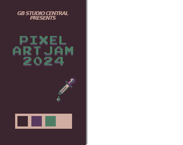
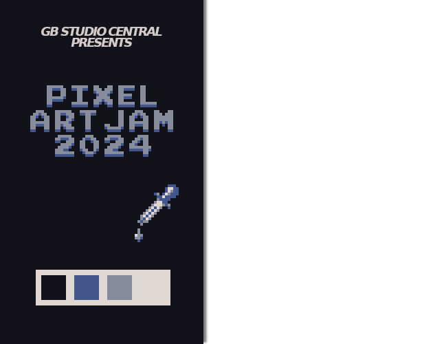
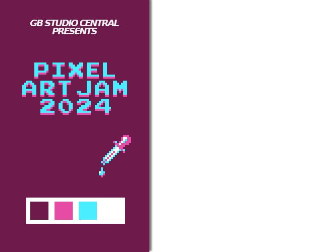
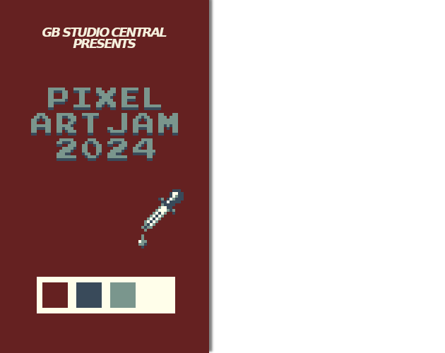
Hi there peeps, I noticed some weird things on the original cover (like pixels that were not the same size on the color picker tool, or certain outlines on the title) I reworked the cover a little, adding some depth on title, and keeping the idea of the four palettes of the JAM, by Roro02.


