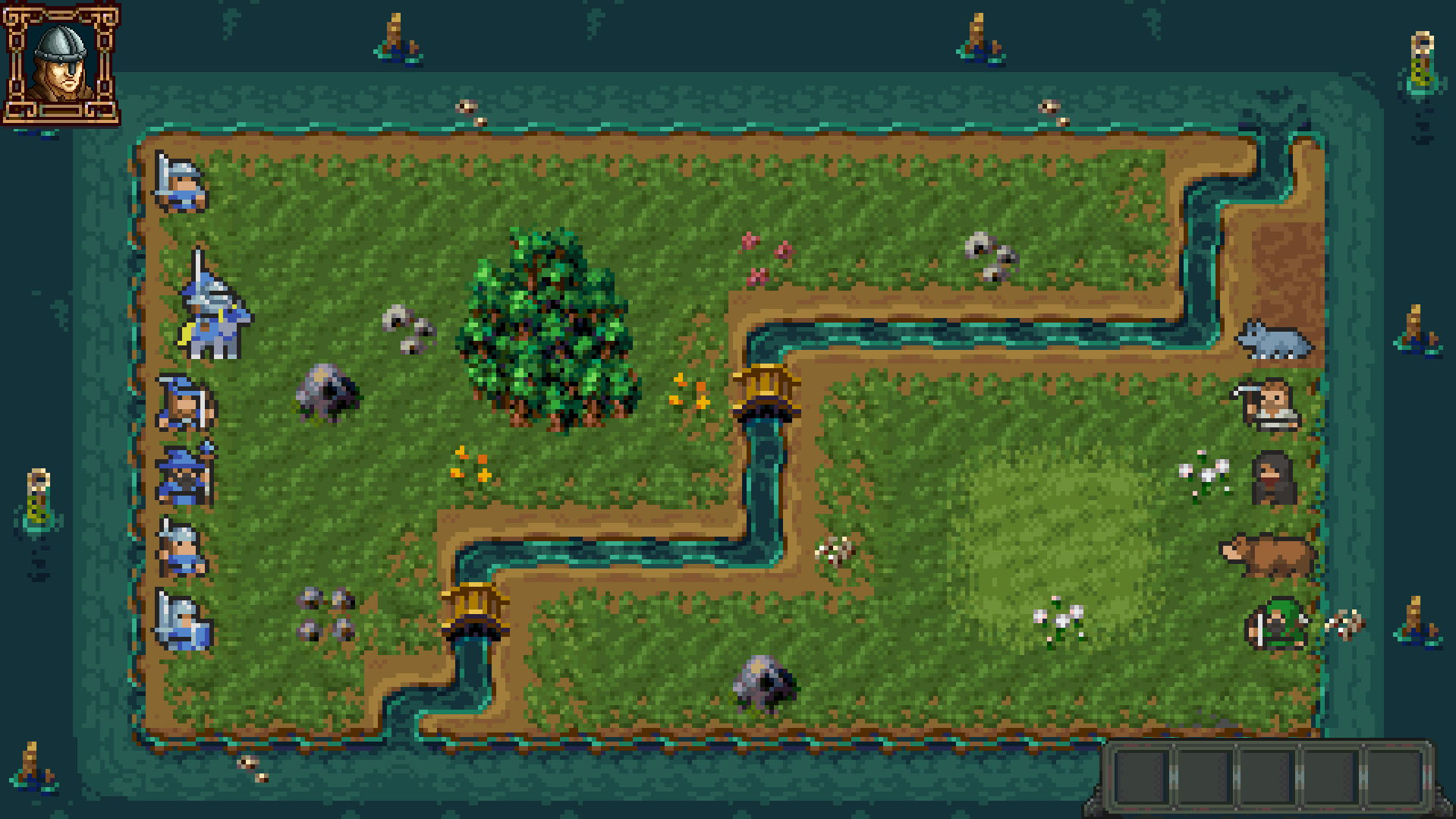
Certainly, you’re welcome! Explaining the process in words isn’t the easiest, but here’s how I would approach it: First, I would adjust the UI to match the original pixel ratio, setting it to 1:1. Next, I would scale up the UI while maintaining the same proportions as the game.By the way, in the original UI file, how many pixels does each square correspond to? (This is important to know how to resize the image.)If you have Photoshop, we can connect on Discord, and I’ll show you how to do it. This way, if you have other elements in the UI, you can manage them on your own!
Viewing post in 2D Pixel Quest Vol.3 - The UI/GUI comments
Unfortunately, I don't have Photoshop; I'm using Aseprite right now. I believe both start from 16x16 (https://itchabop.itch.io/stonebase-ui-pack, https://lyaseek.itch.io/minifhumans), but the UI set has elements at different scales. I've decided to avoid pixel-perfect scaling for now, at least during the prototype and mock-up phase. From your perspective as an artist, do you think it looks awful?
You can do the same thing with Aseprite. If you’re in the mock-up phase, I think you’ve made the right choice. It doesn’t look bad at all, especially since the difference is really minimal. Even if you kept everything like this in the final version, there’d be nothing wrong with it! It’s the same mistake I made with my first pixel art game, but I learned my lesson: keep all assets at a 1:1 ratio and consider 9-slice scaling. I’m glad you’ve found a solution in some way—I’m looking forward to seeing the finished game! :)

