Indie game storeFree gamesFun gamesHorror games
Game developmentAssetsComics
SalesBundles
Jobs
TagsGame Engines
(1 edit)

I like the light-hearted visuals and recognizable gameplay. Visuals are good and fit well with the art style. The "Match-3" type games are always a nice relaxing genre to come back to, and is simple which is perfect for h-games.

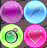
One thing, I noticed the heart bubbles were slightly different colors and could not combine. This was a bit frustrating and would recommend making the bubbles more obviously different if they are a different group.

Finally, I ran into the following error on my first playthrough when trying to match three time bubbles:

___________________________________________

############################################################################################

ERROR in

action number 1

of Mouse Event for Mouse Enter

for object o_bubble:

Pop :: Execution Error - Variable set failed tx - read only variable?

at gml_Object_o_bubble_Mouse_10

############################################################################################

gml_Object_o_bubble_Mouse_10 (line -1)

what a strange bug. i've played for over 13 hours and never seen it

tx definitely isnt a read only variable

I also have to ask if you suffer from some colour blindness, since the different bubbles are pink and purple

Haha, that is a little rude, but I am going to assume you mean well.

While these two are technically different colors, it was easy enough to fool me (and likely others) for the first time as every single other bubble has a different icon and significantly different color, including the shield bubbles. 

I think my main comment also might have come off the wrong way, I do like the game quite a bit. This is just a small suggestion that I disliked in my playthrough.

its perfectly fine, not rude at all, and easy to change, i'll see if i have a different heart to put inside the lust bubbles, i was gonna do a cock icon originally

i asked because all the bubbles had the same saturation and brightness, which can lead to difficulties with colourblindness and i failed to consider that when i was making them.


Is this any better?

(1 edit)

Interesting, I did not know about the color blindness thing, that is good to know.

As for the new colors, it looks a bit darker, not sure if that is just from a different background but overall it looks the same. I'm not proficient in color theory unfortunately so I cannot give much advice on that, but changing the icon should help make it look more unique. I think the idea of doing a cock icon is a pretty good idea and that might distinguish them from the hearts. Or you could maybe to lips, that might work too if you don't want to go the explicit route.