
The mouseover tooltip is hard to read, here. It might be better to just make this panel bigger and fit the description directly into the button.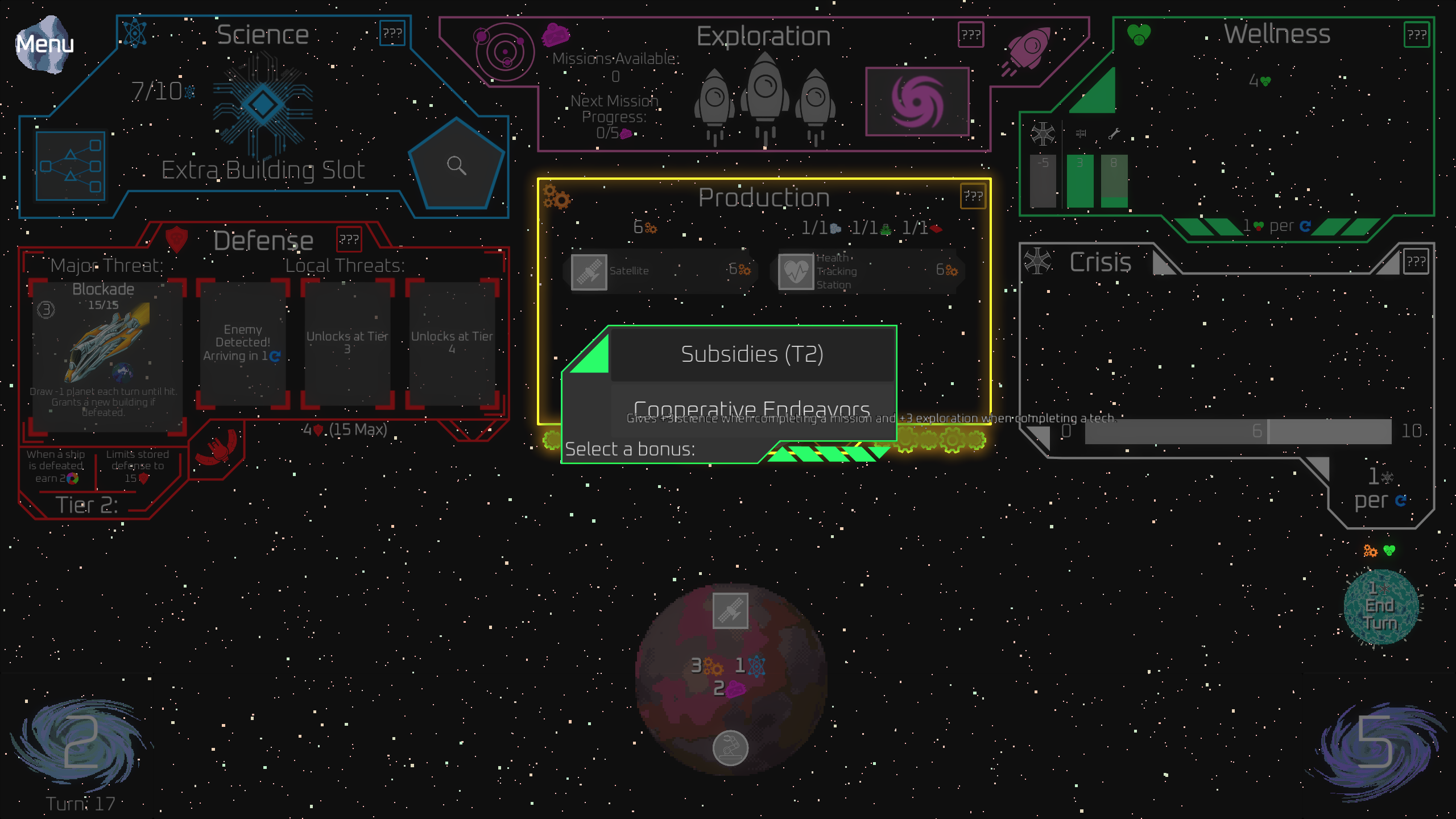
(By the way, be advised that I've added a profile image to my account, recently. I mention this only so that you'll still recognize me from me earlier posts.)