Two things to report. (Current Pro Build)
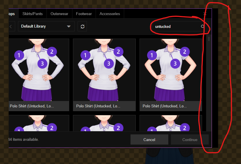
First: I've found that searching for a particular item causes the window to shift its displayed content to the left. That leaves the left side cut off and the right side with a black space about one vertical scrollbar's width wide.

Second: the Raised and Upward Curve Eyebrow items share what appears to be the former item's graphic.


