Indie game storeFree gamesFun gamesHorror games
Game developmentAssetsComics
SalesBundles
Jobs
TagsGame Engines

Autumn Rain

107
Posts
7
Topics
6
Followers
18
Following
A member registered Jun 28, 2018 · View creator page →

Recent community posts

Test with Nightly build
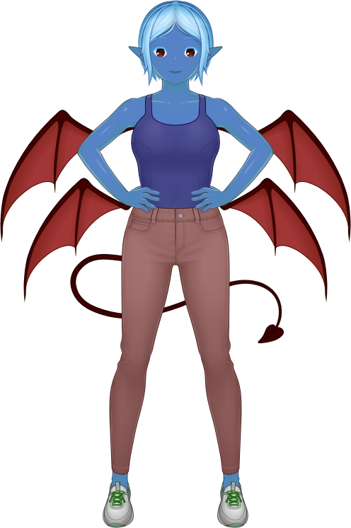
Nightly build: seems to get stuck during PNG export (below) and closing character file tabs.

The game isn't telling me where to go next after Po-Koro. Plus, it's still telling me to talk to Huki, even though I've done that already.

Thank you for taking this into your consideration.

The recent addition of multiple poses to Batch Export got me thinking about combining poses and facial expressions together. As the system stands now, Batch Export can result in about 1440 exported images based on combinations of outfits, hairstyles, expressions, and poses alone. By making poses into a component of a facial expression, that can potentially reduce the export load into a more manageable amount.

I hope I'm explaining this somewhat adequately.

Just remembered that eye-shadow (the makeup) and "shadows-over-the-eyes" (as a character-design detail) existed.

Attempt at making a villainous character.

Just found that these eyebrows and eyebrow shadows are misaligned. Not entirely sure how that happened, either.

Well, now that you mention it, I was thinking of formal attire for occasions such as weddings and funerals, as opposed to at-the-office-dress-code sort of formal. I'd imagine that would require some researching of wedding-goer and funeral-goer attire.

(1 edit)

Created a funeral outfit out of the new 0.3.8 content, and I'm wondering if there are any upcoming plans to add more formal attire?

Edit: added image to post.
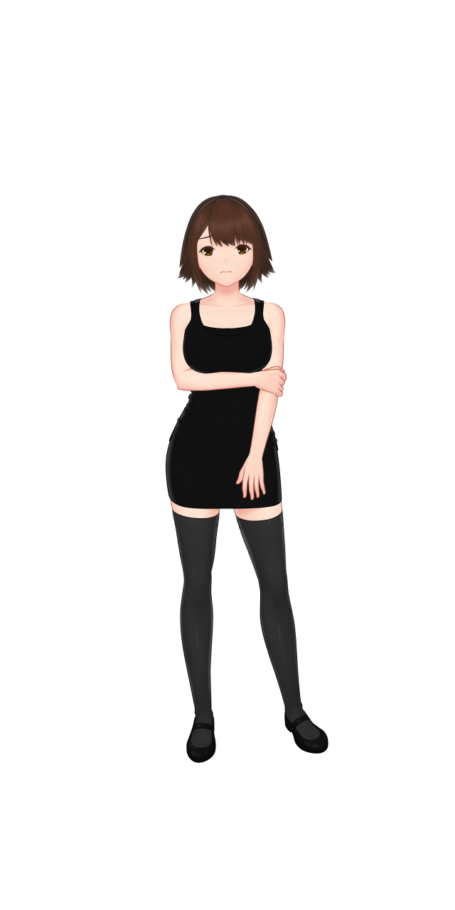

Attempt at making funeral attire from the new update content

Noticed a visual bug with this shirt's color overlapping onto the pants below.

I'd really appreciate it.

On the Male template: I'm finding that something about the neck feels off. It fits fine for a grown-up male, but something about it feels out-of-place when the character is meant to be of high-schooler age or younger?

Just noticed that the first line is incomplete?

Hello! Another stable release update has just been uploaded today, and 

Thanks.

(1 edit)

Found a really nasty incompatibility occurence. This character looks just fine as a PNG and SVG...
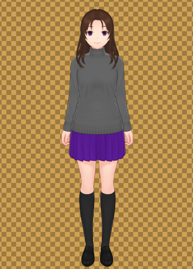

But when I try to open the exported SVG file with Affinity Designer (my current vector-graphic software), I get this:
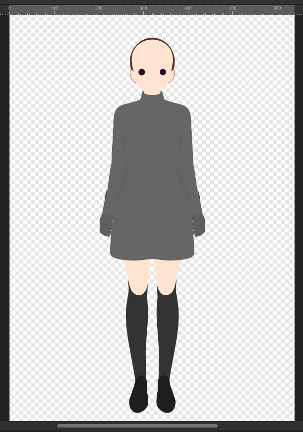

I have no idea why this happens. The exported SVG file has everything, judging by both looking at the Layer window in Designer and viewing the SVG in a web browser (both Internet Explorer and Microsoft Edge). So this is a puzzling occurence (not to mention rather scary).

Ah, I see.

Okay. I felt I had to ask because there's no other pose available that uses this specific pose as its base, such as a "Default" Akimbo, a "Default" Crossed Arms, or a "Default" Explaining/Presenting. The "(Wide)" variations are as close to this "Default Standby" pose as I can see.

Are there any plans to create akimbo/crossed arms/etc. poses from this Standby pose?

Not so much a suggestion, but aren't leggings supposed to go over tights? The software seems to do the opposite, rendering tights over leggings.

Created a casual outfit. Of a sort.


Turtleneck and V-neck Sweaters are glitching with flat-collar shirt.

This was stewing in my head for a while, but I feel it should be brought up, at least: Adding custom graphics to T-shirt fronts. For example, if you were to make a mascot character for Mannequin, if she's wearing a T-shirt, you could add an AR14 or Mannequin logo to that.

It would definitely have to use PNG files, since they can render transparent pixels, as well as JPEGs. It could open up a wide range of "fictional" cosmetic quality, from amateur (an obvious rectangle from a JPEG) to professional-level (a seamless PNG graphic) designs.

I believe so. I only have the stable build installed for now.

Discovered that the "Downward Slant (Neutral)" eyes are not affected by Eye Adjustments.

Altered values with Downward Slant eyes

Altered values with Downward Slant eyes
Same values, with Straight eyes

The character scaling options are useful, but using them for a character height comparison chart (see here) makes me realize that perhaps basing the characters' origins at the bottom (around foot level) would be better than from the direct center of the "canvas/frame" (the rectangle within which the character is depicted). That being said, there are two ways that the bottom-level origins could be implemented:

  1. Aligned directly to the bottom of the frame.
  2. Aligned relatively to the bottom of the frame, based on the character's pose on a hypotheitcal "floor" that said character is standing on.

Perhaps a Gallery thread by AR14 would be more helpful than a Gallery thread by a third party? That way, there's a more direct line between the developer and the posters, without a middleman or go-between needlessly hampering communication.

A few new images posted here! Just thought you should know.

That's right. There's a "mannequin" folder, and then a "mannequin 2" or "mannequin 3" folder depending on if anything else was installed, like the Nightly version or the DLC.

(1 edit)

Height comparison graphic.


Created with Version 0.3.2-stable.20200221, and based off of a sample model:

With the Christmas DLC installed, itch sometimes opens that DLC folder instead of the actual application. Are there any plans to have a "/dlc" folder or the like to avoid this behavior?

New one regarding Batch Export: I think exporting 144 images the second time onward takes longer than the first time. The only difference between all three batches is a change in pose. (First batch rendered with Akimbo pose, second batch with Crossed Arms pose, and Third (current) batch with Standby pose.)

Note: this is a capture of the current stable build, not of the nightly build. I'm placing this here to make an example, and perhaps provide some ideas for execution.

This is one character file's list of 9 Outfit presets, created in order. Let's say, for the sake of argument, I wanted to create a "Formal 3" preset. That results in the following:

  • ...
  • Casual 3
  • Formal 1
  • Formal 2
  • MG Attire
  • Formal 3

At this point, if I wished to move "Formal 3" to between "Formal 2" and "MG Attire", I would have to delete and remake "MG Attire". That means one preset's worth of data is potentially lost (unless the user took extensive screenshots or even filled up a notebook page with all of that preset's information).

Yes, it's inconvenient, but mildly so, and it's fairly excusable in the long term. This next example, however, is potentially more disruptive.

Let's say that I wanted to make a "Uniform - PE" preset, and that I wanted to place it between "Uniform - Soccer" and "Casual 1". That involves manually recording the data of, deleting, and remaking six whole presets just to set this new preset where I would want it.

BeforeAfter
Uniform - Cold
Uniform - Warm
Uniform - Soccer
Casual 1
Casual 2
Casual 3
Formal 1
Formal 2
MG Attire
Uniform - P.E.
Uniform - Cold
Uniform - Warm
Uniform - Soccer
Uniform - P.E.

I can think of at least two ways to give the user more control over the order of presets on the list:

  1. Drag-and-Drop: An option below "Add new..." to open a window, showing the listed Preset items as "drag-and-drop" objects that can be manipulated with a mouse.
  2. Number-Governed Order: Similar to 1., but instead, each listed item has an input box showing their position on the list (1, 2, 3...), which can be changed with mouse + keyboard. Changing one item's order value will directly move it to that point on the list, while shifting all items between the original and new positions down or up. (For example, on a list of Items A through E, with A being the first on the list: if Item D's order value is changed from 4 to 1, the list would also change Item A's order value to 2, Item B's to 3, and Item C's to 4, while keeping Item E's value at 5.)

Hopefully this will prove helpful.

(1 edit)

Two things to report. (Current Pro Build)

First: I've found that searching for a particular item causes the window to shift its displayed content to the left. That leaves the left side cut off and the right side with a black space about one vertical scrollbar's width wide.
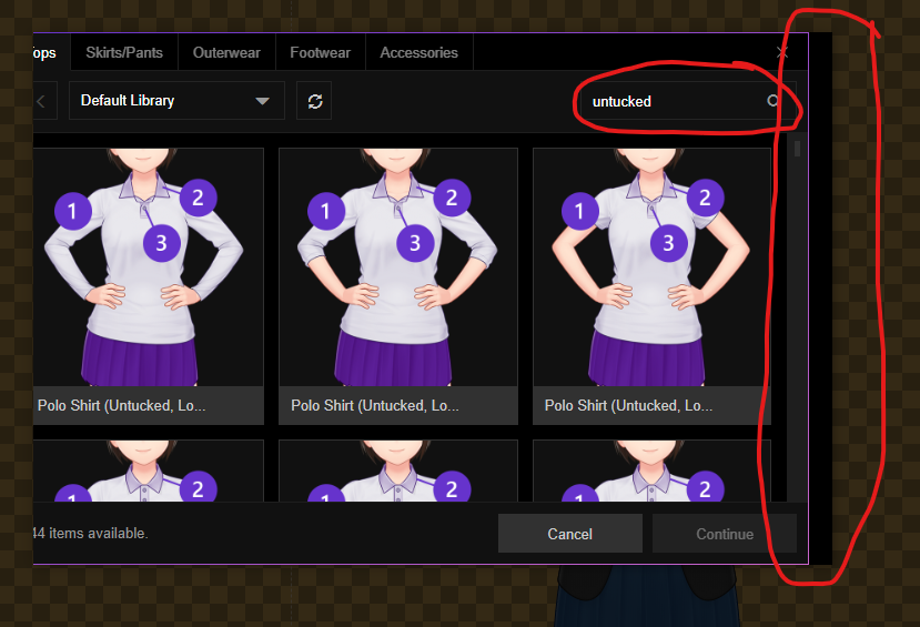
Second: the Raised and Upward Curve Eyebrow items share what appears to be the former item's graphic.

Ah, okay, my mistake. Thank you!

Found that putting shorts over leggings results in this.

Progress on character art for a new project. 3 blurry black shapes are placeholders for male characters.

Looks like having more than one character file open, then saving one of them, leads to the software getting stuck. The loading icon plays normally, and it won't let me do anything.