3 JUN 2020:

Above is the new titlescreen for Scrapship! No more placeholder graphics for the title!
I finally learned how to install fonts and then used HeliosPaint to make the letters. There is still some tweaking I can do (thinking about moving the menu item stack up a bit), but overall I think it's a much-needed improvement.
A quick word about the planet background: It's definitely very good-looking, the only potential problem I see is that any future planets I make won't be as detailed because NASA only has hi-res textures for planets in our solar system. So if I want to make a hi-res alien planet background it might have to be a lower resolution, meaning that the textures won't be consistent.
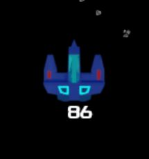
I also figured out a way to make the health appear near the player. Not sure if I'm going to keep this feature, but it does make it easier to keep tabs on how close you are to getting blown up. Below is a pic of what that looks like:

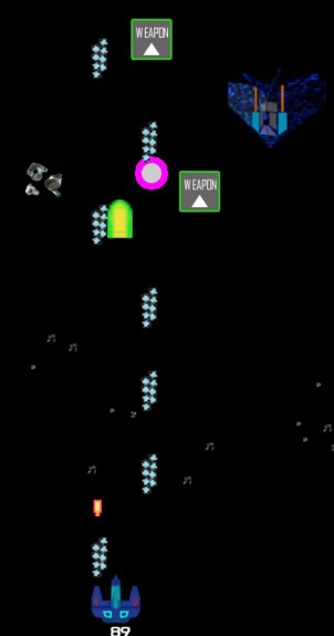
Finally, I improved the weapon upgrade path for the player ship. It's more linear, but solves the issues I've been having with the 3 weapons not being diverse enough.

As you can see, some upgrades now let the player fire a "main shot" (center) in addition to 2 smaller side shots. Instead of separate icons for boosts to Damage, Speed and Width, I just lumped them all into a single Weapon upgrade. There are no longer icons for changing weapons.
That's all for this update. Thanks for reading and for those that have tried the demos, thanks for playing! Haven't played it yet? No worries! Just click the link below:
https://40wattstudio.itch.io/scrapship-demo
See you next week!

