
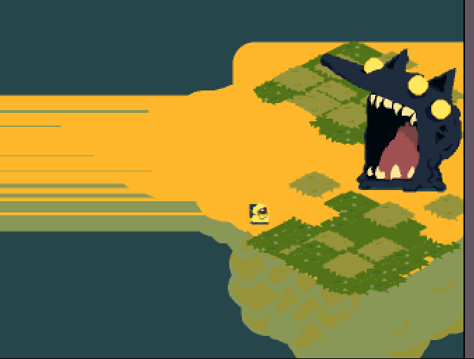
Hey, first of all, let me say that I liked and at the same time didn't like the art! (well, let me explain better). The art itself and the style are awesome. The WOLF is so cool, the design is very memorable and impressive. Also, after Stephen King's "IT," the yellow raincoat is associated with horrors for me ahah, so it was a nice coincidence to make the experience better (since the wolf eats the character as Pennywise). But what I didn't like are colors. The character's coat yellow coat and the bridge are too similar to each other. It kind of distracted me from playing. But overall, the concept is interesting, the premise is catching. It's sad you weren't able to expand the game more and it was too short without explaining anything. Hopefully, you will keep it up!
4 years ago(+1)
Hello AtymTima Games! Thank you so much for the comment! Haven't seen IT yet :D
I would love to have the main vibe stay the same, since many people seemed to like it.
Would you suggest a more saturated Yellow or an Orange?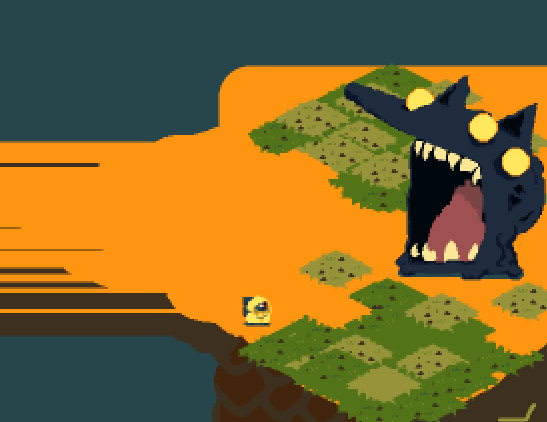
thanks again!
I would prefer the second option just because dark elements make the characters stand out more. Not sure if I'm completely in love with this tone of orange, but I like that you changed the bottom from the light green to something dark.
Though, it my be just my preference. Hopefully, you will be able to get more opinions about that :) I would suggest to try some combinations of complementary colors, though. They usually work really well together. If you have more questions, I will be glad to answer them!