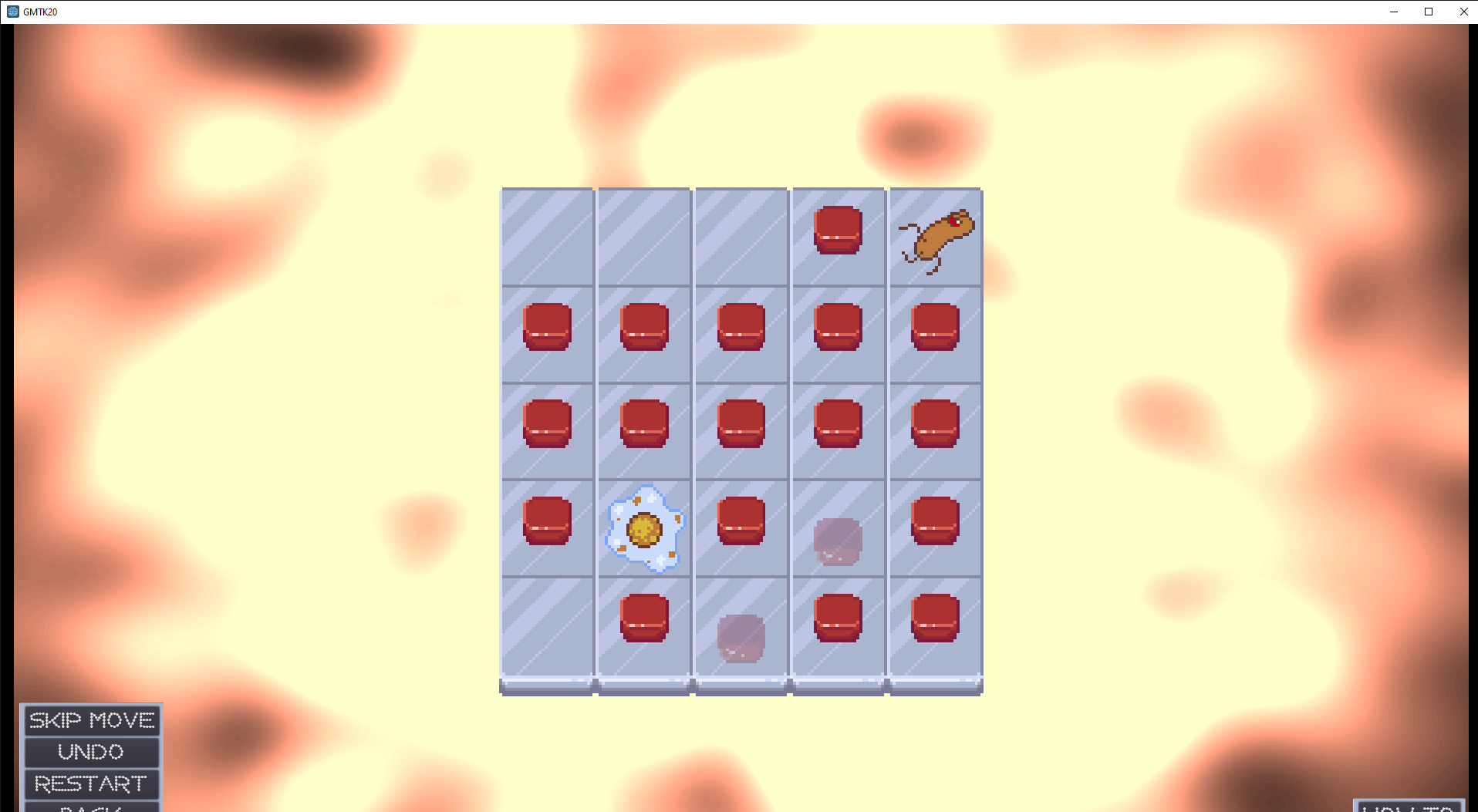
 update: tried the how-to button and yep, would've set me up well to understand the base mechanic of the game. my recommendation would be to have that screen that pops up be an overlay the player sees the first time they attempt the first level (and still have it accessible from that button), OR make the button a lot more obvious (you could even have it flash if the player fails the first level many times in a row). because if i had known it was there i would have absolutely used it. from my perspective, i think based on the size of the agar grids for most of the levels you definitely have room to at the least make the UI buttons larger.
ive included this screenshot to show how your game looks when it first launches. i didn't think to maximize the window all the way, and as you can see the bottom buttons are getting cut off by my task bar, making it hard to see them. thought this might be valuable to know as well. when i maximized the window i could see them, but in my first playthrough i didn't maximize the window because i didn't think i had to.
edit: didn't see your newest comment so some of this info may be repetitive, feel free to ignore anything that's been repeated here

