Check mine and rate it! (Click the image above)
Reverse Adventure: https://itch.io/jam/brackeys-4/rate/723914

Check mine and rate it! (Click the image above)
Reverse Adventure: https://itch.io/jam/brackeys-4/rate/723914
Holy... that level was tough.
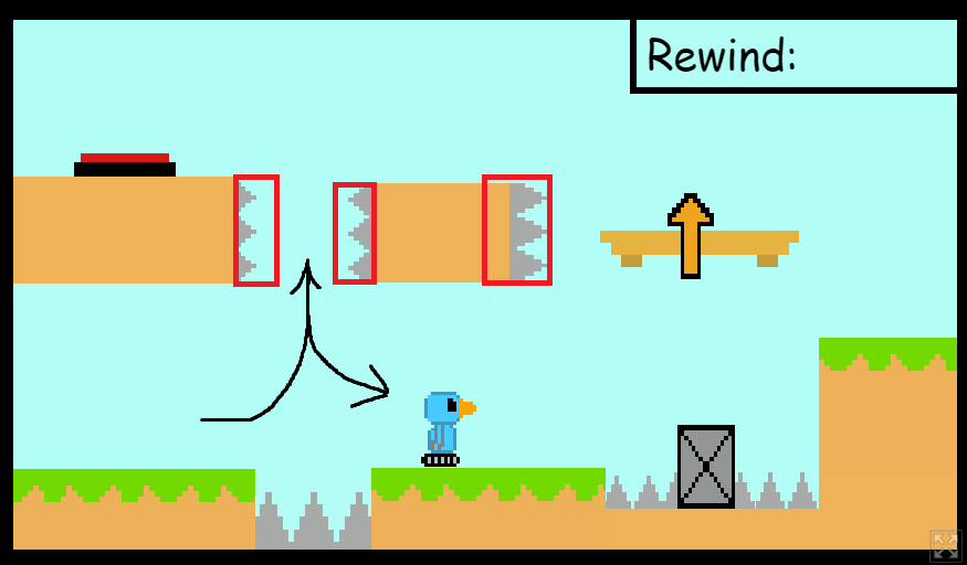
The red squares above are the size of the hitboxes (or maybe they are smaller and the player is wider than his visuals), the furthest right even protrudes into the platform itself which I painfully learned on the 3rd attempt of trying to go that way.
The jump itself requires perfect placement into the center and then strafing when you're half way down the fall which personally I have no problem with as it gives it a little challenge BUT how am I then meant to get back to the start in 5 seconds afterwards other than to try and naviate back down that only just wide enough tunnel and strafe left. That's a lot of challenge and frustration for level 3!
The hitboxes are definitely punishing and the visuals don't convey that it's meant to be a platformer designed to challenge and frustrate so I'm really not sure if this was a conscious choice or not.
After replaying this level 15 times, I would have liked to mute the background music as it was getting a bit repetitive haha
Its hard for me to give detailed feedback as it went from really easy to 'I cant do this' fast, the character felt good to control.
When it comes to platformers there are typically two things I see that frustrate people:
Anything pixel perfect such as jumps and gaps - challenging is fine but don't make a narrow area so tight that the margin for error is a pixel or 2 wider than the player collider
Imperfect controls - There is no such thing from a technical standpoint as code is binary... did the player press jump at this exact moment? no? ok no jumping, BUT that isn't what feels good to the player. Input buffering is a great way to get fluid controls and you can have full control over how strict or lenient it is, here's a good blog point explaining it.