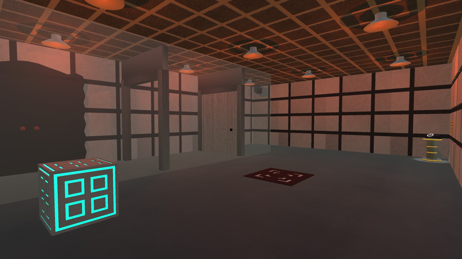
The color palette of orange and ash brown is very pleasing to look at, and the shading of the slight fog seems to fit in with the game’s minimal looking style. The way the cubes have bright outlines really seems to emphasize that these objects are important to complete the puzzle compared to the background neutral-looking colors.
The rewind tool is fun to use, it really makes you feel like you’re defying the rules of time by undoing your mistakes.
When I looked at the title in the thumbnail, I thought I was looking at two glowing red eyes in a doorway instead of it just being two bright doorknobs. Perhaps the edges of the door could be made slightly brighter to emphasize that it’s a door.
It was kind of hard to hear the narration of what the person was saying in the background. It sounds a bit muffled, and I don’t want to have to turn my volume ALL the way up just so I can hear it. An option to adjust the volume of the narration (as well as other volume options) should fix this.
There were some sections where it required constant rewinding in order to get the object to stay in place. Perhaps you could have the ability to stop an object in place by holding down a certain input.
I kind of got stuck on level 3, I felt like it wasn’t really clear enough on what I was supposed to be doing, especially since I JUST got introduced to some mechanics that I don’t feel experienced enough with. For the majority of the time, I thought I was supposed to move the green cube into a certain spot, that is, until I found out that you’re supposed to use it like if it was a lift. The green cube should be changed so that it’s too heavy to be pushed by the player so they won’t get confused as to what they’re supposed to do with it.
You should try introducing one mechanic, and then have a few levels that involve utilizing that one mechanic in baby steps before moving on to something new. That way, you can ensure that the player knows how to use their new tools. During later levels, you should throw in certain stages that involve utilizing one mechanic more than the others in order to double check and make sure that the player still knows how to utilize every tool at their disposal.
I’m not sure if the old-sounding western music fits with the greyish-orange palette and the style of the TRON-styled cubes. The color palette and the way the building is styled seems reminiscent of ancient Japanese interior architecture. The resemblance is almost uncanny:


Perhaps you could style the game around ancient Japan? It would be interesting seeing Portal-styled gameplay with ancient Asian influences.

