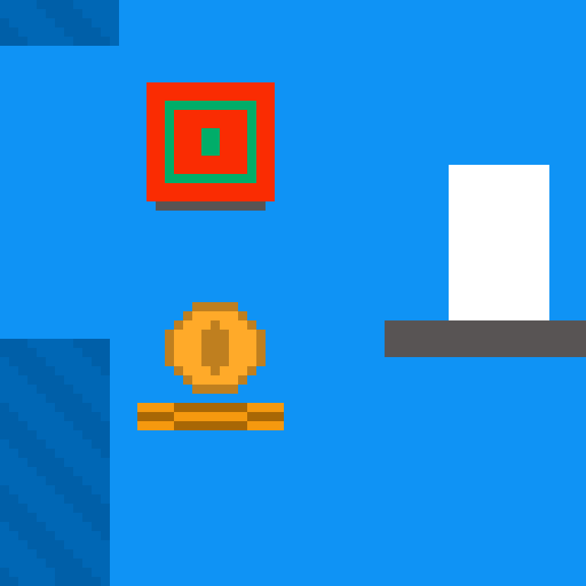
Yep, the visuals are the Unity default 2D shapes,I had thought that the visuals would be like in the image, but I made a few mistakes with respect to the objects that were part of the platforms and it stayed that way. And that music is my first music so its very simple and i don't know much about music. When I know more about all the areas i will conti nue with the project and I will do better, I still have many things in mind. Thank you for play my game. And what is your opinion of the last zone of the level(without spoilers)?
Viewing post in An Unexpected Level jam comments
Without spoilers will be tough, but I'll try: I liked that last part. I got lost there, but I liked the mechanics in the red walls. The jumping inertia was fine, but as I said in my other comment, it was a little weird. I think that lacks a little polish, it seems that some flickering were happening, but I couldn't tell exactly what is lacking. Maybe pushing the player off the wall when he jumps would have made it better. The math puzzle was ok, I found the answer in my first path (lucky, I guess). Overall, it was a little confusing, but maybe that was the objective, I wasn't bothered by it.

