On Sale: GamesAssetsToolsTabletopComics
Indie game storeFree gamesFun gamesHorror games
Game developmentAssetsComics
SalesBundles
Jobs
TagsGame Engines

I regret to say I might be back with another bug - undesirable behavior, anyhow. This is a ... I wanna say "Journey to the North" seed? These have a Style bonus equal to the number of squares of path left clear.
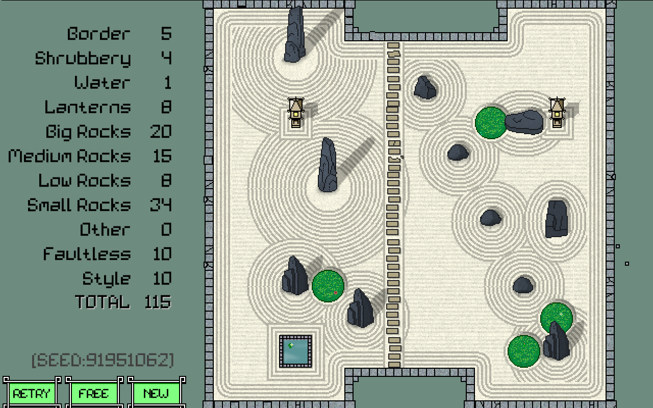

As you can see, it placed the path on the narrow section in the middle for 10 points when the left edge is clear for 12. Aesthetically, I have nothing but approval for this - it looks way better than a path on the edge would - but my impression was that the game would pick the best-scoring path when multiple were available. It feels like something that merits communicating if that is not so.

Again, thank you for the game. I've got thirty-three end screens of games saved to my hard drive because they're just pretty.

The path mechanics are set up to choose the valid path closest to the center of the garden (or arbitarily, if 2 are equidistant) so that behavour is intentional, BUT (a) there's no way for you to know that which makes it impossible to optimise for, (b) it probably is more reasonable to expect it to score the longest path.

I'm a bit torn, because I think central is more likely to look pretty, and I've tried to build rules where pretty gardens score well (this hasn't been completely successful, but it is the intent). I'll have a think about it.

Thanks for pointing this out. And for playing; glad you're enjoying it.

My first thought is to indicate that in some way in the UI? Like, in the explanation of the style rule. Not sure how to elegantly, though.