
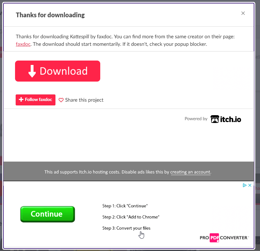
Again, thank you for the detailed and considerate response. Perhaps this is solvable from a graphics design/affordances approach and can avoid almost any engineering costs. I mocked up a version that shows what I'm thinking. Separating the ad with white space and a bar so it is not associated with user's "where do I click?" thinking. Add a redundant but visually dominant Download button with an icon that suggests its purpose. That way even if the user can't or won't read they are less likely to click on the wrong thing even if it is a phishing button. Last, a bit of text explaining the purpose of the ad so it doesn't look like Itch is going the way of Sourceforge, Neopets, or Download.com and that this is a limited and mutable feature of the site. Logged in users can retain the old download window, it is perfect as is. Perhaps some version of this would work?
I appreciate you and the invaluable service Itch provides to the indie community. Thank you for your hard work and attention to this.
 re
re