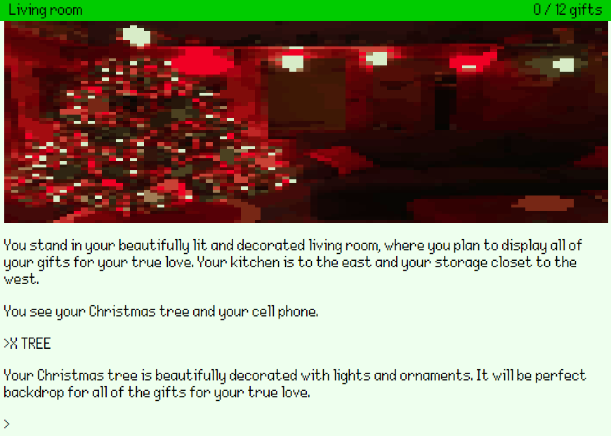
Nice. It'll be good to see the font in a screenshot of you have time.
Viewing post in Tips: Choosing a special font
Looks good.
Recommendation (try any or none of them).
- Digitised graphics at low resolution often looks a bit messy so maybe consider doubling the resolution?
- Try out the beta version of Adventuron, it'll make it so that the image aligns to the left and right of the status bad. (adventuron.io/beta). Back up your game in a local text file on your computer before hand in case there are issues.
- Set the text colour to not quite black ( #333) is good.
- Set the background colour to grey (#ddd).
- Add scanlines (shader = "scanlines" in the theme_settings {} section inside your theme).
- Set the header pen colour to #fff.
Anyway, love it that there are 12!! gifts, sounds like a sizeable adventure, and
Chris


