Hi,
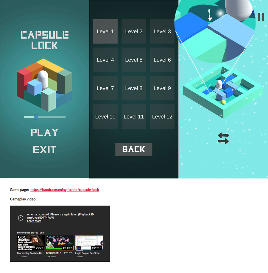
I played it just now. Very neat. I liked that sound slider on the start screen. A nice way to hint on the game mechanics. Also like those colors :)
Now I'll play devils advocat, so I'll be brutal (hope you don't mind, no harm intended). I think honest feedback is the best. Of course all I say is highly subjective.
* The first two screens are very nice with bright colors and then the level screen is all "grey" with very minimal text. That felt like a little downer to me. The level afterwards is very nice again. So that screen just feels off. Same goes for the pause screen. It is just visually inconsistent (roundcornders on the buttons).
* I am writing this being "in" the first level. Honestly I did not understand why the "switch" button at the bottom is necessary. Maybe it's necessary for some mechanic to work later on. But even then I think it would be better to introduce that when it is needed.
Why can I not just drag both (blocks and pill) at the same time? If it's a ux issue (accidental drag of blocks while the player wants the pill) then maybe another solution can be found to solve that root cause. First I tried to move the pill without looking at the button below and was puzzled why nothing happened (had cleared the blocks first).
The pill and blocks glow shortly after switching. That's nice but imho this hints on a deeper problem, namely: it is unclear from just looking at the screen which elements (blocks or pills) are currently active. This offloads the bookkeeping on which "mode" is active to the players brain, not really desireable. If you look away (just talk to someone for a moment) you forget which mode you are in and thus are frustrated once you try to move a part only to realise that you have to switch modes. It's quickly corrected but kills the flow. I really think that this game could improve a lot if you "fix" this.
Also, why can I not flick the pill around just like the blocks. I think that would be a lot of fun :D.
Sidenote/Idea: maybe you could make the pill emmit some white lines and then let the ball (also white) emmit some lines too (all at the start of the level). It would be to hint on their relation (also would have to be minimal to match your style). Maybe similar to this:

* Maybe a bug, not sure. I once had a block being stoppen by a very tiny overlap with another block (screenshot at the end). That felt like breaking the theme of the game (it being logic based, not physics based and finicky).
Very minor things:
* The gradient in the main menu is not as smooth as it could be. Is this a compressed image? Maybe it's my device but if it's an image then you could use a shader on a sprite to get nice uncompressed gradients. If I remember correctly then there are some very nice solutions in the asset store.
* The menu sound repeats after a few seconds. It's nice at first but gets repetitive very quickly. Maybe add 2,3 more loops and mix them up.
* I think it could profit from some minor transition animations between menus.
* Your youtube video seem to be broken (see screenshot)?
I hope I did not hurt your feelings too much. I wrote it in the interest of makeing your game better and I know it's always hard to get/accept that critique.
Also, don't listen to what I say. You know your game best. So, think about why I had the experience I had and maybe you can fix the root cause instead of just catering to any reviewers wishes.
Thank you for making this and grats on getting a finished game out the door :)


