July 16th - 6 Days Before Jam
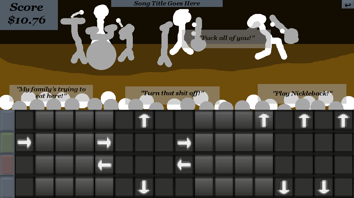
This piece of shit took six hours.
Let's back up a bit. I had ideas floating in my head for my game's core elements, but they needed to be solidifed. And so I set out to make some concept art of the main game screen.
Going in, I knew this scene needed several parts:
- The track. This is where the gameplay happens. The notes scroll along the screen until they reach a "sweet spot" where the player can hit the note using the corresponding key.
- HUD elements. These carry any necessary information to the player.The only 100% necessary element is score; everything else can be accessed through key presses or fade out over time. Still, it's nice to have a bit more.
- Some form of graphical representation. I need a connection between the player's inputs and the music. A band on stage could work, but it'd need to be animated and drawn, and oh god programmer art oh no no no no!
- Text box. This is what will make my game stand out. I want there to be dialogue during the performance; nothing major, so that you don't need to draw your focus away from the track, but it should give some personality to the crowd and band members. It could also make the game more energetic; stuff's popping up on screen, the crowd's jeering, the singer's growling, but if you wanna play good, you gotta focus on your job.
At the time, this didn't seem too bad. How hard can it be to fit four things on a screen? Right? Right? RIGHT!?!?!
My first attempt:
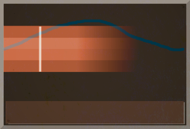
Inspiration comes hold. I open up LMMS and stare for a while. How did the LMMS developers fit everything on screen? And those tracks, notched and shaded for a 4/4 time signature...it's perfect! I screencap, edit the image a bit, and four hours later I have this:
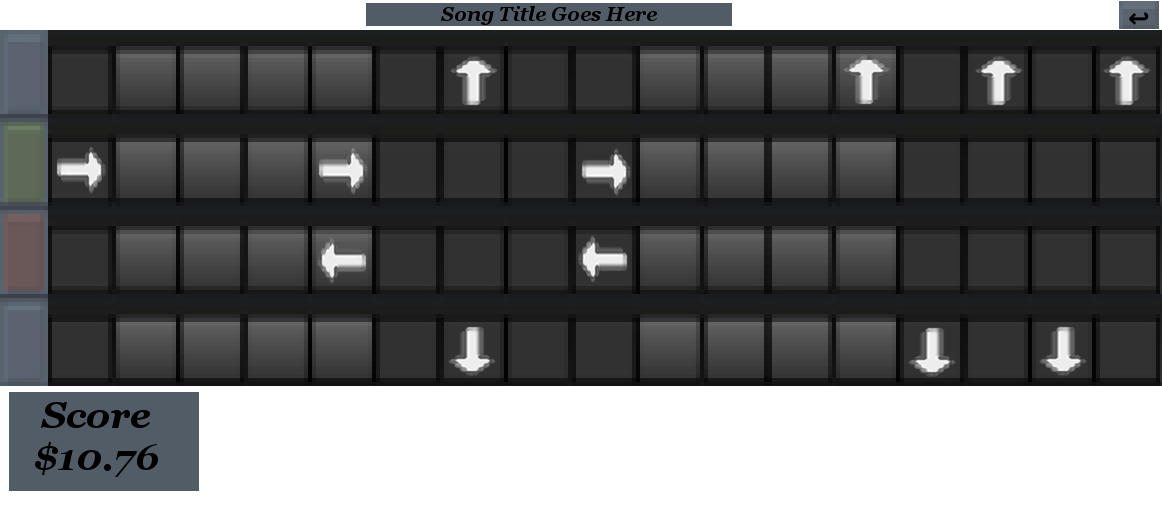
Good news first: we're getting somewhere! That's obviously a track, and it looks a lot like frets, but the shading helps gauge how far the notes are in relation to the beat. I have the four buttons on the left that light up either red or green when the player hits a key, and a score indicator at the bottom (measured in a laughably small amount of money, because this isn't Rock Band. There's even a spot for the song title! This is fantastic...wait, where does the graphics go? Assuming a rather standard 16:9 aspect ratio, I don't have a lot of space above or below the track. I could probably condense the frets a bit, but that still wouldn't give me a lot to work with. Hmm...how does everyone else do it? To Google!
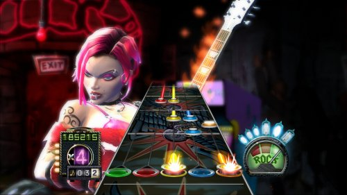
Here's a screenshot I found from Guitar Hero 3. It's brilliant, really. The track fades into the distance, with a full-sized "sweet spot" area while the notes in the distance are smaller. This tricks the eyes into thinking the notes are traveling towards you. And unlike my bulky 2D track, the 3D track in Guitar Hero barely reaches halfway across the screen. It's a nice trick, but I'm not sure I can replicate it. What else is there?
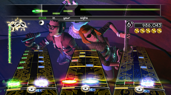
Here's a screenshot from Rock Band 2. Same fade-into-the-distance technique. There's some partial transparency on the vocals track at the top, but that doesn't help much. Really, this screen is extremely convoluted; the men (women?) on stage barely take up a third of the screen. And yet somehow I can make them out perfectly. Everything is in frame; the microphone, the guitar, the outfits and glasses. It's fantastic cinematography, placing the women (men?) exactly where they need to be and moving the camera in exactly the position to get them in frame. But again, I'm making a 2D game. How can this help me?
And then I saw what wasn't there. And so I was enlightened.
These performers aren't on camera in full. Parts of the track obscure their bodies; the legs, feet and parts of the arm. Because you don't need to see them! You need the face and just enough detail to show what they're doing. Everything else can go behind the UI.
Here's my concept again:

I place the heads of the crowd above the track, but their bodies are behind it. So even though I have dozens of people on-screen, they each take up only a tiny bit of space. And I play around with layering to give the illusion of depth, thus freeing up more space. The text box is seperated into several semi-transparent boxes, thus letting the crowd and performers do their thing behind the text. It's shit art, but as a concept, it's worth improving on. And that's what I needed.
July 17th - 5 Days Before Jam
I haven't touched Unity since the shitty tutorial. I downloaded GameMaker yesterday, but then I kinda sorta lost the executable. The installer told me it's on my computer, but not even my PC's Search feature is turning it up. After an hour, I locate the executable in a folder within the anals of my hard drive, then pin it to my taskbar. I really hope it stays there.
But enough of that confidence draining loss of productivity! Today is GameMaker day.
Good news is that this tutorial is a million times better than the Unity's recommended tutorial. Bad news is that it's for an older version of GameMaker. There's all the expected problems; everything's in a different place, there's a few extra toggles that aren't explained, there's a tab system that's not shown in the video, etc. But this is...fine. It's more than fine, actually. It's perfect. I'm having to explore GameMaker myself in order to follow the guided tutorial, and it's helping a lot.
For instance, in the tutorial, there's a field labeled "Speed" that the instructor explains is the framerate. Trouble is, it's not there in my version of GameMaker. I do some digging and find a "Game Frames per Second" field under Options -> Main -> General. And while I'm there, I find checkboxes to allow fullscreen, stop displaying the cursor, customize the game's installer, adjust the name of the executable, display a custom splash screen, and more.
Though, I can't have the tutorial take all the credit. GameMaker's UI is extremely intuitive; everything is clearly labeled and uses standard UI conventions. For instance, there's customizable sidebars with docks that navigate like any file explorer, with a bit of tabbed web browsing thrown in. If you've ever used a computer, you could probably use GameMaker.
This is...fun! I'm excited! I want to learn more, discover the engine's limits, and probably break things! Oh, GameMaker, where have you been all my life?
While digging around in GameMaker, I notice something horrible. Something...copyright related.
GASP!
By default, GameMaker comes with a default license agreement for all games. I won't go into too much detail because it's boring, but using this default agreement is complete bullshit. So I change it:
Any portions of this game not already owned by YoYo Games Ltd. or any other copyright holder is licensed under the Creative Commons Attribution-NonCommercial-ShareAlike 4.0 International License. This means you can use this game for whatever you want, provided you provide me (Kyle Terreault, a.k.a. "Oportet") with reasonable attribution, do not use this for commercial purposes without my permission, and use this license on any derivative works you make using this game.
I then insert a splash screen to make double-sure the lawyers are happy:
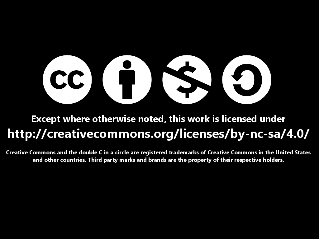
You know, I still haven't actually made anything with GameMaker. I should probably do that.
In the next post: I actually make something! Huzzah!

