Indie game storeFree gamesFun gamesHorror games
Game developmentAssetsComics
SalesBundles
Jobs
TagsGame Engines

[Devlog] To The Mountain Top Of Rock! (My First Game That's Amazing)

A topic by Oportet created Jul 16, 2017 Views: 1,413 Replies: 11
Viewing posts 1 to 9
(1 edit) (+4)

OH GOD WHAT AM I GOING TO DO WHAT HAVE I SIGNED UP FOR SOMEONE PLEASE HELP ME

Welcome to the devlog for Kyle Terreault's (A.K.A. Oportet)'s future multi-million dollar success, To The Mountain Top of Rock! It's gonna be a long journey full of panic attacks but I'm confident I can make it out of this jam with something to show for it. Onwards!


July 15th - 7 Days Before Jam

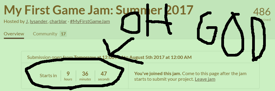
On the front page of Itch.io is an enticing offer. My First Game Jam? Sounds perfect! I have no idea how to make a game! What could possibly go wrong? Wait...oh, shit.

Let's back it up a bit. A few hours before signup, I was doing this:
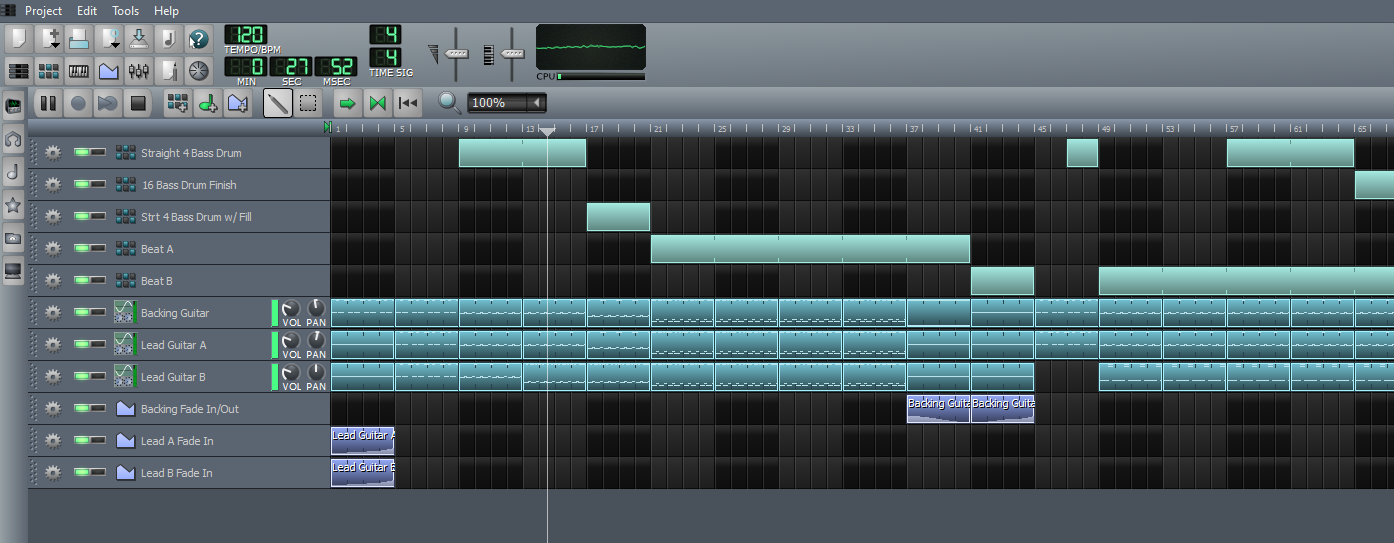
Look, I can make stuff! Well, not games, but it's stuff!

This is Linux Multimedia Studio, or LMMS. On screen is Bad And They Know It (Combat Loop), my attempt at a sweet hard rock loop for that RPG I'm never going to make. It's pretty awesome, in my opinion. The song, not the RPG. The RPG doesn't exist. But if it did, it would be awesome too. Because i would've made it.

Anyways, my song! Unfortinately, the rules of My First Game Jam require most work to be done while the jam is in progress. So Bad And They Know It is going to stay on my hard drive for now. But it's not entirely forgotten.

A couple hours later, I'm staring at the sign-up sheet. I have one form to fill out:
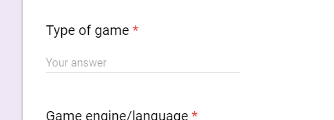

My eyes hang on the blank field for a good few minutes. What do I want to make? The theme hasn't been announced yet, but I'm not sure if I even want to follow it. What games can I make? I'm a complete novice with no experience in any game engines or frameworks. Hmm...what am I good at?

In a moment of utter stupidity, I type in "Narrative Rhythm Game".

Great job, Kyle. Way to keep your expectations realistic.


I'm panicking in the Discord chat. I know enough about game dev to know I need an engine of some sort. I could've sworn I heard Unity's easy to use, so I download it and boot it up. And whaddaya know; there's links to tutorials right off the bat, videos and all! Let's check it out:

My attention fades as I listen to the teacher moan. I make the horrible decision of reading the YouTube comments.

"It became too complicated at 0:00"

"These tutorials are terrible. It just explains which buttons to press and which menus to look in, without actually explaining what you're doing, or why you're doing it"

"I feel so stupid, I absolutly hate myself after this; I don't get it... need food now"

Naysayers, all of them! Power on, I sa-what do you mean compiling error? I copied the code exactly!

As I spend a good ten minutes looking for the discrepency (an extra comma), I can't help but feel...shitty. This isn't game design. How did I make they ball move? Why am I typing "Void" before half these commands? Doesn't Void mean not valid? Why do I want my commands to not be valid?

I'm copying some dude's code that might as well be a foreign language. Let's say it's French. Now, I took a year of French in high school, and I learned a bit about the grammah, but I couldn't speak it if a kitten's life depended on it. And I love kittens.

A hour in, Unity isn't looking to hot. Time to panic in Discord some more.


While I'm failing miserably on the technical side of things, I'm still coming to terms with my concept. Okay, "Rhythm Game" might be a decent idea, but...Narrative Rhythm Game!? Look, Kyle, you're a pretty good writer. I would know, I'm you. But some things just don't need a narrative. "Hey, I liked Rock Band, but I really wished they had a better story" said no one, ever.

After my escapades in Unity, the theme is announced:

I have a feeling I'm going to fear the J by the time this is over.

"Dreams", huh? Pretty abstract there. A rhythm game about dreaming? What does music have to do with dreaming? What dreams do musicians have? Hmm...

Oh. Oh, this theme's perfect. We're going to the top, baby! From garage band to rock star, follow the journey of...hmm, I need a band name. It needs to be good. The band name's probably gonna be the project title, and I need the title to reflect the game, so it can't be too abstract. It must describe a band, and a band only...wait a minute.
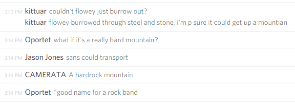
If anyone asks, I was researching in that chat. I totally wasn't slacking off

Hmm, now that I think about it, I'm pretty sure I heard a rock song about mountains.

Okay, maybe it's not a rock song per say. It might be slightly on the heavy side. But that's okay! I can pump out some death metal tracks; really, all you need to do is throw notes around like a rich man at a strip club. Okay, you can't make good metal that way, but I'm working on a deadline here. I gotta decide on a musical style, and I'm a sucker for obscure references no one will ever get. They're the best references, you see.

This is good, this is good! I have the audio design planned out, and I've even found a narrative. Oh, right, the title! Well, it's a game about becoming famous, so why not "To The Mountain Top"? Wait, I editted out the musical reference. Uh..."To The Mountain Top Of Rock?" That's a perfect title, but a bit obnoxious as a band name. Okay, how about the band's name is "The Mountain Top Of Rock", and the title can be "To The Mountain Top Of Rock". Oh. Ooooooooh. That's good. That's perfect. To The Mountain Top of Rock!

I know a couple good instrument presents in LMMS that could work for this. We get a bassist on one track, one or two guitarists, a drummer. I can't growl, so it'll have to be a instrumental band, but those death metal instrumentalists are going to the top!...No.

I'm lying to myself. Dreams aren't how music works. Broken dreams, maybe. Metal's a niche genre; supply outstrips demand, and The Mountain Top Of Rock has a better chance of winning the lottery than becoming famous. If they're lucky, they might get a record deal that puts them in debt, because Music Is Politics. No industry exec is going to take a chance on these guys, no matter how hard they play or good they get. Even if they were the only death metal band in existance, they're still a risk compared to the "safe" pop groups, EDM producers and rap/hip-hop artists that dominate today's radio. I can't in good faith have someone play my game when it's such an obvious lie. What kind of person would I be if my lies inspired someone, either on their own or as part of other artist's lies, to join a band full-time? I told them "yes, it's awesome!" I'm setting them up to fail, and I cannot in good faith take that risk.

The Mountain Top Of Rock have big dreams. They've poured their hearts into their band, and it's gonna get them jack shit.


With the narrative and themes sorted out, it's time to design the gameplay. Practically speaking, it needs to be a short game if I want any semblance of quality. I still don't know how I'm making this game WE'RE ALL GOING TO BURN, so I'm going to need to keep it simple. Some keyboard inputs timed to a music track while The Mountain Top Of Rock performs a set in an empty venue. Maybe a cutscene or two as they're heckled by the snobby crowd, perhaps the guitarist can flip out at someone. Nothing major; some text boxes and a sound effect or two. Hell, I don't even need a stage; I could just have some abstract waveform that thumps to the music. I'm no art expert, but I'm pretty sure I can draw a line.

You know, this is starting to remind me of another game.

I can pillage some of these mechanics. We have can rent money be the goal; the better you play, the more you get paid. You'll have a couple songs before bills are due, and when they are, you gotta pay. If you can, great; play the same songs over again for more rent. If you can't, game over. How do you win? Ha! That's hilarious.

So this is a game about dreams, isn't it? And what's the point of a depressing tone if you can't crush your player's hopes? With everything in mind, I draft a short summary for the future Itch page.

To The Mountain Top Of Rock, baby! Guide your death metal band from the garage band to the stadium. Go from dirt poor to filthy rich of the sales of the most hardcore records the world's ever known. Accumulate millions of fans accros the world and experience the narrative of The Mountain Top Of Rock as they take their dreams and blast them with bass. It's gonna be a long road where only the toughest survive. I hope you can handle it.

I'm such an asshole.

At this point, there isn't much going for this concept gameplay-wise. It's "Quick Time Event Simulator 2017", and we all love those. Now, I could come up with a totally original idea that roxers everyone's boxers, oooooooooooooooooooooooor I could rip off a flash game.
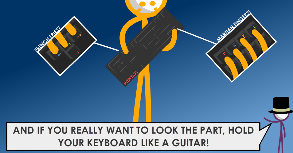

This is Super Crazy Guitar Maniac Deluxe 4, a free flash game I know because I'm poor (linky link). It's control scheme (if you can call it that) is awesome and stupid at the same time, which fits death metal perfectly. Best yet, it requires very little programming knowledge to impliment. Just bound the controls to the right keys. It's idiotproof. What could possibly go wrong?


In the next post: Playing with GameMaker and (bad) concept art!

Submitted

Reading you experience with unity, I can totally relate to how it feels trying to learn coding/scripting for the first time. Nothing makes sense and you feel totally dumb. This is totally normal!!! Don't get discouraged! You clearly have a lot of heart and that honestly the most important part (or so I hear.)

Excellent stream-of-consciousness devlog, very fun to read. Looking forward to where your journey to the top of the mountain goes next.

Thanks! Nice knowing people out there care about my drivel. I'm hoping the less-formal style helps people with the design process. I'm starting the log early because I've heard of lot of people in the Discord ask for help with inspiration, and, well, inspiration just kinda comes. It's easy to say "This inspired me", but it's hard to say how unless you follow your thoughts exactly. Where and when the ideas came to mind, what you were doing at the time, etc. I can't wait to read everyone else's stuff.

Are you in the jam? I hang out in the jam Discord while I'm slacking off researching, and I'd love to see whatever you're making/planning to make. The more games I play, the more knowledge I get anyways, See you around, maybe?

Submitted

Hey there! I haven't really been able to hang around pre-jam but now that it's all started I should be hanging around the discord a bit more. So I definitely will see you around! 

(+1)

July 16th - 6 Days Before Jam

This piece of shit took six hours.


Let's back up a bit. I had ideas floating in my head for my game's core elements, but they needed to be solidifed. And so I set out to make some concept art of the main game screen.

Going in, I knew this scene needed several parts:

  1. The track. This is where the gameplay happens. The notes scroll along the screen until they reach a "sweet spot" where the player can hit the note using the corresponding key.
  2. HUD elements. These carry any necessary information to the player.The only 100% necessary element is score; everything else can be accessed through key presses or fade out over time. Still, it's nice to have a bit more.
  3. Some form of graphical representation. I need a connection between the player's inputs and the music. A band on stage could work, but it'd need to be animated and drawn, and oh god programmer art oh no no no no!
  4. Text box. This is what will make my game stand out. I want there to be dialogue during the performance; nothing major, so that you don't need to draw your focus away from the track, but it should give some personality to the crowd and band members. It could also make the game more energetic; stuff's popping up on screen, the crowd's jeering, the singer's growling, but if you wanna play good, you gotta focus on your job.

At the time, this didn't seem too bad. How hard can it be to fit four things on a screen? Right? Right? RIGHT!?!?!

My first attempt:

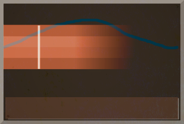
This one took an hour.
My plan was to overlay a waveform that dances around as the music plays, letting the track and text box take up the rest of the screen. I tried overlaying a semi-transparent stock image of paper, added a border, messing with the colors to add contrast. In the end, it looked...okay,I guess. But that waveform was clearly in the way of things, and the track itself lacked definition, and the black background was a huge waste of space, and blue-orange contrast is overplayed, and the border didn't fit but it looked worse if I removed it, and...

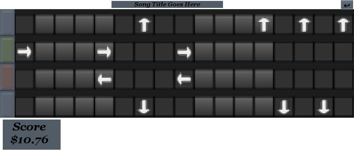
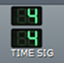
Inspiration comes hold. I open up LMMS and stare for a while. How did the LMMS developers fit everything on screen? And those tracks, notched and shaded for a 4/4 time signature...it's perfect! I screencap, edit the image a bit, and four hours later I have this:

Good news first: we're getting somewhere! That's obviously a track, and it looks a lot like frets, but the shading helps gauge how far the notes are in relation to the beat. I have the four buttons on the left that light up either red or green when the player hits a key, and a score indicator at the bottom (measured in a laughably small amount of money, because this isn't Rock Band. There's even a spot for the song title! This is fantastic...wait, where does the graphics go? Assuming a rather standard 16:9 aspect ratio, I don't have a lot of space above or below the track. I could probably condense the frets a bit, but that still wouldn't give me a lot to work with. Hmm...how does everyone else do it? To Google!

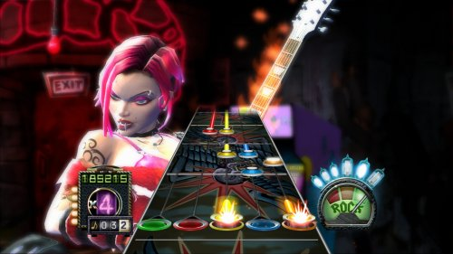
Here's a screenshot I found from Guitar Hero 3. It's brilliant, really. The track fades into the distance, with a full-sized  "sweet spot" area while the notes in the distance are smaller. This tricks the eyes into thinking the notes are traveling towards you. And unlike my bulky 2D track, the 3D track in Guitar Hero barely reaches halfway across the screen. It's a nice trick, but I'm not sure I can replicate it. What else is there?


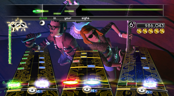
Here's a screenshot from Rock Band 2. Same fade-into-the-distance technique. There's some partial transparency on the vocals track at the top, but that doesn't help much. Really, this screen is extremely convoluted; the men (women?) on stage barely take up a third of the screen. And yet somehow I can make them out perfectly. Everything is in frame; the microphone, the guitar, the outfits and glasses. It's fantastic cinematography, placing the women (men?) exactly where they need to be and moving the camera in exactly the position to get them in frame. But again, I'm making a 2D game. How can this help me?

And then I saw what wasn't there. And so I was enlightened.

These performers aren't on camera in full. Parts of the track obscure their bodies; the legs, feet and parts of the arm. Because you don't need to see them! You need the face and just enough detail to show what they're doing. Everything else can go behind the UI.

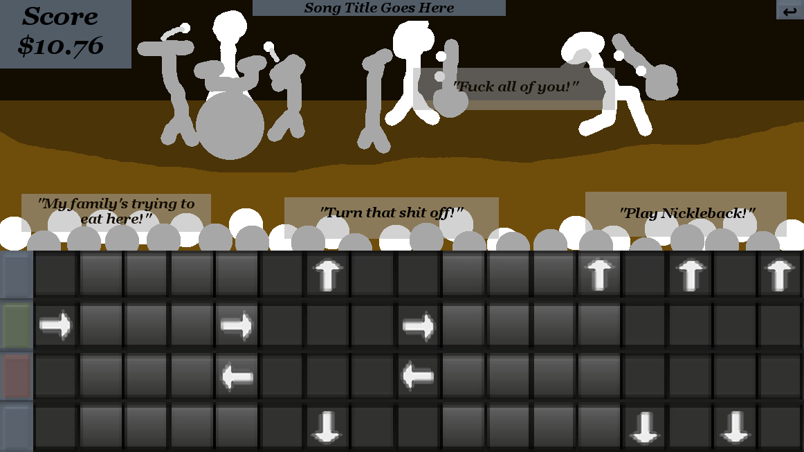
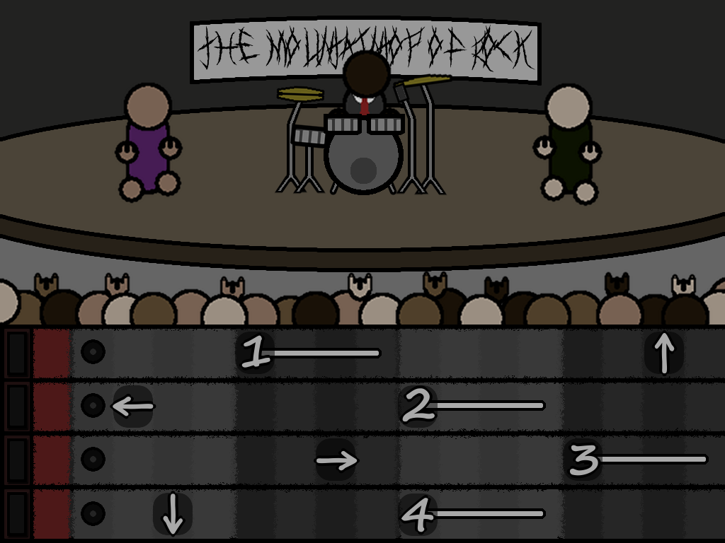
Here's my concept again:

SIX HOURS.

I place the heads of the crowd above the track, but their bodies are behind it. So even though I have dozens of people on-screen, they each take up only a tiny bit of space. And I play around with layering to give the illusion of depth, thus freeing up more space. The text box is seperated into several semi-transparent boxes, thus letting the crowd and performers do their thing behind the text. It's shit art, but as a concept, it's worth improving on. And that's what I needed.


July 17th - 5 Days Before Jam

I haven't touched Unity since the shitty tutorial. I downloaded GameMaker yesterday, but then I kinda sorta lost the executable. The installer told me it's on my computer, but not even my PC's Search feature is turning it up. After an hour, I locate the executable in a folder within the anals of my hard drive, then pin it to my taskbar. I really hope it stays there.

But enough of that confidence draining loss of productivity! Today is GameMaker day.

Good news is that this tutorial is a million times better than the Unity's recommended tutorial. Bad news is that it's for an older version of GameMaker. There's all the expected problems; everything's in a different place, there's a few extra toggles that aren't explained, there's a tab system that's not shown in the video, etc. But this is...fine. It's more than fine, actually. It's perfect. I'm having to explore GameMaker myself in order to follow the guided tutorial, and it's helping a lot.

For instance, in the tutorial, there's a field labeled "Speed" that the instructor explains is the framerate. Trouble is, it's not there in my version of GameMaker. I do some digging and find a "Game Frames per Second" field under Options -> Main -> General. And while I'm there, I find checkboxes to allow fullscreen, stop displaying the cursor, customize the game's installer, adjust the name of the executable, display a custom splash screen, and more.

Though, I can't have the tutorial take all the credit. GameMaker's UI is extremely intuitive; everything is clearly labeled and uses standard UI conventions. For instance, there's customizable sidebars with docks that navigate like any file explorer, with a bit of tabbed web browsing thrown in. If you've ever used a computer, you could probably use GameMaker.

This is...fun! I'm excited! I want to learn more, discover the engine's limits, and probably break things! Oh, GameMaker, where have you been all my life?


While digging around in GameMaker, I notice something horrible. Something...copyright related.

GASP!

By default, GameMaker comes with a default license agreement for all games. I won't go into too much detail because it's boring, but using this default agreement is complete bullshit. So I change it:

Any portions of this game not already owned by YoYo Games Ltd. or any other copyright holder is licensed under the Creative Commons Attribution-NonCommercial-ShareAlike 4.0 International License. This means you can use this game for whatever you want, provided you provide me (Kyle Terreault, a.k.a. "Oportet") with reasonable attribution, do not use this for commercial purposes without my permission, and use this license on any derivative works you make using this game.

I then insert a splash screen to make double-sure the lawyers are happy:

This extremely professional-looking image took thirty minutes, including the time to find and download the appropriate graphics. BECAUSE APPARENTLY STICK FIGURES NEED MORE EFFORT. Man, game dev is wierd.
I skipped over it because boring, but this legal stuff took about an hour to get right, including research, editing the license file, and creating the image. Still, it's good practice for whatever games I'll be making in the future. This detour I've made ensures people can't file off the serial numbers of my game and sell it as their own. Well, they can, but not without breaking the law like chumps. It's nice to know I actually own what I make, even if I'm not selling it.

You know, I still haven't actually made anything with GameMaker. I should probably do that.


In the next post: I actually make something! Huzzah!

(+1)

July 18th - 4 Days Before Jam

I went to bed at 3 AM last night. Today, I had toast for breakfast. I haven't charged my phone in days, even though I've been sending out job applications. It doesn't matter. It isn't the jam.

I'm not sure if this pace is sustainable. I'm going to be spending weeks of my time on something that won't make me a cent. I keep telling myself I'm getting job skills, I'm becoming computer literate, I'm working my ass off and that's enough, but...well, why? Why am I here? Do I really expect a sustainable career in an industry where prices are plummeting and studios can't sustain themselves? Do I want to get a job at a triple-A publisher where the culture is toxic at best? (disclaimer: I am a straight white man, though if your industry is that masculine-centric, ten 99% chance the workplace is vain chest-pounding and passive-aggression)


I have made a horrible mistake.

I thought it would be cool to share, ya know? I mean, I couldn't use the song. But maybe someone else could? I don't know. Look, it was a good idea at the time, okay!

And that's how Bad And They Know It (Combat Loop Preview) ended up on Soundcloud.

But then...


People liked it? How? That's impossible. I made it! The jammers (jamers? jammi?) are being polite. They must be. After all, I wouldn't want someone trashing my work. Let me share it with my friends, they know what's up.


You bastards. Here I am, making a game about how hard it is for musicians, and you compliment me? You think I deserve to be creative? Oh, I'll show you. I'll show all of you.


Enough procrastinating. Let's finish the GameMaker tutorials.


This took twelve hours. I did everything; sprites, coding, sounds. There was a loading screen, level and score system, a mute button, multiple control configurations. There's even an ambient loop I added in, mixed within LMMS. It was mine. I made it.

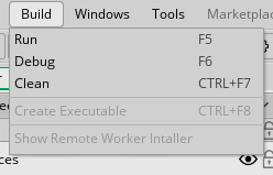
With the game finished, I figured I would share it around. Get some feedback, maybe get a new technical challenge before the jam starts. Something to help develop my skills, you know? All I needed to do was package the game into an executable and publish. And then this happened.


It's grayed out. Why is it grayed out? WHY IS IT GRAYED OUT?!?

It seems there's been a miscommunication.


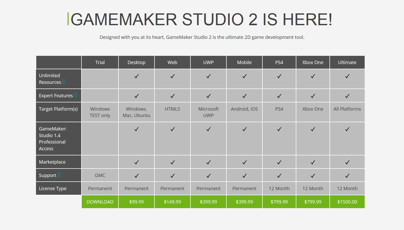
This is the download page for GameMaker 2.0. I want to personally choke whatever advertising agency made this spreadsheet. Ignore the condescending yet vague checkboxes ("Expert Features?" What features, and how are the "expert"? Is everything else not expert?). The Trial version of GameMaker exports to "Windows TEST only" (bonus points for use of "only"). What does that mean? Well, apparently it doesn't t mean you can only export to Windows, because you can't even do that. That's right, Windows TEST means you can only test your game within GameMaker. Nevermind I've already spent days learning your scripting language, writing code, creating custom images and sprite, and pretty much everything on my own. Fuck that, fork over the cash!

And then I saw this.


That's low. That's real low. You're telling me, if I don't want to hand over me and my player's data to an idiotic marketing department so some middle-manager can cherry-pick the useless data to justify their own idiocy, then I have to pay? Fuck you. What the fuck even is "anonymous game statistics?" What information are you collecting? Where is it stored? Is it safe? All good questions that I shouldn't need to research because you should be giving your customers accurate information, fuck you, fuck you, fuck you.

I wouldn't mind if this was made clear. But from how deceptive all this is trying to be, I have to wonder if this was designed to happen. Trap the customer into investing far too much time, then hold their creation hostage. Crackpot theory? Probably. More likely, whoever implimented these wasn't paid to be clear. Their one goal was and still is to sell you shit; everything else is pointless. Regardless, joke's on them. I don't have 100$. So HA.

I currently have the time for this jam because my college placed a hold on my account, freezing my access to courses. It was a 37$ fee misapplied without my financial aid was factored in. I'm currently in a job search, but I doubt I'll have a paycheck in time for the jam. In theory, I could make the game anyways and pray I can upgrade GameMaker before the jam ends. Or I could switch to Unity, though the steep learning curve will certainly lower my game's quality. Hell, if it comes to it, I could probably distribute am uncompiled GameMaker file and beg someone to create the executable for me.

Fuck it. I'll find a way. This isn't gonna end me. I'm signed up for the jam, so I'm making a goddamn game.


July 19th - 3 Days Before Jam

There's more limitations to GameMaker's trial version. According to this blog post (https://help.yoyogames.com/hc/en-us/articles/230407528-GameMaker-Studio-2-Trial-Limitations):

"...you are also constrained as to the resources that are available, with the following limits in place:

  • Objects - 15
  • Sprites - 20 (no dynamic loading permitted, no SWF or Spine sprites permitted)
  • Sounds - 10 (no audio buffers permitted)
  • Tilesets - 2
  • Scripts - 10
  • Paths - 5 (no dynamic path creation permitted)
  • Timelines - 2 (no dynamic timeline creation permitted)
  • Fonts - 5 (no dynamic font creation permitted)
  • Rooms - 5 (no dynamic room creation permitted)
  • Shaders - 0
  • Included files - 0
  • Extensions - 0
  • Configurations - 0"

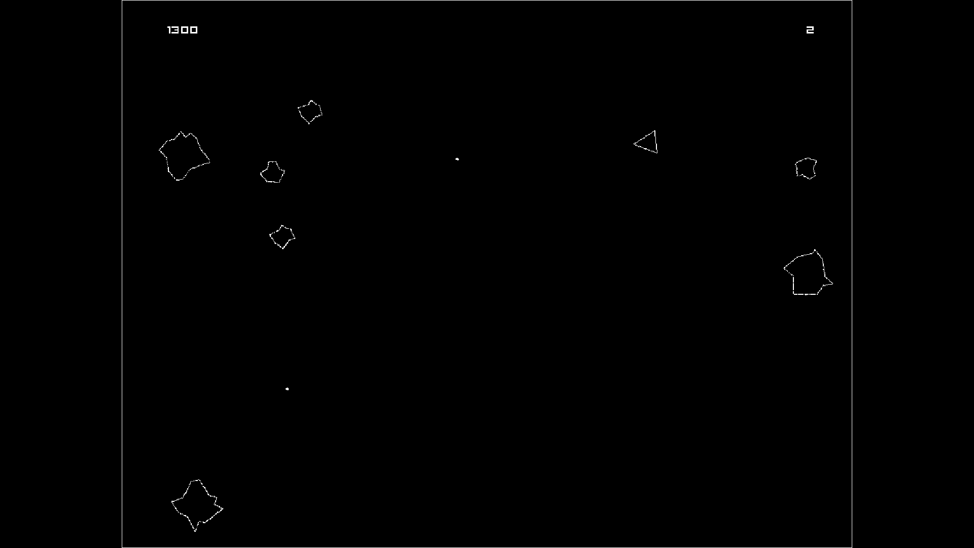
For reference, my asteroids game used the following:

  • Objects - 9
  • Sprites - 7
  • Sounds - 7
  • Tilesets - 0
  • Scripts - 0
  • Paths - 0
  • Timelines - 0
  • Fonts - 2
  • Rooms - 2

Except not really. You see, when I made the sprites, I accidentally cheated GameMaker. The asteroids in my game have six different variations, yet there's only two asteroid "sprites" (one big, one small). Each asteroid sprite has three frames of animation moving at 0 frames per second; when an asteroid is spawned, it picks one of the frames at random. There asteroids also spin for extra variance.

My point: I can beat these limits. This isn't the end of the world. Worst case scenario, I call out for help building the executable. I'm surrounded by sympathetic developers looking to play people's games. Surely, someone could help. Else...where, there is no "else".


Meet Sketchy Jeff.


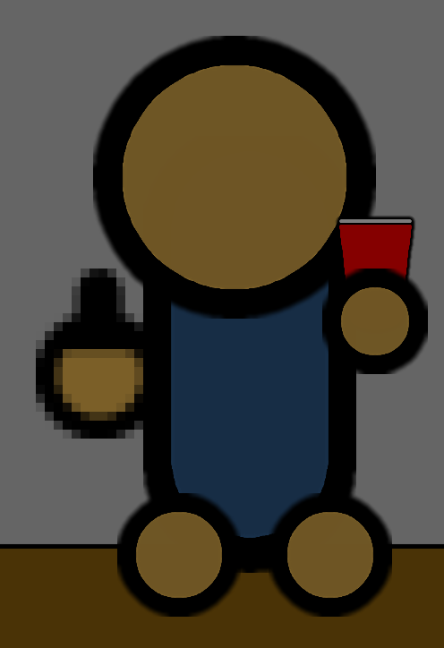
Sketchy Jeff's a fantastic guitarist, but he has a slight anger issue. Actually, he has a slight alcohol issue; the anger's just a symptom, you see. Let's say there's a lot of red cups on stage, and leave it at that.

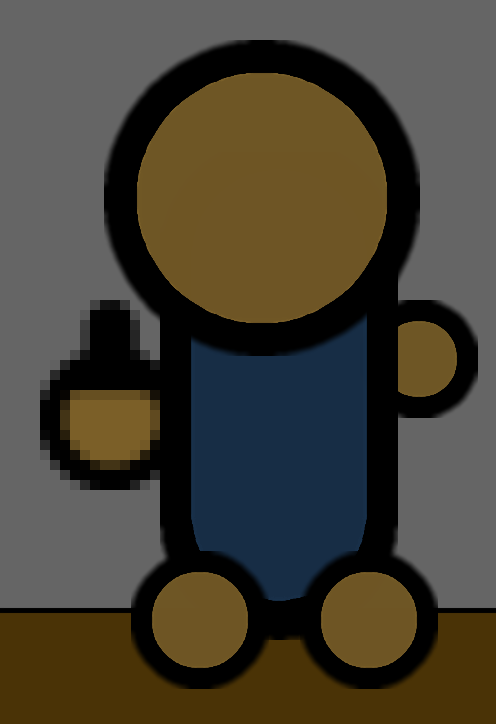
Sketchy Jeff isn't the most artistically impressive specimen, but he's a grade above stick figures, he's easy enough to make, and his detached hands and feet are simple to animate.

At some point, I started making a mid-2000s flash game. I'm not sure how I feel about that.


I'm starting to get scared of feature creep.

I have two weeks to make a game. I have three days to learn how to make a game. I'm not Miyamoto, here. I'm a pseudo-indie dev working without a team. Everywhere I go, my fellow jammis tell me "keep it simple, don't bite off more than you can chew". And I don't need to make the next Skyrim anyways. For god sakes, I spent six hours drawing stick figures. What do you want from me in two weeks? A game?

Maybe my original concept is too vast. Following a band from the bottom to the bottom takes time; time I don't have. So let's scale it back. Instead of a full career, let's just follow one gig from start to finish. I won't need to create different venues, which will save time on art. And this gives the game a fixed end point. Make enough money from the gig to pay rent, or spend the night on the street.

A lot can happen during one gig. For instance, Sketchy Jeff can get really wasted and try coping a feel of the bassist. And then Suit Jeff can come in and kick Sketchy Jeff's ass. Yes, there's a Suit Jeff. Of course there's a Suit Jeff. Sketchy Jeff ain't complete without a Suit Jeff on drums.


In the next update: Asteroids becomes a horror game! Also, I look at pictures of cups!

Submitted

"It's grayed out. Why is it grayed out? WHY IS IT GRAYED OUT?!?"

God, I feel your pain. I didn't know that GMS2 couldn't export games until the day before the jam, so I had to make a last minute switch to Construct 2, an engine I haven't touched in months.

Good luck with your game, man.

July 20th - 2 Days Before Jam

Quick notice: I've gotten a private request from a reader asking not to be named if  mentioned in the devlog (they aren't). In hindsight, it was reckless of me to include Discord handles in my screenshots, and so from now on I'm removing names. If you're curious, you can find these chatlogs in the jam's public Discord server. (https://discord.gg/5DUwhZq)

Today I learned the greatest thing ever.


There's no official download link for GameMaker 1.4 anymore, but through what must be an error, it's still available for download through steam by using a link (steam://install/214850). There's no store page anymore, because...look, I'm trying to give these guys the benefit of the doubt, but they aren't making it easy on me. The free version of GameMaker 1.4 is superior to the free version of GameMaker 2.0, and they can't make money giving things for free. Well, they can, because they're doing it now and still making money. They just can't make enough money for....whatever their expenses are. I'm sure it's tight.

Or they could've been bought out by an online gambling corporation between the release of GameMaker 2.0 and GameMaker 1.4.

Dammit, GameMaker.


Drawing cups is hard.

I'm trying to practice drawing simple objects with the same art style as Sketchy Jeff. I make the outlines thin, it clashes with the art style. I make the outlines thick, you can't tell it's a cup. I solve this like every other problem: Google.

https://s16-us2.ixquick.com/cgi-bin/serveimage?url=https:%2F%2F2100.intervarsity.org%2Fsites%2F2100%2Ffiles%2Fred_cup_0.png&sp=52ac846b0b18ac327adbec0357d94d15

Here is a cup, viewed from the side. It might not look like much, but it's clearly a cup. But how do we know it's a cup, and not just some red shape?

  1. Grey line at the top, indicating lip.
  2. Bumps along the edge, indicating rivets.
  3. Rounded bottom, indicating depth.

I need to confess: I've been working on these cups for two days now. They've taught me art is my weakness, which is good to know. Doesn't mean I don't have to do it.

Eh, screw it. Put it off for another day. Again.


So this is where I'd link my cool asteroids-themed horror game I've made in GameMaker 2.0, but, well...

It's really cool. There's a simple loading screen using the engine-provided splash screen system. There's fullscreen support, a mute button, an invincibility toggle with animation, a level system with steadily increasing difficulty, score and lives, all that. It looks just like any other asteroids clone. Except there's this ominous drone in the background. Losing all your lives causes all enemies to freeze, then a screech as the game goes black. It locks into fullscreen and refuses to minimize. You're in a new screen now; there's asteroid's everywhere, but your gun isn't working. The droning ambient is replaced with a soft piano, slowly playing four notes over and over and over. The score has been replaced by a timer ticking up and up. But then you die, and...

Okay, the game's suppossed to reset at this point, but it just freezes. It's a game-breaking bug (irony!) I can't for the life of me figure out. The function isn't being triggered, even though the code around it is. I test the function by mapping it to a key, and it works. There's no variables or arguments involved. Oh, I hate this part. I've exclaimed "this should be possible" far too many times already, and not that fake-panic-attack-for-comedy variety either.

This devlog's gotten weird.


My premise is flawed, but I don't know what to do about it.

I believe death metal isn't commercially viable. It's a niche genre in a scene where "commercial" is an insult. You can't "sell out", because there's no one to sell out to. (Okay, maybe you can find a market in angsty teenagers, but those aren't real people.) There's also the culture: sex, drugs and rock n' roll isn't conductive of a fit personal life. There's a way for good death metal to be commercially successful, but it involves a really high luck stat.

I also believe people like it. Not all people. Not even the majority. But some think it's awesome. Like me! I like it. I can spot a hackjob metal band emulating the genre with no understanding of why it works. I also know those who use death metal's conventions not as a crutch, but as a tool. Dissuading people

Let's ignore the message for a bit. Making a game where you can't win makes the whole thing feel a waste of time. It isn't, as there's lessons to be learned from "losing", but it still feels wrong. It's unpleasant to play, and that makes it unlikely people will bother seeing it through. What's the point of telling a story when no one wants to sit through it?

Even if, from a design perspective, the game worked...would it work narratively? Would people care? I'm telling a very cynical story, which risks me being too cynical to be trusted. But I don't like dark and depressing. I like happy. I think the world's pretty damn awesome, and if you don't, here's a song about rabbits.

Yes, I listen to pop. And not just any pop. I'm talking the lightest, most sentimental pop in the world. That's a 69 on that man's face. It's track 9 of 69 off the album 69 Love Songs, 69. It's an amazing album, even if it's the gayest thing the world. Because it's the gayest thing in the world. So gay, so good.

Now, YOU know I'm a sentimental guy. Whoever plays my game won't. From the evidence they'll have on hand, they'll assume I'm a jaded individual that doesn't think people should be happy. And they have every right to that. That's solid evidence, and people should trust solid evidence. It's my burden to prove I'm not jaded.

I have an idea, but I want it to stir for one more day. If it works, it could solve all these problems in one swoop.


In the next update: Drugs! (not like that)

(1 edit)

July 21st - 1 Day Before Jam HELP


Kyle, what can you do to prep yourself?

1. Draw that damn cup already.
2. Compile an outline from your ideas.
3. Get familiar with GameMaker 1.4.

Three things. Let's do this.


It's day three of trying to draw a cup.


It's a cup, but it looks...off. I've been trying to emulate hand-drawn art with a mouse, making the so-called straight lines curve in unnatural directions. That's why Sketchy Jeff works while the cup doesn't: Sketchy Jeff could've been made with just pens, but the cup would need heaps of tools. It gives an inconsistent feeling that annoys the brain.

This means it's ideal to use one "pen" size for every line for that hand drawn look. But Sketchy Jeff's "pens" are too thick for smaller objects. The only reason I got away with the thin black line in the background is because it's, well, a background. It's like an old cartoon: the backgrounds are in a different style than the foreground. But with the cup, it's using background conventions for a foreground object.

Then again, I haven't tested this theory. I suppose I could redraw Sketchy Jeff and the cup to test this...how much time do I have left?


HOLY SHIT I SPENT 3 HOURS ON A CUP!

...

Task 1 complete! Moving on.


As I have learned over this past week, people like music.

Being a musician is hard. Yes, there's starving artists scarping together rent. Yes, music is politics, the industry sucks and is run by marketing departments, half the artists out there are doped up the eyes, blah blah nihilism. You've heard me rant about it enough.

But! - and I know this may surprise some of you - people like music. They can't pay for it, but they like it. Yeah, there's some idiots out there that want you to get a real job, but if you did, they wouldn't get their music. In the words of Sketchy Jeff: "Fuck those assholes."

It's wrong for me to blame artists for being artists. I love music, and I couldn't live without compressed YouTube rips of my favorite bands. Music's gotten me through the toughest times in my life. It's made me laugh, it's made me cry, it's made me learn. Musicians do this world a service, whether we admit it or not. But don't take my word for it. Let me show you.

The Mountaintop Of Rock are now playing a charity concert to help fight drug addiction.

They don't have it easy. Their personal feuds are dangerously close to playing out on stage. They're driving to gigs in a deathtrap. Suit Jeff sleeps in his car. But goddamn, do they put on a show.

Should artists be entitled to more? Probably. Should they be put on pedestals? Probably not. Sure, musicians can do amazing things, but they can be total dicks as well. Sketchy Jeff's an asshole, but he doesn't need to be an asshole. As great as he is, there's millions of other guitarist out there just as great as him. Asshole musicians are replaceable.

During the course of the concert, Sketchy Jeff gets drunk. He fondles the backup guitarist, causing Suit Jeff to kick his ass. Once the ass is kicked, Suit Jeff calls his friend Pablo, who plays the rest of the gig.

Because fuck Sketchy Jeff.


Let's head back to the concept art.


We all know how rhythm games work. The notes scroll over a "sweet spot", the player presses a key at the right time, the note gets played. Press a key at the wrong time, or fail to hit a note, and your score goes down. It's simple, it tests skill, it requires focus, and it rewards the player with kickass music. In To The Mountaintop of Rock, there's also a narrative reward; the better you play, the more people stick around to watch. The more people watching, the more donations to charity. It's a cause the player can invest themselves in.

But why stop there? Why not make it more cathartic? For instance, in most rhythm games, the "sweet spot" is represented with a fuzzy line. But what if we got rid of the line? Instead, when a player presses a key, a pin pops up on the track. Scrape a note with the pin and sparks fly as rewards. This also gives visual feedback when a player presses a key.

Speaking of visual feedback, we could have a light on each track that flashes depending on context. Green light means you hit a note, red light means you missed a note, orange light means you pressed a key without hitting a note. This clarity helps the player know when they fuck up, so they don't get angry at the game. It's self explanatory too; green and red are symbols for good and bad, and orange's more similar to red than green. And with hundreds of notes to observe, they'll have all the evidence they need to piece the system together without a tutorial.

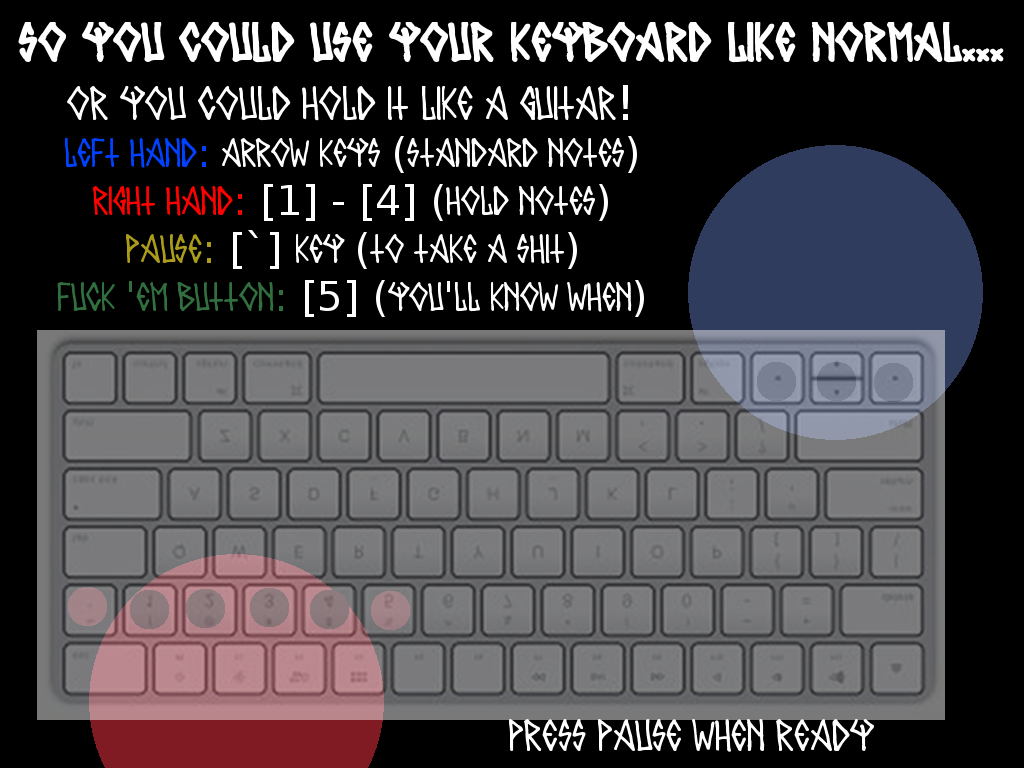
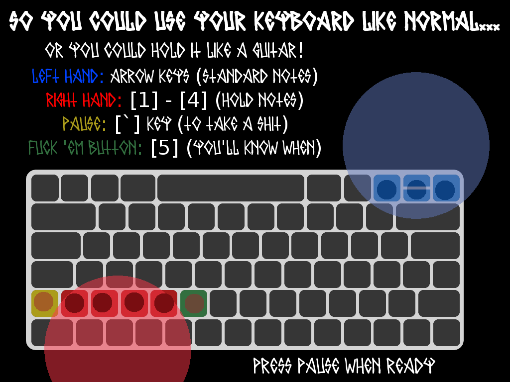
Let's talk controls. By shaping the notes as the keys to press, the player knows exactly what to press at what time. But we're also using the keyboard-as-guitar gimmick. Then again, it's a cool gimmick; being told "hey, you can do this cool thing" is less likely to annoy than "you can do this boring thing". I think I can get away with a diagram.

Aesthetics and identity. It's a game about metal, so it should be metal themed. Menu buttons sound like drums. Text being drawn sounds like guitars. The font should be designed by a crazy person. Let's grab the player immediately by having metal start playing as the game loads. There should be absolutely no doubt what game you're playing.

Time before play starts should be minimal. Let's map it out. Game boots up, a fade from black to build tension. Title card, main menu that doubles as an establish shot of the venue. The van rolls up when the player presses start to show how shitty it is. Cut to the stage, where the band introduces themselves during warmup. The control diagram pops up and the player gets some practice while the characters are introduced. This "warmup" functions exactly like a song, but the score is wiped when the setlist begins. This means warmup is both tutorial and gameplay, all within seconds of pressing play.

Oh, and pressing [F] should flip the bird.

Task 2 complete! Time check:


I have until tonight to make Pong.

It's a simple game that requires simple programming. It'll test everything I've learned in GameMaker; sprites, coding, sound effects, the whole shebang. There will be no guided tutorials. It will be all me.

Let's do this!

(three hours later)

Fuck!

I almost had it. The paddles work (mostly; the ball bounces, but you can't angle your shots), the menu/loading screen works, the sound effects work, the score systems works. But that damn bouncing!

I need to manipulate a variable called [direction]. If [direction] is at 90, then the ball is moving straight south. At 180, the ball is moving west; at 270, north, at 360 (or o), east. When the ball hits a wall, it needs to bounce at the same angle it hit the wall at. In other words:

If direction = 0, then direction must become 180 (ball hitting straight on and flipping 180 degrees)
If direction = 45, then direction must become 135 (ball hitting at 45 degree)
If direction = 90, then direction must become 90 (ball scrapping along side of wall)

Goddamnit, I'm doing math, aren't I? I'm pretty sure there's some algrebra nonsense that would let me figure this out. I don't know no algebra nonsense. Fuck math.

Still, I got the actual programming done. And if my goal was to get familiar with GameMaker 1.4, I succeeded. So...close enough?

Whatever. Time check:


Huh. That explains why everything's dark, then.


This is it.

Tomorrow, the jam begins. I will be free to start work on the project. I'll need to draw everything, compose everything, code everything. At my disposal: a limited knowledge of GameMaker, proficiency with LMMS, some experience with GIMP, the drawing skills of a three-year-old, a single piece of concept art, and a few paragraphs of design notes.

I don't feel ready. Then again, I don't think anyone does. I guess we're gonna find out.


In the next update: The loading screen and a kickass intro song!

July 22th - 13 Days Remain


It begins.


I have decided to embrace my flash game-ness.

The music's edgy. The concept's edgy. The characters' edgy. My drawings are edgy (puns!). It's a perfect fit. I go over-the-top until it's laughable, lure the player into thinking "hey, this is a parody", then remind them that edgy band just raised a couple hundred for charity, while your not-edgy self hasn't.

I'd need to separate good edgy from bad edgy. In a post-GamerGate culture, edginess is associated with douchebaggery, and not without reason. Edgyness has this "screw you all, I'm doing what I want" aspect to it, which can be good, but it often devolves into "I'm not listening to your criticism because you're all haters". You see, at some point in my life, I realized "hater" actually means "people that disagree with me but whom I'm not willing to give the benefit of the doubt to because I'm an asshole". If anyone looks at my game and thinks it's celebrating that mindset, I have failed. 

Hmm...I have an idea.


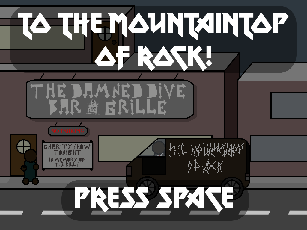
And there's my loading screen.


It's time for music.

Normally, I'd think it's best to leave music for last. There's always the risk a song will find itself without an appropriate scene, resulting in lost production time. But I'm in a unique position. 100% of the game's music will be metal, so cut songs can find somewhere else to go. And the music's part of the gameplay, so cutting anything would be more trouble than it's worth.

Today, I'm focusing on the intro song. This will play during the title cards and menu screen as a way of establishing tone. It doesn't need to be particularly long, as you'll probably leave the menu before it finishes. However, since you could stay on the menu for potentially forever, it will need to loop. Let's begin!

I start by selecting instruments. To streamline the process, I'm going to be using the same few instruments for all of the game's songs. After some experimentation, I decide upon a drum set, a guitar, and a bass guitar. Suit Jeff is on drums, Sketchy Jeff can be moved to bass, and the player can take the most visible role as guitarist. The small selection also speeds up the composition process.

After an hour of tinkering, I'm not happy with the result. I try adjusting tempo, rewriting the riffs, changing out the bass guitar to a slappy-ier sound; nothing works. Then I realized my mistake.


Four measures, four beats per measure? That isn't metal enough.

I rewrite the entire composition into a 4/7 time signature. And sure enough, I have a working product in 15 minutes. I uploaded it to Bandcamp here, if you wanna listen. Also: Soundcloud sux, Bandcamp also sux but it sux less.


July 23rd - 12 Days Remain

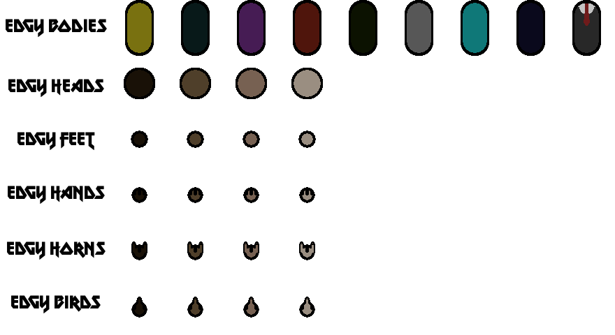
Here's a sprite sheet.


I think it speaks for itself.


The main menu's my first major challenge. And it's quite the challenge.

Here's what I got so far:


The peep, title bar, and button prompt are all separate images, and the windows are a partially transparent foreground object. I'm hoping to give the screen some more energy in the game itself; peeps bouncing up and down, button prompt flashing, etc. It would match the high-tempo music that's playing over it.

Unfortunately, that all involves programming. So far, I've gotten the title cards before the menu programmed with a fade effect, but I'm still working on the menu itself. Since the text is white, I'm using a screen flash effect to "reveal" the text to give some liveliness to the scene. Menu loads in, screen flashes, text appears. I still have to work on animating peeps walking about. At least it's progress.


In the next update: Sexual harassment! And that's terrible.

July 24th - 11 Days Remain

Behind the scenes, I've been planning for a female protagonist.

It isn't a bold political statement or anything like that. I just needed a way for Sketchy Jeff to get kicked off stage, and there was one spot in the band left. He gets drunk, he makes a very stupid decision involving boobs, he gets kicked to the curb. But it does complicate the design. In a traditional rhythm game, there's not much you can do about him. But whoever said this is a traditional rhythm game?

The current plan is for random "crowd events" to pop up at certain times. They're dealt with a single key press (mostly likely [5], as it's close to all the other keys), but they're timed; fail to press the key and suffer the consequences/lose out on the reward. And as these involve dealing with the crowd, you'll have to keep an eye on the stage from time to time. It's an unashamed QTE component, but rhythm games are all QTEs anyways. If given a lenient timer and used in combination with the music, it might just work. Maybe. Hopefully. Look, we're not at the playtesting phase, alright? Gawhd.


Art comes first.

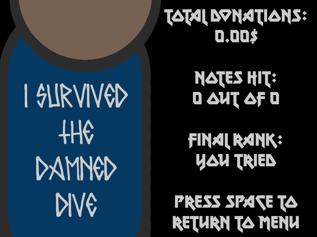
The two major game screens are the main menu and the stage. Between them, the only sprites required are the people (already done), the instruments (still pending), and the van from the intro (finished). I have a few backgrounds to make; the stage is WIP, the control diagram's going to be a killer, and the end screen is still being designed. With all those done, I'll have every art asset the game needs (unless I'm forgetting something, which I probably am). I'll be freed up to work on music and programming.

Unfortunately, I'm not an artist. My flash game theming takes off some of the burden, but drawing's still a significant time investment. As of time of writing, I have 46 different images created for the game with at least double that to go. Most of these are from the people sprites, which have been segmented into head, body, feet and hands. Thank god I chose simple shapes that make easy recolors.

Oh, and I'm redoing that crappy concept art.


Drawing art is giving me gaming flashbacks.

I don't know if it was the games I grew up with, or some fascination of the time period, but the 2000s was full of art programs in games. Tony Hawk's Pro Skater Underground's board creator. Jet Set Radio Future's graffiti editor. Animal Crossing's custom patterns. Mario Kart's icon creator. Every racing game ever's decal system. Seriously, these things were everywhere.

So of course I played around with them. They were all crap compared to Photoshop or GIMP, but it's what I had. And I got pretty good with them, too. For instance, take any crappy shape.


Now copy it and turn the copy black.


Move the copy underneath the original.


Bam. I made a contrasting shadow. You're welcome, world.


July 25th - 10 Days Remain

Today was my first struggle with motivation.

Let me be clear; I want to make games. If I have to spend ten hours every days staring at a computer screen writing code, I'll take that and run. But - and I cannot stress this enough - I don't make games for myself. If I wanted a game, I'd play someone else's. No, I make games for everyone else.

I've received wonderful feedback, both positive and negative, from the jam community. But those around me, physical me, don't care. Now, I don't mind that; there's a lot of things I don't care about, and if you care about it, then you've found something worthwhile I'm not a part of. But when you're making something - anything - you need an audience. Knowing that people you care about are never going to listen? It's a pretty shitty feeling.

"Don't care" might be too strong a phrase. "Don't see the value in" is more accurate. I could go on about how video games are art, that they mean things to people, blah blah I'm the most important person in the world (disclaimer: I'm not). Doesn't mean this makes me money. Doesn't mean I'm "working". Doesn't mean some hack could reskin Farmville instead.

I can tell you why all that's bullshit. Yeah, any marketing executive could copy Farmville and make a boatload of cash, and a good amount of people will like that game. But we, as a society, can do better. Okay, games aren't the most important thing in the world. But it's what I know. If I'm not making games, then that leaves all the more space for a marketing hack to copy Farmville.

I don't know where this existential crisis came from. But it stole a day of work from me.


I spent today playing flash games.

Call it research. Call it soul-searching. Call it slacking off. Whatever it was, I wanted to know what I was making. So I browsed some portals and played my childhood classics.

Mind you, I came late to the flash games scene. There was still some edgyness, but polish was finally taking hold. Games picked up sponsorships from dedicated web gaming sites. Credits often included dedicated artists and composers. I'm surprised how relevant Upgrade Complete and Achievement Unlocked are, despite being near a decade old. It was, in my humble-but-objectively-true opinion, the golden age of flash games.

It's a good thing we'll always have access to them, right?

---

In the next update: I read the news!

July 26th - 9 Days Remain

My game just got a lot more important.

Adobe has announced they will no longer be supporting Flash Player by 2020. This means any unarchived flash games will become unplayable. It's not surprising news - Flash's security vulnerabilities have long been known, third-party support has been waning, and HTML5/WebGL/whatever-the-fuck has been slowly creeping in. Despite this, there's still a significant flash gaming community out there. I was browsing through Newground's portal yesterday in my nostalgia binge; it might not be the center of the internet anymore, but the Flash community keeps going (here's an interview Tom Fulp did last month). I'd hate to see everything go to waste.

And here I am, making a Flash game-like. I guess I gotta finish now, don't I?


I'm still drawing. I hate drawing.

I wouldn't mind I was good at it. Right now, I'm shooting for par. The instruments are passable. The UI is passable. The people are passable. Everything is passable, and that's the best I can do. Trust me, I've been trying.

And keep in mind; drawing is only part of the art. The stage and main menu are 99% complete, but I still need to separate each image layer into it's own sprite. Right now, it's a pretty-ish image that I can't animate. Once that's done, I'll need to import everything to GameMaker for use with the code. There I can create animations, either by manipulating sprites with code or by importing individual frames. I'm not entirely sure which process is ideal. I guess we're gonna find out.


Let me go through my drawing process in more detail.

1. I try and freehand (read: use GIMP's tools and artist intuition the best I can). If it works, great. If not, fuck.

2. I google a reference image. For instance, a keyboard for the control diagram:

https://s14-eu5.ixquick.com/cgi-bin/serveimage?url=http:%2F%2Fsketchapp.rocks%2Fwp-content%2Fuploads%2F2016%2F06%2Fkeyboard-700x200.jpg&sp=27da934cdf020c9a7a5920721d0c98f8

3. I overlap the reference image with my canvas and make it partially transparent.


4. I copy the reference image the best I can in my flash-gamey style. If it works, great. If not, fuck.


Above: A shit drawing, but I don't know how to improve it anymore so fuck it. It does it's job.

I'm not saying this is a good process. Tjere's potential copyright infringement if I don't transform the image enough. WHICH I DO please don't sue me.


July 27th - 8 Days Remain

Quick one today (you can only say "GAH ART AGH" so many times). But I finished the ending screen!


With that, the art is done. I'll probably need to touch up some things later, maybe add a few sprites I missed, but it looks like I'm done! It's finally time to start programming!

...crap.


In the next update: The warmup song and main menu!