July 21st - 1 Day Before Jam HELP

Kyle, what can you do to prep yourself?
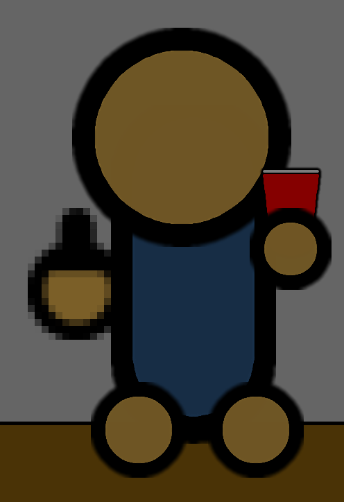
1. Draw that damn cup already.
2. Compile an outline from your ideas.
3. Get familiar with GameMaker 1.4.
Three things. Let's do this.
It's day three of trying to draw a cup.


It's a cup, but it looks...off. I've been trying to emulate hand-drawn art with a mouse, making the so-called straight lines curve in unnatural directions. That's why Sketchy Jeff works while the cup doesn't: Sketchy Jeff could've been made with just pens, but the cup would need heaps of tools. It gives an inconsistent feeling that annoys the brain.
This means it's ideal to use one "pen" size for every line for that hand drawn look. But Sketchy Jeff's "pens" are too thick for smaller objects. The only reason I got away with the thin black line in the background is because it's, well, a background. It's like an old cartoon: the backgrounds are in a different style than the foreground. But with the cup, it's using background conventions for a foreground object.
Then again, I haven't tested this theory. I suppose I could redraw Sketchy Jeff and the cup to test this...how much time do I have left?

HOLY SHIT I SPENT 3 HOURS ON A CUP!
...
Task 1 complete! Moving on.
As I have learned over this past week, people like music.
Being a musician is hard. Yes, there's starving artists scarping together rent. Yes, music is politics, the industry sucks and is run by marketing departments, half the artists out there are doped up the eyes, blah blah nihilism. You've heard me rant about it enough.
But! - and I know this may surprise some of you - people like music. They can't pay for it, but they like it. Yeah, there's some idiots out there that want you to get a real job, but if you did, they wouldn't get their music. In the words of Sketchy Jeff: "Fuck those assholes."
It's wrong for me to blame artists for being artists. I love music, and I couldn't live without compressed YouTube rips of my favorite bands. Music's gotten me through the toughest times in my life. It's made me laugh, it's made me cry, it's made me learn. Musicians do this world a service, whether we admit it or not. But don't take my word for it. Let me show you.
The Mountaintop Of Rock are now playing a charity concert to help fight drug addiction.
They don't have it easy. Their personal feuds are dangerously close to playing out on stage. They're driving to gigs in a deathtrap. Suit Jeff sleeps in his car. But goddamn, do they put on a show.
Should artists be entitled to more? Probably. Should they be put on pedestals? Probably not. Sure, musicians can do amazing things, but they can be total dicks as well. Sketchy Jeff's an asshole, but he doesn't need to be an asshole. As great as he is, there's millions of other guitarist out there just as great as him. Asshole musicians are replaceable.
During the course of the concert, Sketchy Jeff gets drunk. He fondles the backup guitarist, causing Suit Jeff to kick his ass. Once the ass is kicked, Suit Jeff calls his friend Pablo, who plays the rest of the gig.
Because fuck Sketchy Jeff.
Let's head back to the concept art.

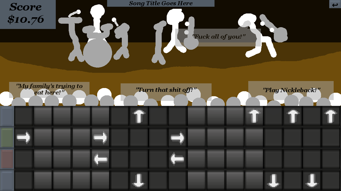
We all know how rhythm games work. The notes scroll over a "sweet spot", the player presses a key at the right time, the note gets played. Press a key at the wrong time, or fail to hit a note, and your score goes down. It's simple, it tests skill, it requires focus, and it rewards the player with kickass music. In To The Mountaintop of Rock, there's also a narrative reward; the better you play, the more people stick around to watch. The more people watching, the more donations to charity. It's a cause the player can invest themselves in.
But why stop there? Why not make it more cathartic? For instance, in most rhythm games, the "sweet spot" is represented with a fuzzy line. But what if we got rid of the line? Instead, when a player presses a key, a pin pops up on the track. Scrape a note with the pin and sparks fly as rewards. This also gives visual feedback when a player presses a key.
Speaking of visual feedback, we could have a light on each track that flashes depending on context. Green light means you hit a note, red light means you missed a note, orange light means you pressed a key without hitting a note. This clarity helps the player know when they fuck up, so they don't get angry at the game. It's self explanatory too; green and red are symbols for good and bad, and orange's more similar to red than green. And with hundreds of notes to observe, they'll have all the evidence they need to piece the system together without a tutorial.
Let's talk controls. By shaping the notes as the keys to press, the player knows exactly what to press at what time. But we're also using the keyboard-as-guitar gimmick. Then again, it's a cool gimmick; being told "hey, you can do this cool thing" is less likely to annoy than "you can do this boring thing". I think I can get away with a diagram.
Aesthetics and identity. It's a game about metal, so it should be metal themed. Menu buttons sound like drums. Text being drawn sounds like guitars. The font should be designed by a crazy person. Let's grab the player immediately by having metal start playing as the game loads. There should be absolutely no doubt what game you're playing.
Time before play starts should be minimal. Let's map it out. Game boots up, a fade from black to build tension. Title card, main menu that doubles as an establish shot of the venue. The van rolls up when the player presses start to show how shitty it is. Cut to the stage, where the band introduces themselves during warmup. The control diagram pops up and the player gets some practice while the characters are introduced. This "warmup" functions exactly like a song, but the score is wiped when the setlist begins. This means warmup is both tutorial and gameplay, all within seconds of pressing play.
Oh, and pressing [F] should flip the bird.
Task 2 complete! Time check:

I have until tonight to make Pong.
It's a simple game that requires simple programming. It'll test everything I've learned in GameMaker; sprites, coding, sound effects, the whole shebang. There will be no guided tutorials. It will be all me.
Let's do this!
(three hours later)
Fuck!
I almost had it. The paddles work (mostly; the ball bounces, but you can't angle your shots), the menu/loading screen works, the sound effects work, the score systems works. But that damn bouncing!
I need to manipulate a variable called [direction]. If [direction] is at 90, then the ball is moving straight south. At 180, the ball is moving west; at 270, north, at 360 (or o), east. When the ball hits a wall, it needs to bounce at the same angle it hit the wall at. In other words:
If direction = 0, then direction must become 180 (ball hitting straight on and flipping 180 degrees)
If direction = 45, then direction must become 135 (ball hitting at 45 degree)
If direction = 90, then direction must become 90 (ball scrapping along side of wall)
Goddamnit, I'm doing math, aren't I? I'm pretty sure there's some algrebra nonsense that would let me figure this out. I don't know no algebra nonsense. Fuck math.
Still, I got the actual programming done. And if my goal was to get familiar with GameMaker 1.4, I succeeded. So...close enough?
Whatever. Time check:

Huh. That explains why everything's dark, then.
This is it.
Tomorrow, the jam begins. I will be free to start work on the project. I'll need to draw everything, compose everything, code everything. At my disposal: a limited knowledge of GameMaker, proficiency with LMMS, some experience with GIMP, the drawing skills of a three-year-old, a single piece of concept art, and a few paragraphs of design notes.
I don't feel ready. Then again, I don't think anyone does. I guess we're gonna find out.
In the next update: The loading screen and a kickass intro song!

