On Sale: GamesAssetsToolsTabletopComics
Indie game storeFree gamesFun gamesHorror games
Game developmentAssetsComics
SalesBundles
Jobs
TagsGame Engines
(2 edits) (+1)

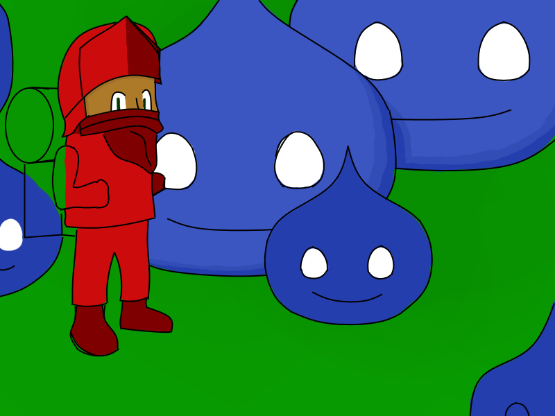
Intresting game, I got bored and desided to remake the game picture, got to do some other stuff, but I got most of the out line to remake it, is there anything you didn't like, about the orginal, that you would like me to change? 
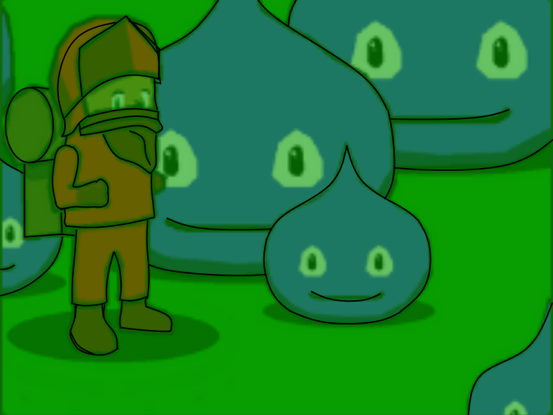
Edit: Oh gosh, that's a bit big.

Oh sweet! You can vectorize things and make them look smoother.  Sorry, I have to wait until after work to respond to comments.

I made that by using Gimp like MSPaint, my art skills are limited.  If I wanted to change anything, I would make the guy's neck scarf excuse to not draw a face look better, and remember to give the backpack arm straps :P  Otherwise, I would love to see how you would think to improve the title page art!

(2 edits)

Oh yeah, arm straps! I'm using Paint.net and I'm trying to get gud at art and stuff, I also have a drawing pad so there's that.

I still have a lot of stuff to do like shading, redrawing the lines and more shading. (oh and eyes)


Is there anything that you like or don't?

Edit: just noticed the eyes look really creapy right now.

EditEdit: is that thing on his head a helmet? Not sure if I should be giving it a shine.

(1 edit) (+1)

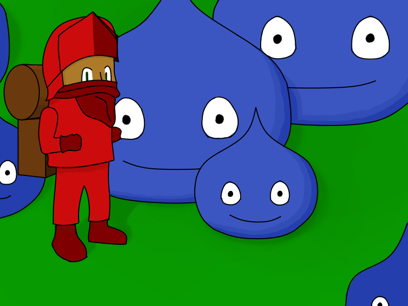
I've worked on it some more, getting close to finishing, besides adding shine to things and more shading. Is the thing on his head a helmet?


Edit: Is the top part of his pack a bed roll?

Nice shading.  That is supposed to be a bedroll.  Looks much less creepy now that everything has pupils :P  The thing on his head is supposed to be a cloth hat with the front flipped up.  Now that you mention it, it totally looks like a helmet.