Devlog #6 - Settings Menu, Level Select & Polish
These past few weeks, I've been focusing more on level design, the Steam page, and preparing the Itch demo, but I have made a lot of changes.
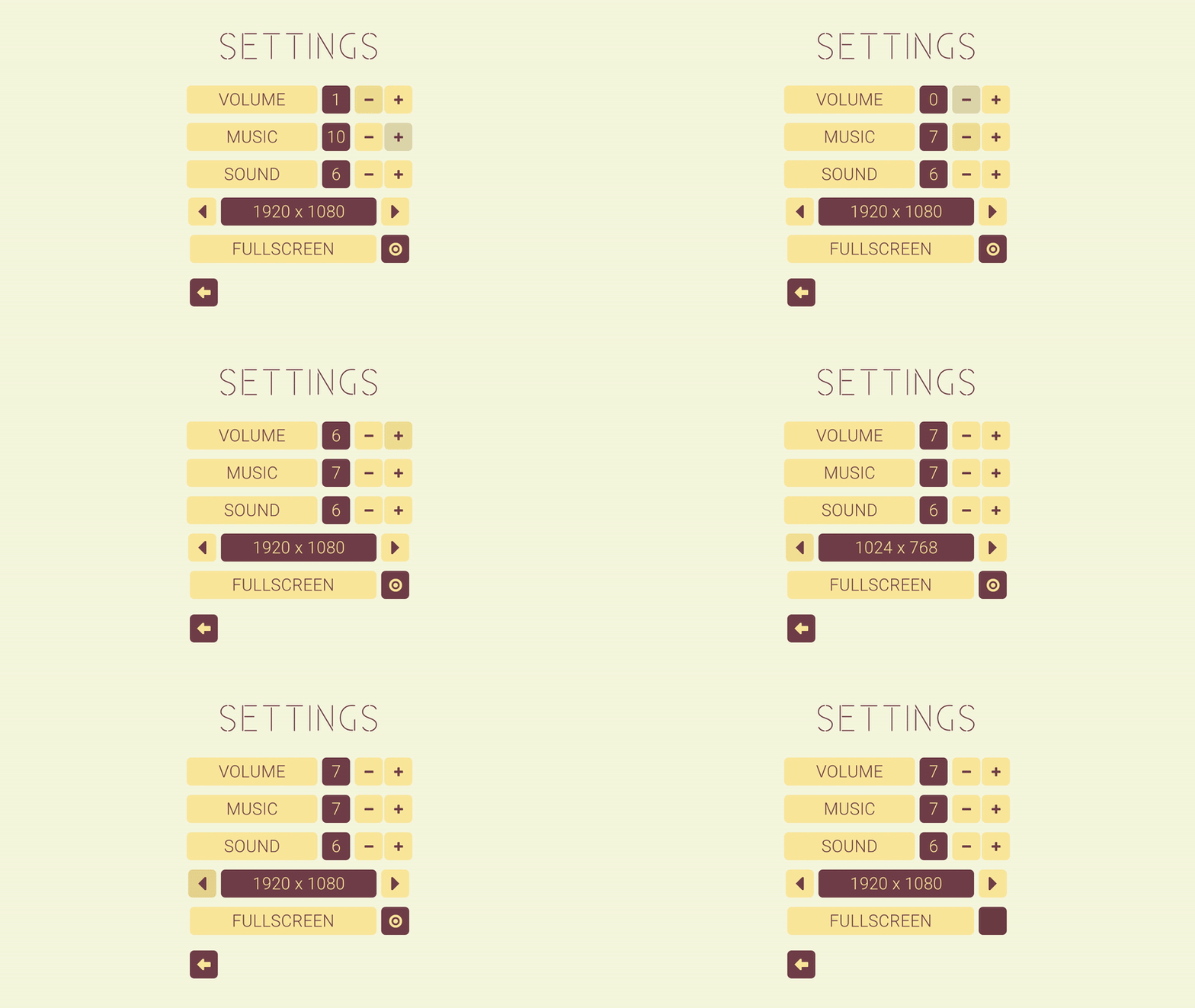
First, I completely overhauled the old settings menu, replacing it with a simpler and cleaner look. Instead of sliders and dropdowns, there are now way more intuitive button-controlled settings.
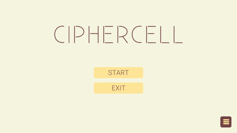
In addition to that, there wasn't any cohesion between any of the menus; some had bigger buttons, some icons, some small text, others large, etc. So, I went through all the menus and fixed the formatting.
I also changed many text buttons for icon buttons to improve the aesthetic and make the game more universally understandable.
The level select also got an overhaul, now having different sets to select from.
New Settings Menu:

New Main Menu

New Level Select:


