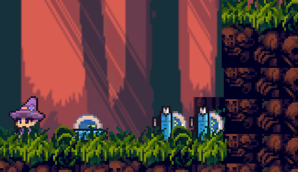
Thoughts before meeting the female NPC:
-
The graphics look great on their own but I feel like the style is quite consistent. For example, the grass has no outline but the player does. I feel like this is due to combining art from different asset packs
-
I’m not a fan of the background. I feel like it would look good normally but it looks a bit blurry. I assume that was done intentionally (since the other art isn’t blurry) to keep the player’s focus on the foreground but it just feels off with the pixel art aesthetic
-
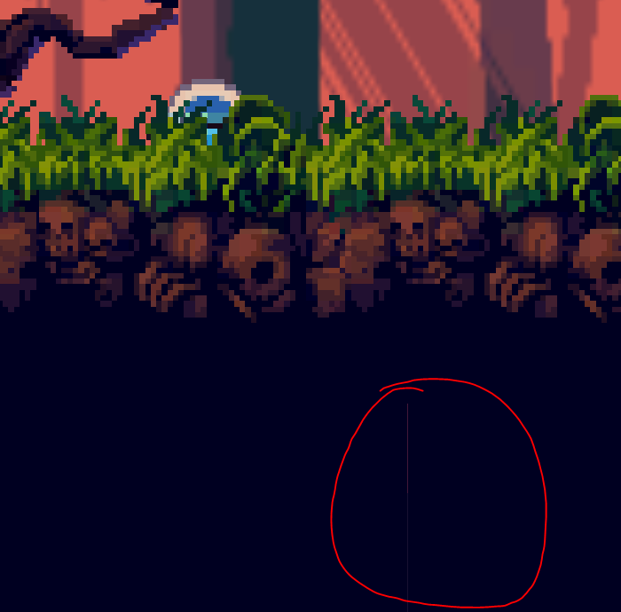
Pretty minor but sometimes there are gaps between tiles
-
I don’t like the color of the progress bars. I think they could work if the entire game was of a similar style and used a similar color scheme but here it doesn’t feel very cohesive. I’d recommend using a site like Lospec, it has some really good pre-made palettes that could help with this
-
I’m also not too sure what the two progress bars represent. It seems like one of them is a jump cooldown but it’s pretty confusing. (I’m aware there is an issue with the jump cooldown judging by the game’s tagline)
-
LMB makes the player render above the grass which I’m not a fan of. I think the player should always render above it. I also don’t like the animation. Assuming it is attacking, it doesn’t really look like it. It just seems like it gives the player an angry facial expression
-
I don’t like how the player isn’t as mobile in mid-air. It makes it feel pretty clunky. Definitely my biggest gripe with the game. I think it might have just been a bug though
-
I feel like the music is too loud but the music itself isn’t bad. Nothing spectacular or anything but I feel it works well for this game
Thoughts after meeting the female NPC:
-
The dialogue box looks good but I don’t think it fits with the rest of the game’s style (although it’s not as jarring as the progress bars)
-
The “continue” button hitbox is quite small. I’d personally prefer a hotkey to continue with the dialogue (that way the game would be keyboard-only as well which is always nice)
-
I just realised the “female NPC” is actually a man. Sorry Mr Tutorial Man, no offence intended
-
The green bar seems to be a jump cooldown and the red one an attacking one. There’s a delay between the player pressing the input and the bars starting to deplete which I think looks weird. I also don’t like how it vanishes and instantly reappears when the cooldown finishes. Personally, I’d prefer an animation of the progress bar increasing as the cooldown comes to a close instead as I feel like “a progress bar increasing” has more positive connotations
-
I won’t be able to critique any of the audio past this point as my headphones are currently being used by my dog unfortunately
-
Someone else mentioned this but the tutorial man keeping track of my deaths gets annoying. I like the death counter in the top right though. I wish it says “Deaths: [number]” instead of “Death - [number]” though as at first I thought it was talking about negatives and thought it was a bug
-
The player kind of floats when walking over the clones
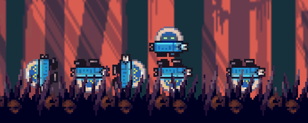
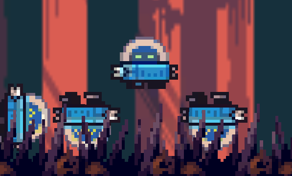
- It looks funny but I don’t think it’s a good design choice to allow clones to rotate freely once dead. I feel like it could open up the possibility for a lot of frustration since the rotation is pretty dependent on RNG
After meeting the first enemy (wizard-like guy):
-
At first, I didn’t realise it was an enemy. I thought they were just an NPC so I just walked into them. I feel like this could be made a bit more clear
-
The enemy’s idle animation is quite blurry. (I would record a video of it but you can’t see it when the fps is low)
-
I think there should be more visual feedback. When the enemy dies they just vanish. Perhaps an exploding animation of some sort?
-
The tile edge is a cleanly cut vertical line which breaks immersion a bit
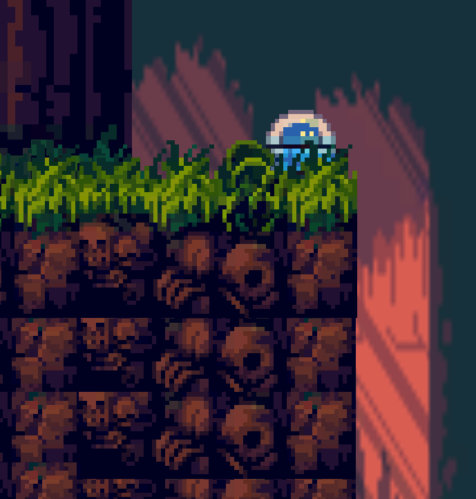
-
I like how the map has decorative objects like trees and what I think are tombs dispersed throughout. It definitely makes it feel a bit more lively
-
The cliff (see screenshot above) was very frustrating to get past since I restarted back at the tutorial man every time. Someone else described this as a rage game but I don’t really agree. This particular sequence just feels a bit frustrating and repetitive
-
I encountered an invisible wall at some point but it fixed itself when I jumped
After the cliff:
- I’m not sure why but I just floating on these set of grass tiles. It doesn’t seem to happen with the other ones though
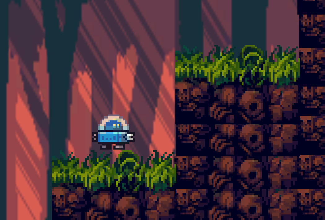
- I keep on getting stuck in these tiles and periodically the player just vanishes and then reappears while being stuck in said tile (isn’t visible in the video): https://gyazo.com/b73f6d651e326481bbfcede2afe39edc I wasn’t able to progress past this point unfortunately. If this wasn’t a bug then I don’t think this is a good design choice as it very much seems like a bug and it’s not very clear how you’re supposed to progress past the point. Also, if this isn’t a bug please let me know how to progress past this
Extra thoughts:
-
The game feels quite slow-paced which I don’t think works very well in a game jam setting
-
Overall, a pretty solid entry!
Edit: After talking to the dev on Discord turns out you’re not supposed to be able to progress much past the cliff. Here’s how I did it though and found that walk-through tiles bug:
