#3 Art Style and Basic Animations
Since its conception I already had an approximate idea of how I wanted the game and the characters to look like. The sprites had to be made to fit the metrics established during the movement prototype phase: 16x24 for the playable character on a 8x8 tile grid. That is roughly similar to some action games on the NES and would give me enough space to make detailed sprites without going overboard (to be honest I don't like making sprites that are too big).
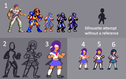
Here's the process I went through in order to get a basic reference frame for the main playable character:
 | 1. Gathering references from some games I got inspired by. 2. Making a crappy sketch to get an idea of the pose and proportions. 3. Throwing some distinct colors to make the sketch more clear. 4. Shrinking the sketch down to the desired sprite size. 5. Tracing an outline and starting the sprite on top of the reference sketch. 6. Trying to make it look decent. |
Overall it is a simple process that can help a lot when you have trouble designing stuff in pixel art, specially characters. When making art I have the habit of avoiding to get direct references from other things because I'm afraid of indirectly copying them, but sometimes it is better to not worry about it too much - specially if you are challenging yourself with something out of your comfort zone.
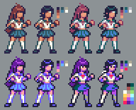
I was very fond of the initial result, but it was still not quite there. I spent some time experimenting with different color palettes and deciding if I wanted a sort of 8-bit look or something more fancy and detailed. After trying to animate it and having some trouble, I settled on going with a vibrant 16 colors palette and made some changes to the sprite that would get it to look more clear and distinct. 
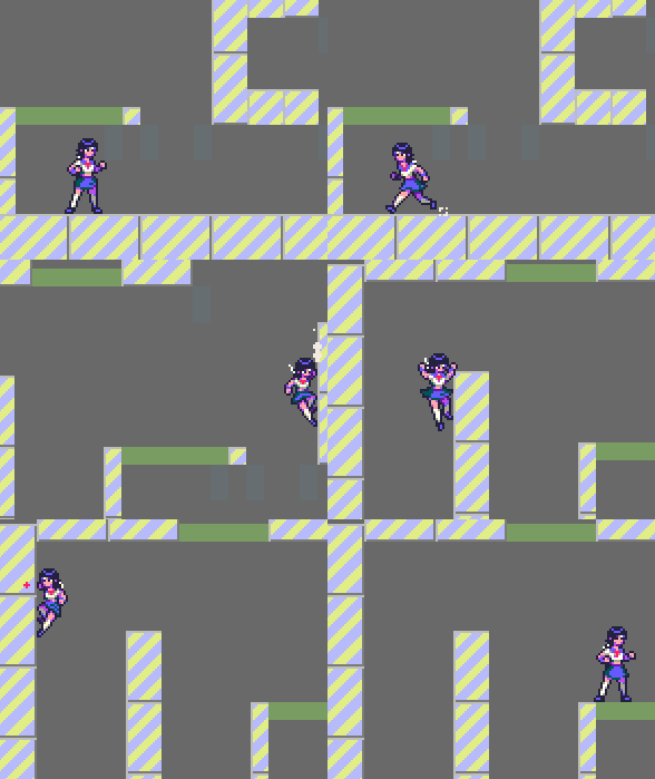
Animating the sprite took much more time than establishing the art style for it. I tried to not overdo the animations, but they still ended up getting more polish than my original plans. After many revisions, here's how it looks in-game so far:

For now I'm going to start focusing on combat, so hopefully we will talk about it on the next one!
\ (• ◡•)

