Looks pretty cool :O I really like the skeleton, the cheese looks good too.

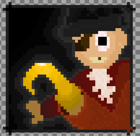
A portrait a made recently for my game, rather happy with how it came out, even if it doesn't looks amazing.
I think Broegan may be right, not less colors, but less tones of the same color? The gradients make it kinda muddy, if that makes sense, especially with your muted colors. The pose is great though, I always have trouble posing my characters, and this conveys a lot of action and personality :D
-CuddlyColin