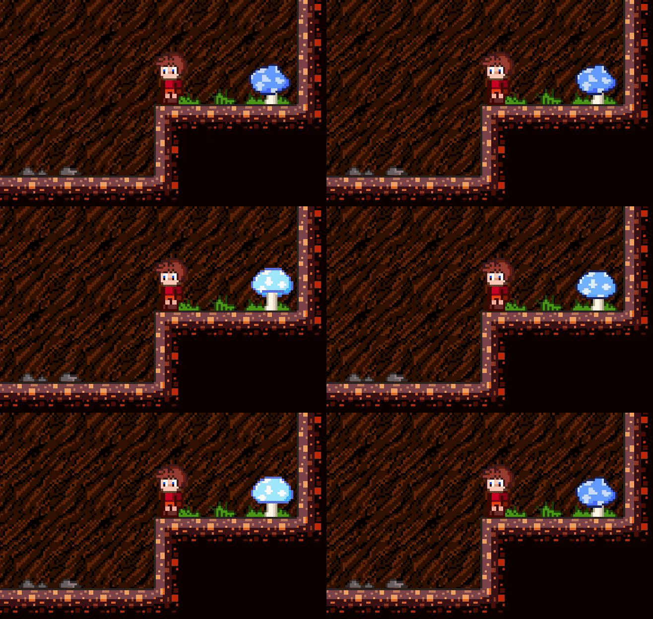
Some quick updates! All visual upgrades. The textures used for the tilesets were previously scaled 2x2. I had my reasons, but I ultimately think it's best to have the tilesets match the character's ratio, I also made the tilesets darker to give a more 'glowy' vibe. I think it looks way more natural, though I must admit, I've gotten so used to the large-scaled blocks that it's still taking some time to grow on me. 
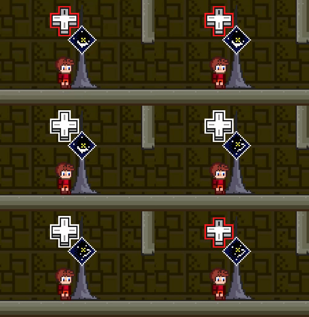
Also an animated icon now appears when standing in front of interactive objects!


