Thank you kindly! ^_^
IIShots
Creator of
Recent community posts
I think in terms of atmosphere you knocked it out of the park, Like Tim Burton meets Diary of a Wimpy Kid, I enjoyed the sound and graphics a lot.
The gameplay is serviceable but could use some extra spice as it didn't keep my attention for all that long.
Must admit though it is a charming little distraction, i'd love to see other games with this sort of visual flare! Good work. :)
(also I apologise, for some reason the page bugged out and it sent my comment 3 times, I deleted the other two copies I hope I didn't spam ya!)
Thank you for the feedback! I would have loved to do a double-battles-Esque fight system, maybe if I do some post-jam upgrades i'll include it.
I definitely agree with you on the enemy levels in the next area, I wish I would have tweaked it from lv.1-3 stuff in the 2nd area to just lv.1-2 so it's not such a beginner's trap. Will definitely look into those chests post-jam!
Thanks once again! :)
Thank you, and yes I totally agree on the lack of direction; I wish I had put a sign or NPC advising you to grind a bit before leaving the initial area, but I think if I could go back and retweak it I would simply scale the level down in the next area from lv.1-3 to just lv1-2.
Thanks for the review! :)
Some quick updates! All visual upgrades. The textures used for the tilesets were previously scaled 2x2. I had my reasons, but I ultimately think it's best to have the tilesets match the character's ratio, I also made the tilesets darker to give a more 'glowy' vibe. I think it looks way more natural, though I must admit, I've gotten so used to the large-scaled blocks that it's still taking some time to grow on me. 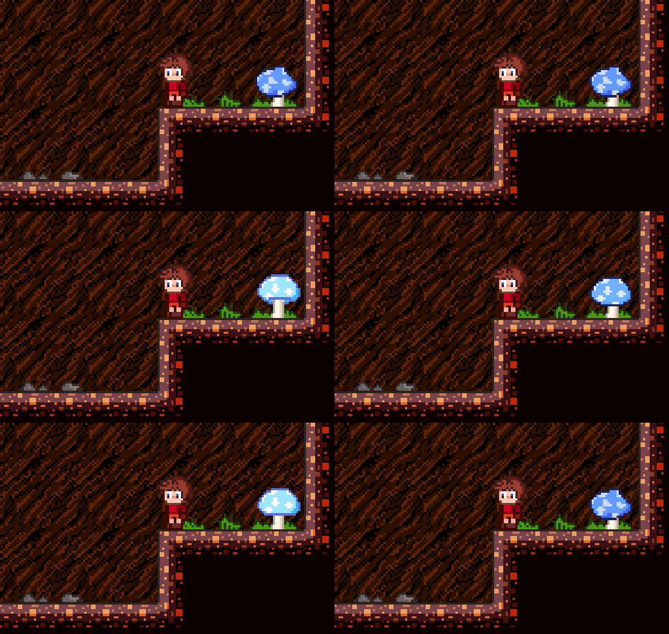
Also an animated icon now appears when standing in front of interactive objects!
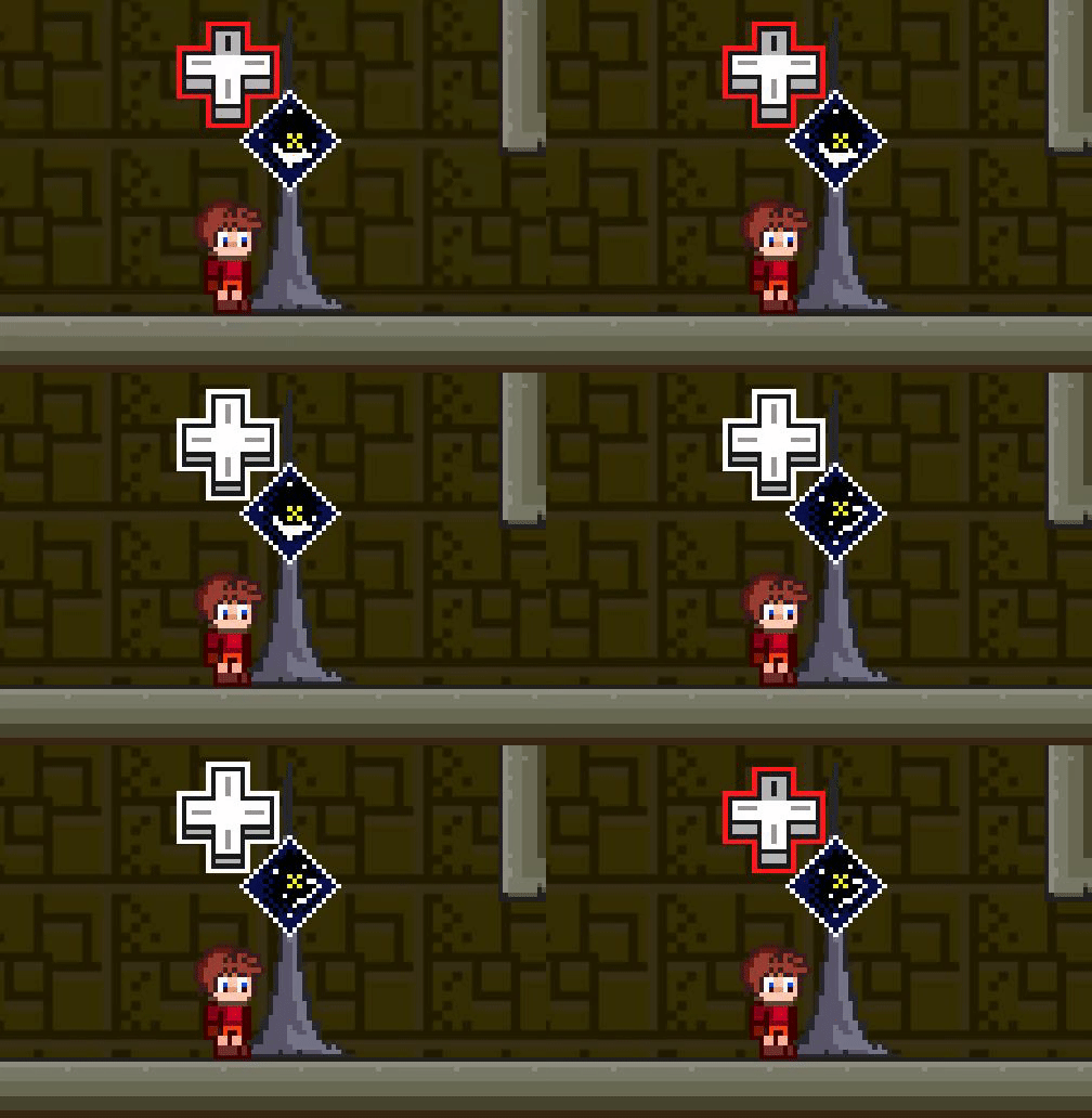
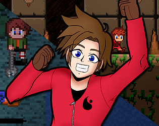
Dungeon Dot Ruby is a remake of an old Flash Game I made in 2013 jam packed with revamped assets, new levels, weapons and other extras! At this point, I am primarily focusing on the main game, but there's a ton of stuff coming our way! It is a relatively small game, and it being a remake of a flash game, I want it to retain its 'smallness' and to a degree, its 'flash-game-weirdness.' I have more than what's shown in this video done, but this section of the game is almost entirely finished, so I figured i'd show it off! Let me know what you think!
I will be sure to update this forum with more goodies in the future! :)
Unfortunately a big setback happened irl and it took much time away from it, I had to leave the jam since I would never make the date :(
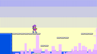
I haven't abandoned the project, but I will have to release it separate from the game jam, it's called 'Sparking! Ezme'
I'll be sure to reply to you with a link to it (probably gonna put it on itch.io and/or Newgrounds when it is complete! :)
edit: on that note, since I no longer am limited by a date, I will probably take the extra time make things look prettier than they would have. I'm not gonna add any extra content though, I still plan on keeping the game short/simple like it would have been so it doesn't lose that 'small game' integrity.


