Indie game storeFree gamesFun gamesHorror games
Game developmentAssetsComics
SalesBundles
Jobs
TagsGame Engines
(1 edit)

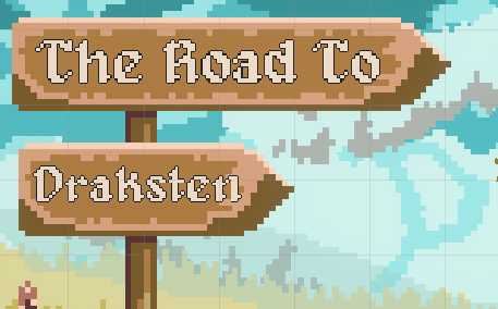
It looks really nice and the leaves are a nice touch. The one thing my eye is drawn to is the lettering. I feel like perhaps the outline might be a bit too thin. It kind of feels like it doesn't fit with the background art. I might be wrong about the outline, it might be something else. I'm usually the type that needs to try something and see it to know if it's right, but there is something about the lettering I feel could be improved.

I played briefly but in-browser games cause my internet to have issues but one suggestion I had for the dialogue is to make the entire thing print out on the click of a button so as to bypass the typewriter effect.

(+1)

Hi Powered by Decaf! Thanks for checking out my game. I have changed the title in the new build, I think I should update this feedback post with the newer content. Yeah, the text is of a bigger base resolution than the signboard, which is why it looks weird haha. I'm trying to increase the outline thickness by just putting one outline on top of another, but here's how it looks for now.

I understand the oddness, but I'll try my best to fix this. 

About the browser issue, you can download the windows build (unfortunately, that's the only machine I have to test on). And the typewriter effect can be bypassed in the newer build. Thanks for your feedback and have a nice day!