Indie game storeFree gamesFun gamesHorror games
Game developmentAssetsComics
SalesBundles
Jobs
TagsGame Engines
(+1)

Yup, giving up on this one! 😢


Up until this point it was pretty smooth ride. The I think third level that had the three different lanes to top goal gave me some grief but eventually I managed to get through. But at this point it just ramps up the difficulty/complexity too much for me to wrap my head around.

The idea itself was very nice (though not entirely unique). The execution on the other had would have needed some polishing. The UI is very clunky. The buttons being that big and spread across the whole screen made the normal play flow annoying. Ordering the arrows was fine I guess but afterwards that useless trek to the right side of the screen to push play and then back all the way to left side to click on the number buttons. As that was the main loop of the game and heavily featured trial and error, it was a constant slog between the left and right sides of the screen. Keyboard shortcuts would have done wonders for usability and player experience here! Maybe this annoyance was just heightened for me cause I was playing on a laptop touchpad though... 🤷‍♀️

The whole play button thing was pretty much pointless as you had to use all the pieces so it could have started automatically at that point. Didn't find any use for the undo button either but dunno if that might come useful later on. Actually I'm kinda scared if there is "later on" since the complexity will get completely out of hand. And the arrows already didn't fit to the container box. 😅

There could have also have been at least some pointers on what to do on the start. I figured out what the point was pretty quickly (as I've seen similar mechanics done few times on other jams) but then finding out that I need to hit the number button to actually execute the move actions took me some time.

One thing that also annoyed me was the time waste of the "dead" moves. Just having the player unnecessarily wait around is never fun. Could have maybe highlight the arrows with a colour as the moves are happening and then skip the dead moves and show something like an X on top of that arrow to indicate that it couldn't be done. Not that big of a deal of course but the level transition animation had too much of a delay of just being white too.

Almost liked in the beginning about giving up. Went back for some more tries now but same result really. But did I somehow manage to get off the grid here? Even after resetting here with the stop button, the bull starts half inside the rock on the left and not in the corner as I think it should? 🤔
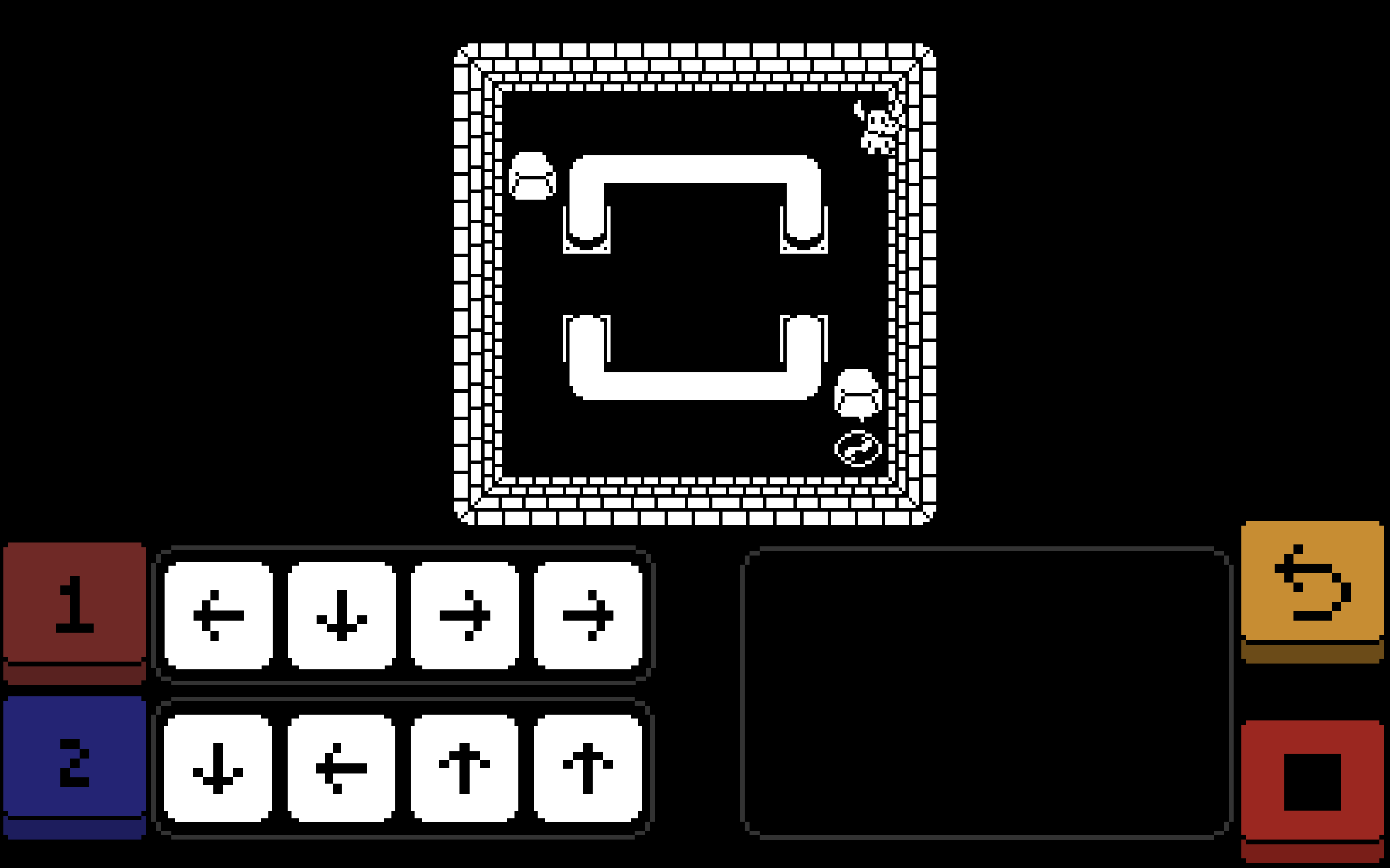

Anyways, good job! 👍

(7 edits)

Well ouch, you pointed pretty much every major flaw of the game we noticed, and we totally agree with you.

1) the bull in the wall

Yes, it's a bug, I forgot to round the position after each step, so the excess deltatime builds up when a game is too long, and it's especially noticeable on web player since the framerate is a bit lower. We noticed that a little bit after the closure of the submission, it was easily corrected, but too late :(

But the game is beatable since no puzzle is long enough for the offset to be 1/2 tile big.

2) the level 7 is super hard

Yes, the idea was to make one last level with only the basic elements of gameplay, but we underestimated it's difficulty. This was probably because we tested the puzzle with the solution in mind and not a lot of time.

3) the play button is not pointless

It prevents failed allocations and allow you to test allocations in your mind, it's useful later on too.

4) clunky UI and too long white screen

Yes, the white screen is way too long. 

Our game is far from perfect but the fact you are the first one to play it enough to find all the flaws means a lot to us ! 

So thank you !

Edit : for level 7 put 5 tiles on button 1 and 3 on button 2 (yes the UI doesn't suggest you should put 5 tiles in one move, sorry)

(2 edits) (+1)

Oh right, crap, didn't even think of putting five moves there. So I guess you kinda gate out the content too early with too hard of a level if you do have some additional types of blocks too. Getting introduced to different types between similar levels (before going back to basic but difficult) would also greatly alleviate the monotony too. But yeah, getting difficulty right (in puzzle games especially) is hard. And even harder without external testers.

Puzzle games like this should always have some leeway to be able to skip for example one level to balance out the differences in players. I've tried even going as far as giving one level beat basically ability to skip four levels. The game (my last GitHub Game Off entry) had a star system and getting the max three stars and a completion would then unlock the next 3+1 levels. Noticed a pretty good amount of people beating the whole game of about 20 levels without really abusing the skips and getting comments about some levels they had to skip.

The play button is not needed! The functionality itself might be but the button isn't. The first click on the number keys could do the same thing really. And even the stop button could be kinda built in to happen when you just reorder the letter. That might be a bit annoying without warning though since it resets the puzzle.

edit: No need to give out the solution. Would probably find it easily enough knowing that could do 5:3.