On Sale: GamesAssetsToolsTabletopComics
Indie game storeFree gamesFun gamesHorror games
Game developmentAssetsComics
SalesBundles
Jobs
TagsGame Engines
(1 edit) (+1)

I just finished playing Imperial Grace Demo and I love the story this far!   Our three available LIs are also very endearing in their own unique ways <3 

My only issues with the current version of the game resides with my headache triggers.   The first time I tried the Demo I was in the middle of a migraine and couldn't play at all because the saturated gold of the font prevented me from reading anything.  (my brain couldn't process the contrast with its background)

So I waited a week later to play =^.^=
I was really happy to realize that changing the Font to "simple"  helped A LOT to reduce the eye strain I was feeling from the saturated gold font colour so thank you a lot for this option <3 
It works like a charm !!!

The other element my brain has issue with is the saturated yellow parchment used for the petitions. I have now learned to squint when it time for it to show up! But at least the Font is dark so I can read it perfectly well still. =^.^=

Technically those things aren't "bad elements of the game", it's just that my own brains had difficulties adjusting to them. 


But all that aside, I'm totally looking forward to the rest of the game! 

You guys worked so hard for the demo <3 

May your muse never fails you
=^.^=

Hello, I am glad you enjoyed the game but I am sorry if you had difficulties playing the game because of the color, we try to be the most accessible possible, but my knowledge is very limited in this area, we have progress to make. 

Maybe we could add a "resting design" option, like we did for the colorblind, ideally what color should the parchment/text and the textbox/text have to be more comfortable to play for people who has headaches triggers? Any tips overall about what we should care about if we implement this feature?

(1 edit)

Oh please you don't have to apologize <3 
I am photosensitive, so I face these kinds of issues in many other games too. 
=^.^=

So for the general text, in my case the "Simple" Font worked perfectly to negate the eyestrain effect for the textbox this far. I'm so happy you had this option in your game. 

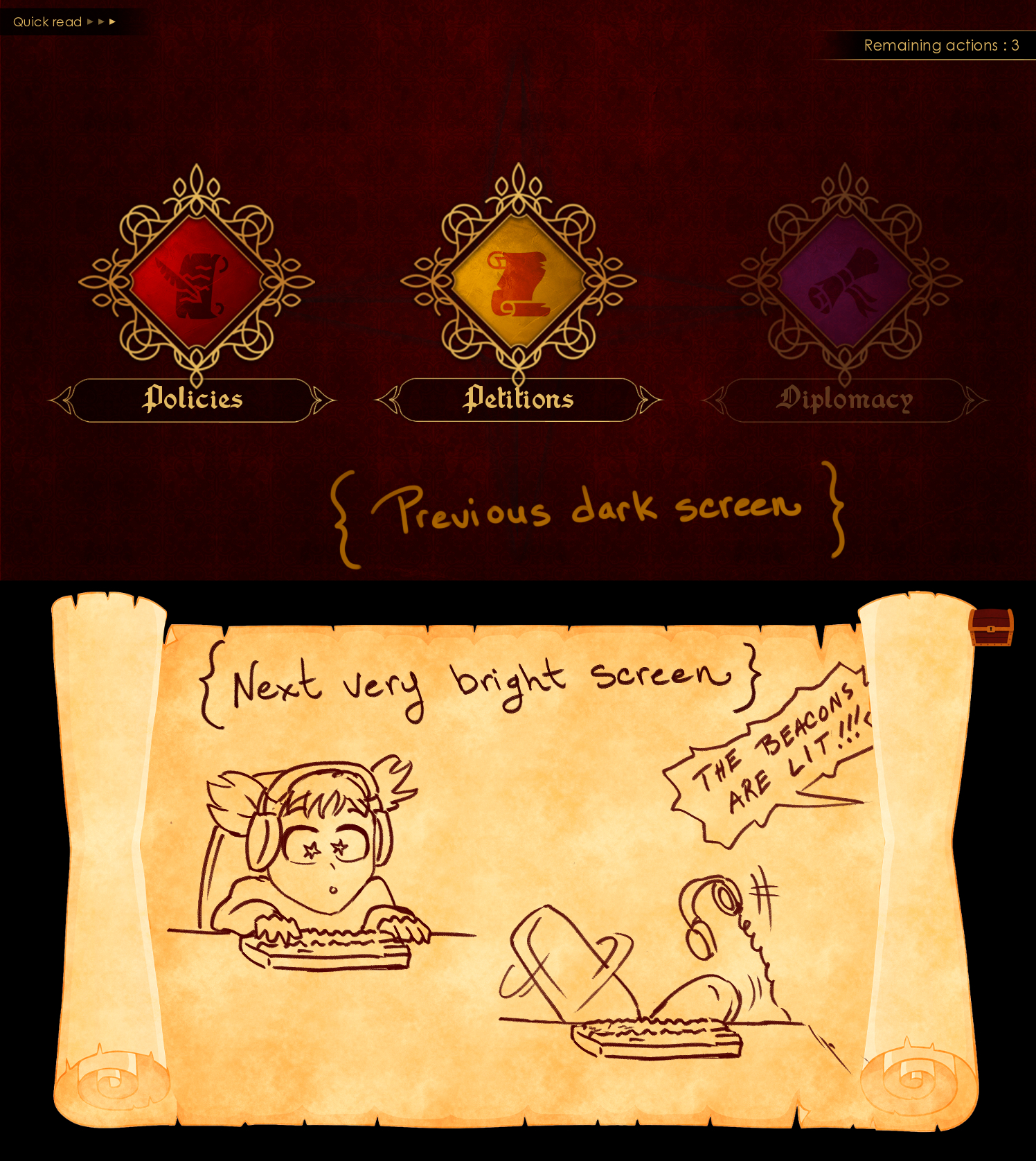
As for the Petition Parchment, in my case the issue is that it's following a very dark screen, so when it appears it's like a "bright beacon of light"the beacons are lit ;)   (sorry, couldn't help with this LOtR meme)
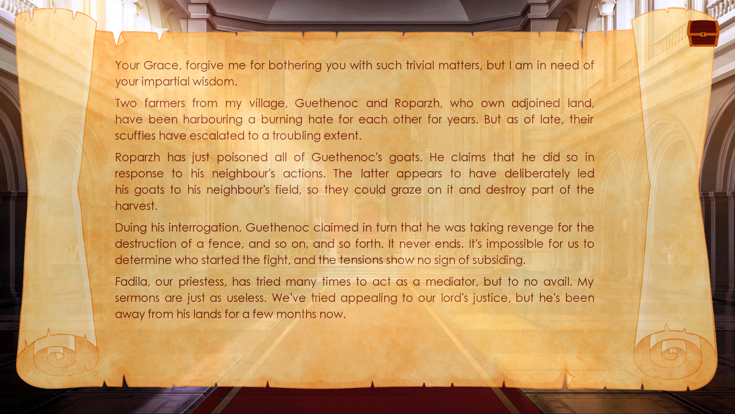

If I may be so bold to make such a suggestion, the appearance of the Petition Parchment could be a bit less "visually disruptive" if we skip the black background altogether and immediately switch to the throne room, and since we're at it, we could also give the parchment a tiny bit of transparency, this way it would cut on its brightness and also making it fit a bit more with its following "Petition Response Options", which are also semi-transparent. 
Semi transparent petition parchment

In any case, the appearances of the parchment are predictable in the game, so early on in the demo I could easily guess when it was time to "squint away" because a petition was coming ;) hehehehe

You guys are doing a great job!
Keep it up !!!

<3

(+2)

XDDD I can't get over the references, I laught so much thanks XD

 I will take into consideration your suggestions and see what can be done for the game! I am sure you are not the only person photosensitive and it can also help other people sensitive to sudden change of light. 

Thank you so much for your understanding <3 
and you have included so much already in your game to help out with dyslexia and colour vision deficiency. 
=^.^=

May your muse never fails you !
---'--,-{@