Indie game storeFree gamesFun gamesHorror games
Game developmentAssetsComics
SalesBundles
Jobs
TagsGame Engines

Wow, this game caught me a off guard! At first, I thought "Breakout + Magical Girls," nice! But by the time the first boss appeared, things got intense quick! I had a really good time playing this. The story was good (I see below you've already mentioned it might have been inspired by a certain MG show, hehe) and kept me invested as I battled through levels! The defensive enemy was pretty hard, but not as hard as one level where I just couldn't get that last block for minutes on end. (A breakout problem in general). The power were all fun to use. I didn't understand bubbles while playing, but you explained it below.

My main critique would probably be that the graphics were a mixed bag. The game sprites and characters looked nice, but some of the BGs and enemies were a bit rough. The text was hard to read in fullscreen too, but not so hard as to make me want to play in a small window hehe.

Anyway, great entry and great game! Awesome work.

(+1)

Thanks for the feedback! I do have a few solutions to the "breakout problem" for the next magical girl game jam. I'm thinking of doing the abilities quite a bit different (and adding different playable characters). For example, I was thinking of adding a temporary block-seeking powerup, or a powerup that pulls the ball to the x position of the paddle (this one is a bit problematic in practice though). 

Next time I will test more in full-screen, I pretty much only tested in the editor which was at the intended resolution, but the text looks awful at full screen. I'll probably also not force the low resolution, it was a bit of an experimentation. 

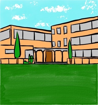
The backgrounds don't seem to be getting much love. I'm curious if that's due to the pixellation the game enforces along with the small screen size or if there's a more fundamental issue with the pictures. Here's the original picture of the "outside school" area; what do you think?

(+1)

I went back and played a bit again to remind myself of what gave me mixed feelings about the art. I played fullscreen the first time... this time I went back and forth a bit, and I do think it works better on the small screen... though I prefer playing in fullscreen. Fullscreen really causes the BG images to break down unfortunately.

Beyond that, I think the BG art itself looks solid and has a distinct style going for it. However, it doesn't quite match the cleaner character art and in-level clean sprites. Since I posted my comment, XCVG played and commented, and I think they nailed the problem on the head. The art is all good individually, but there's a big mish-mash of styles that make it seem a little off.

(+1)

Thanks for the additional feedback!