Hi, Tchey.
Thanks for all the feedback! I don't think I can address all of that individually, but I will speak about some of them more specifically, and I'd like to make a few comments on the overall design of the game to inform that.
Steam Marines 2 is intended to be a permadeath game. The systems are balanced around the player not reloading saves just because something goes wrong. This is unlikely to change.
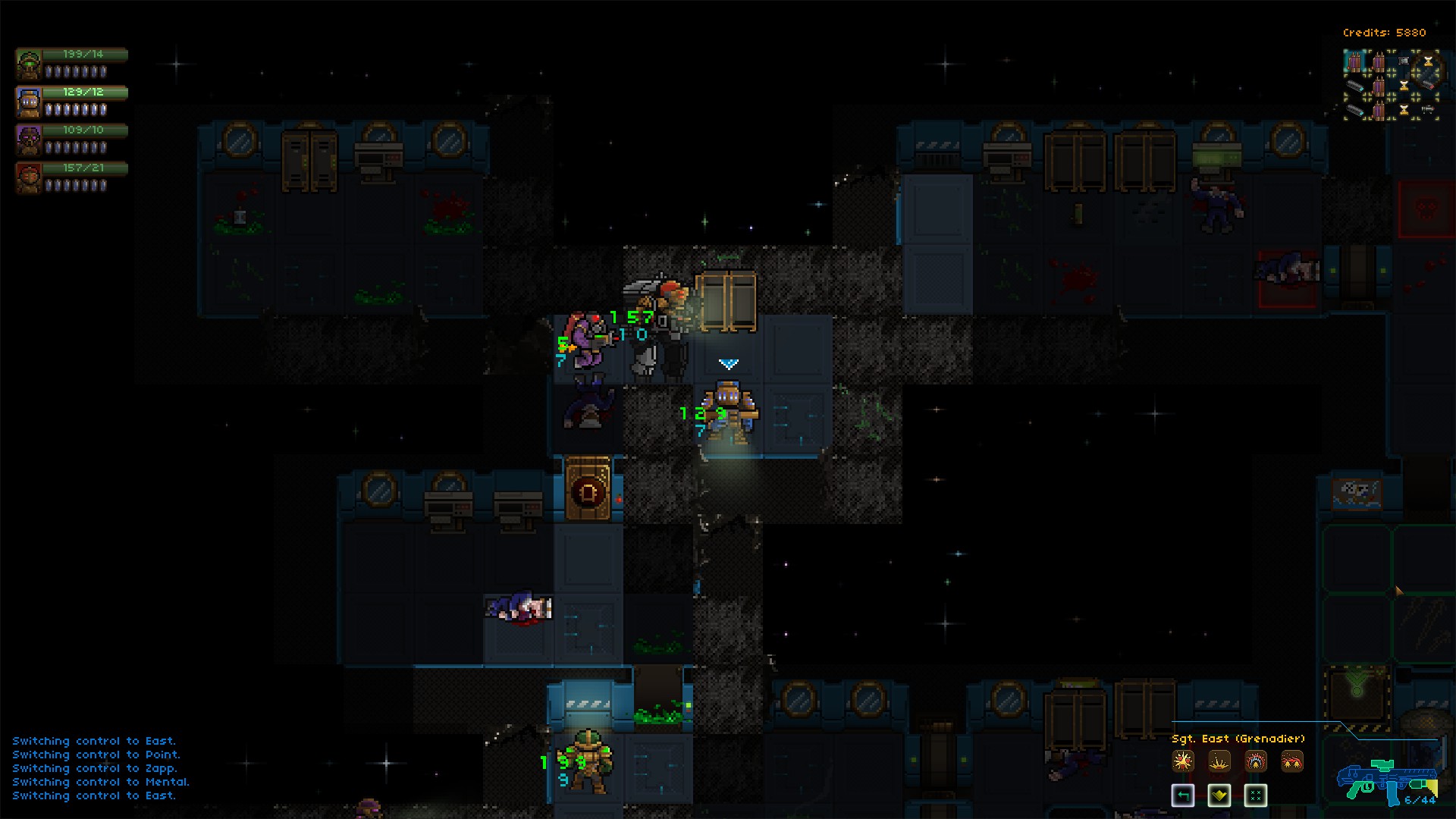
I agree the user interface needs a lot of work: it's my main focus at the moment! A note: by default the action cam should be enabled, not sure why yours was not, but it does make the (default) targeting much more clear. I'm not sure why the tooltip is showing under your icons, or why the door tooltip is displaying an incorrect keybind - I'll look into that.
There are issues with stacking unit portraits on the tactical field the way you have depicted, specifically health, armor, and attack values are displayed as pips and can, as the game progresses, get large which means they run more to the right and would overlap the other portraits. I could stack them vertically (this is what I did in Steam Marines 1) but my main issue was that many players complained because 1) they found duplicated information on screen, and 2) they found themselves looking between the portraits and tactical field double checking.

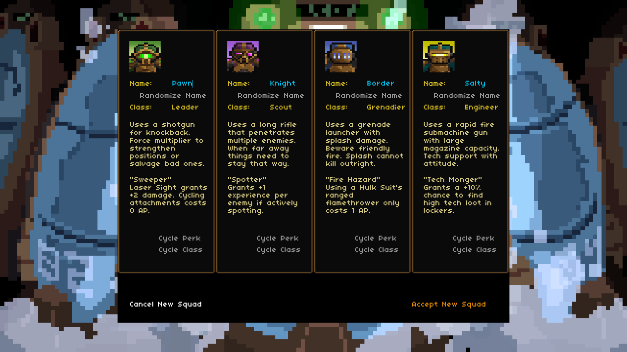
Creating a full squad at the start of the game was something I wrestled with in Steam Marines 1 as well. The main problems were that you could make the early game pretty degenerate, and this also tended to flood new players with too much information.

I'm not telling this to suggest you're wrong - a lot of this will be subjective from player to player. I'm just supplying my reasoning and past experience trying other things :P
I am very glad you gave me so much feedback about your user interface/experience impressions and I will definitely take that into account moving forward!

