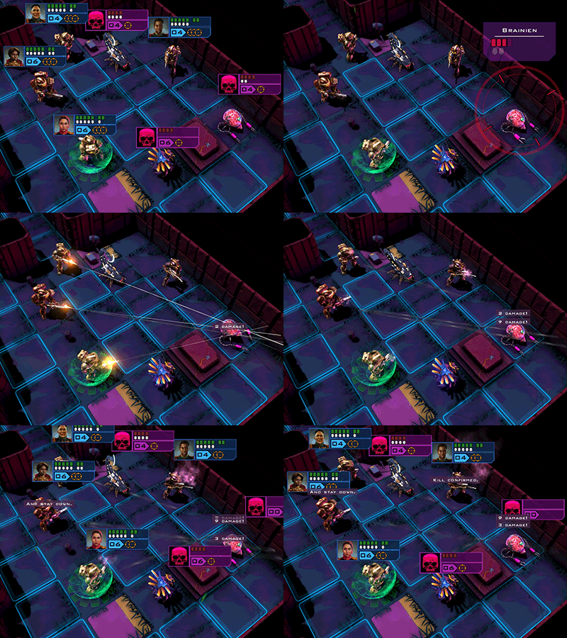
Hello,
After about one hour, here is my first impression. I think it's important to give fresh feedback, and later more advanced ones, because many players don't bother "trying" more than 1-2 hours before giving up on a game. So...
- I don't like
= Suggestion
+ I like
+ Action/Move points, it's way better than the overused 2 Actions system, like the modern xcom do. Still i prefer a Time Unit like Xenonauts or OpenXCom or Enemy, but it's fine.
+ No Initiative, i can play my Marines in the order i want, like in the 3 excellent games quoted before.
+ I can interupt my Marine, play another one, and come back to the previous Marine.
+ Steam Punk in Space, even if i didn't see yet much steam, it's nice
+ Turn Based Tactic, my favorite genre i guess
+ Each class brings something, like Leader opening the door gives +1 action
+- Not sure if i like the line of sight being a cirle instead of a cone, but without the option to turn angle by angle, or walk backward and strafe like in Space Hulk, i guess it's fine.
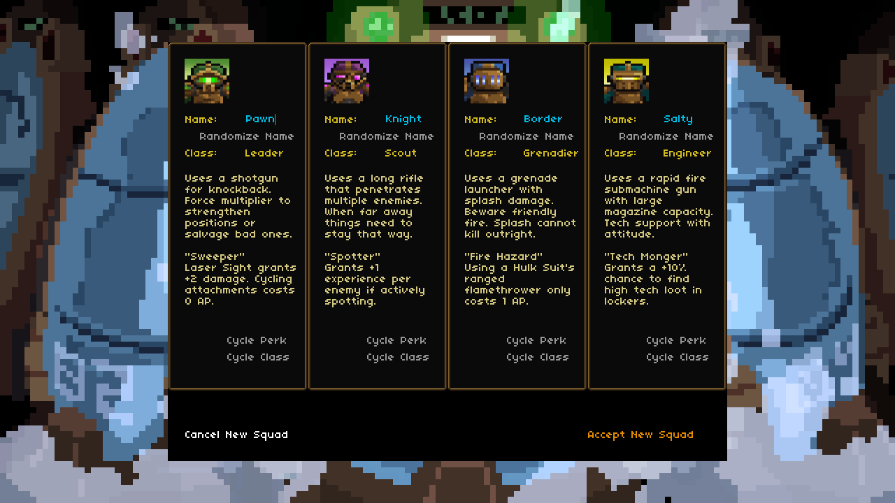
- Caracter creation is ugly and confusing. Why should i click on a button to cycle Steam Marines class one by one, without being sure what is what ?
= Instead, have tabs with all class visible at once, and a short description of them
- The next screen i see, there are 2 Steam Marines, no mission, and the loadout options seem to do nothing. And i don't have money to recruit. So, i think i start with 2 SM. But i don't, i start with 4 SM, that is my main + 3 randoms. The game is randomized, alright, with permadeath, and i have almost no choice to start with.
= Give me full control of my starting team, and show them all on that screen
= Give me a starter mission (maybe a tutorial one)
- Perma Death. I hate permadeath, but in some very specific roguelike.
= Give option to play with "disabled SM". Medic during mission could rez dead SM without penalty, and after a mission, all dead SM are alive, but with a random -1 to a stat.
- The Galaxy Map is very dull, unattractive, ugly and useless. Why should i wait for my ship to navigate from place to place, when there is nothing worth to look at ? I just "waste" several seconds waiting for my ship to reach its destination. Also the map is very very very ugly.
= I would rather click on a spot to directly go there.
- Only one save ? What if i like to try something else, without loosing my current game ?
= Have several save slots
- The GUI needs rework, a lot.
- Tooltips for skills often show under the icons (see screenshot :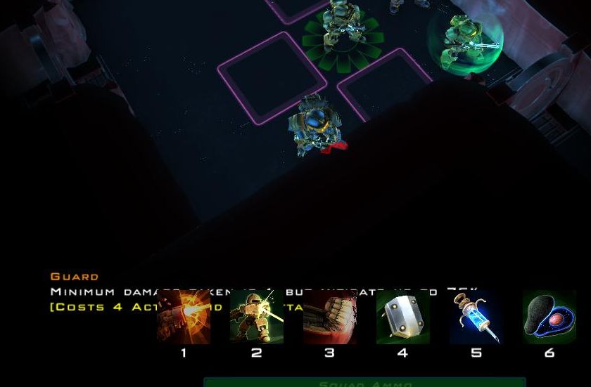
- With killcams, the screen is easily blocked by walls, tooltips, and other stuff on the way.
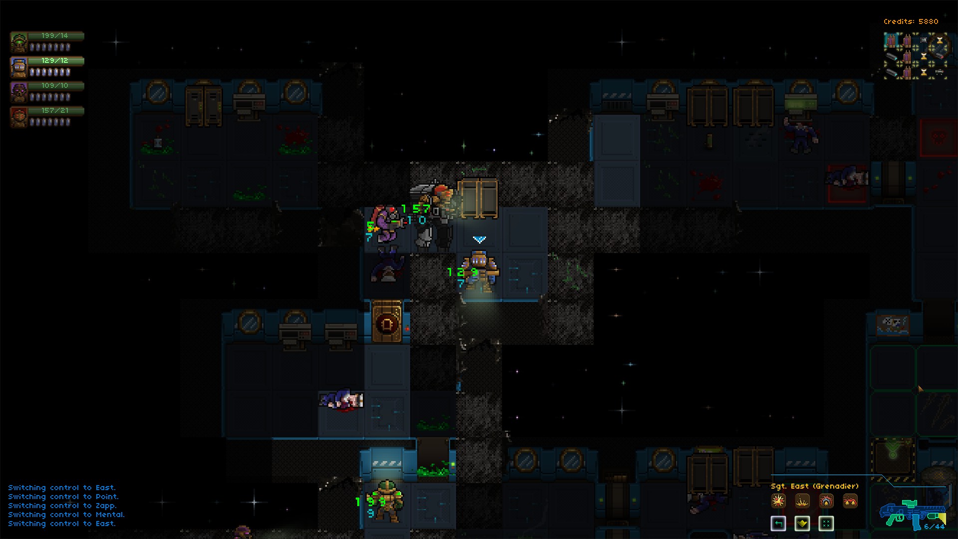
- At first the GUI was really huge, i had to find the right checkbox in the option to keep it under control... It was like this :
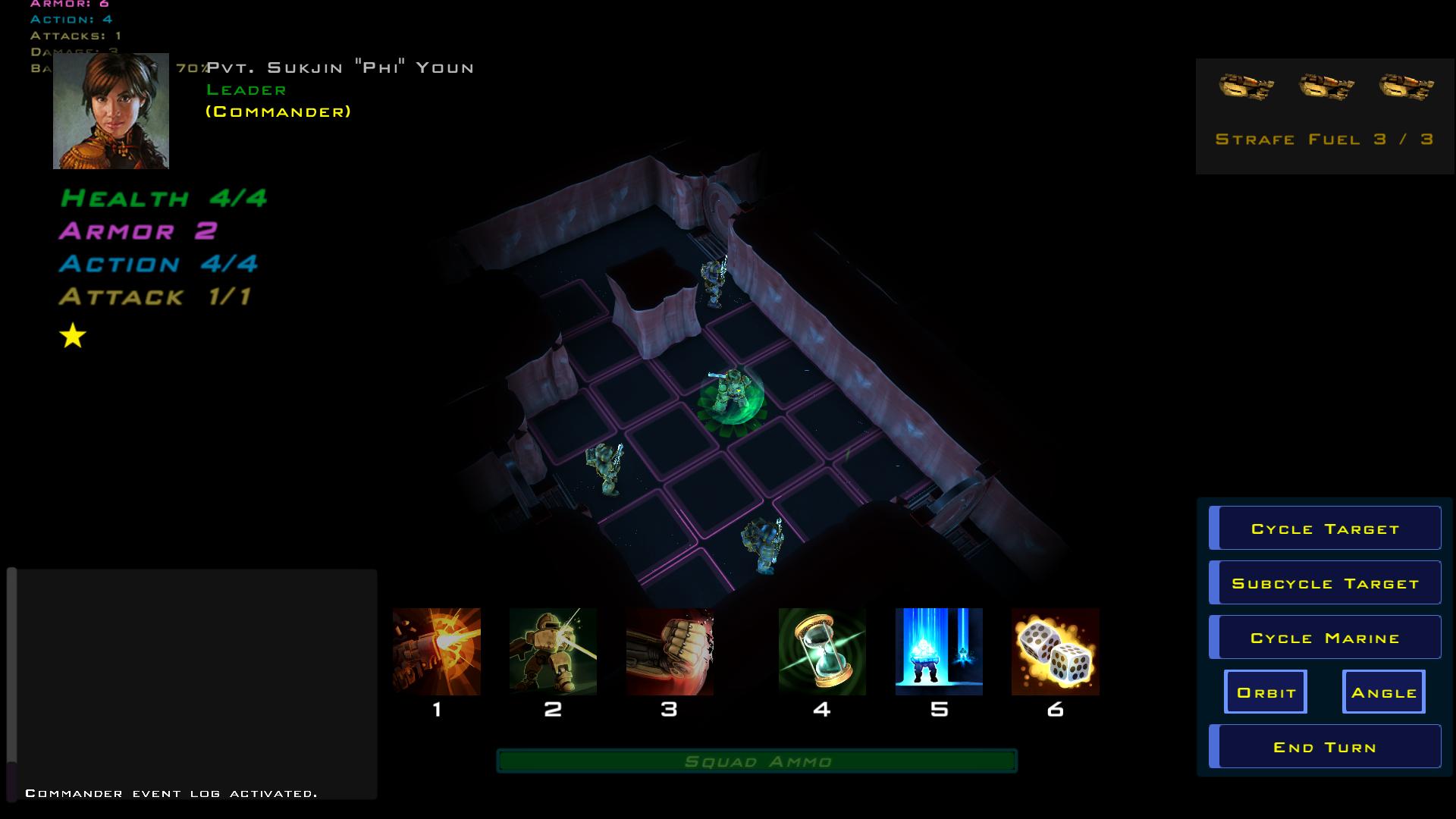
- targetting tooltips are... not well done, at all. Super confusing. Who is my target ? Sure i can guess, but it needs a big rework here, IMO.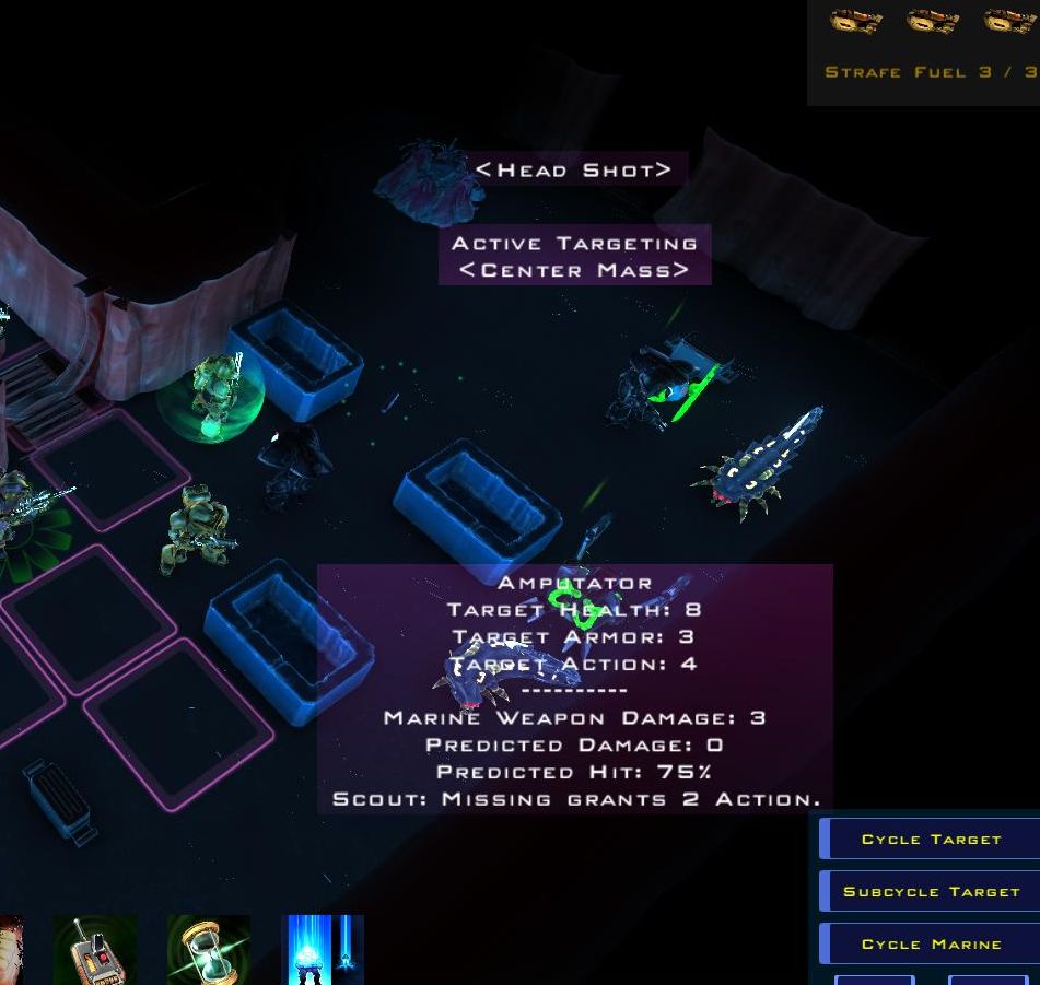
= improve the GUI !
= When the cursor is hovering on a skill icon, the text should show the special effect of the weapon, instead of having to look at the target tooltip.
= All icons should be unique based on the weapon and effect, like the Grenade Launcher, etc
= MMB should be used for panning the view, not switching between "angle" or "orbit" cameras
= All SM portraits should always be visible on screen, something like this :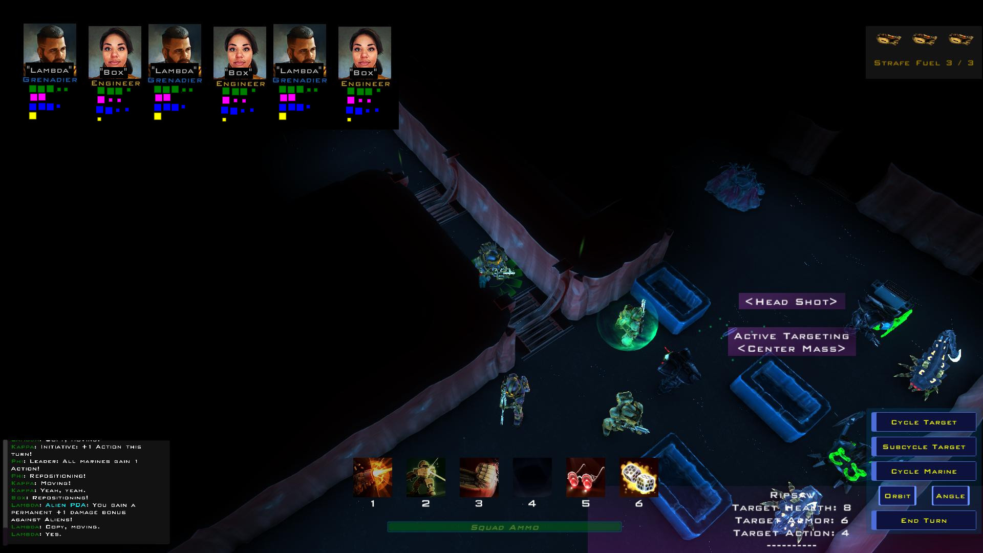
On this picture, large dots under portraits show the remaining, and small dots show already spent, so i always know my maximum potential. And of course, i just copy/paste to have 6 portraits, but they would be one per caracter...
- The Doors show (LMB) to open them, but i have to click RMB instead.
- Knockback from shotgun, when hitting a target with an obstacle behind, could be better
= If there is an obstacle behind, the target should not "strafe", but take +1 DMG
= If the obstacle is an enemy, the enemy should take +1 DMG too


