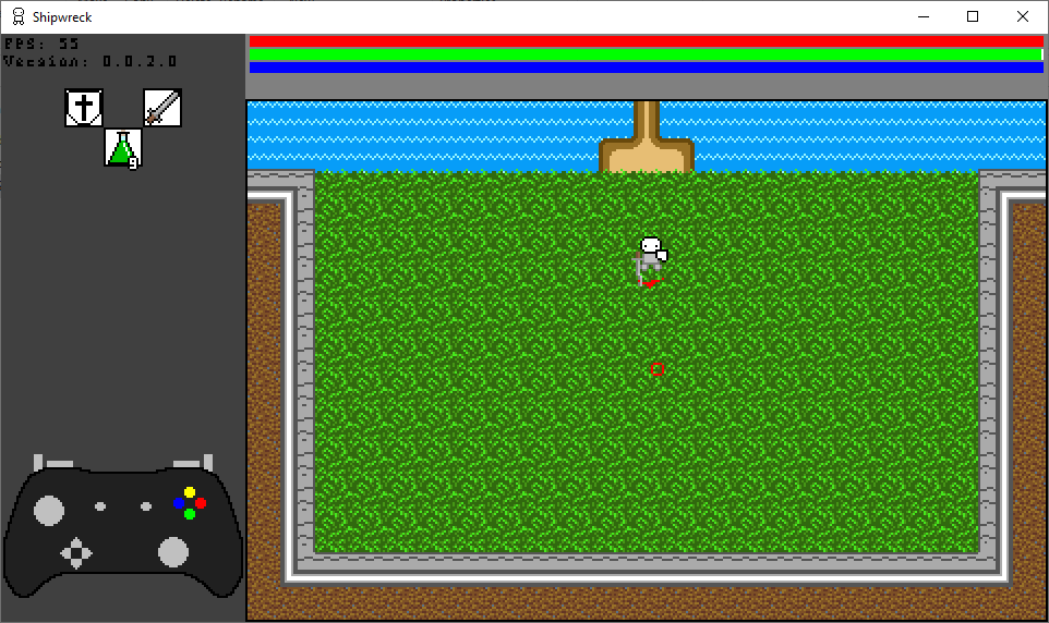
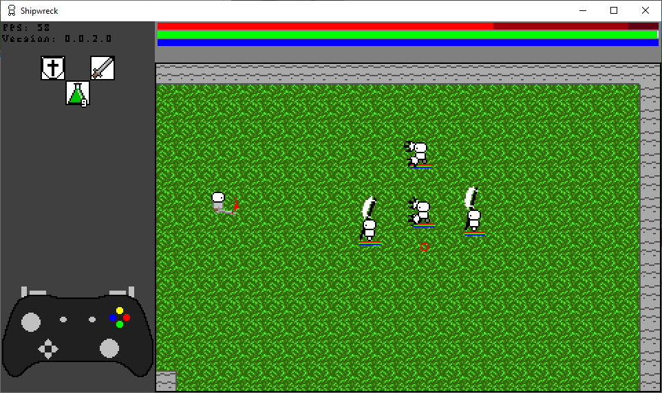
I really, really like this so far. Killing the hard enemy felt great, and you've really nailed that feeling of soulsy combat in a way I don't think a 2d game really has before - I've played a shitload of soulslikes, and I honestly think this is the highest praise I can give.

The weapon trails really make it feel obvious when things are dangerous, which is fantastic. I kind of wish there'd been music/atmos but totally get that combat has been the priority so don't begrudge there being none yet.
I love the style of the little fella - I hope he looks like that right up to release.

The game has great conveyance - when I entered this room I immediately was like "what is the best way to deal with this threat", which I think means you've done a great job of conveying exactly what's required of the player and what the nature of the threat is as well as the toolset available.
I finished the demo and gotta say that I think all of my feedback at this point would be in the areas of presentation and inventory management. Once I got how it worked it was fine, but I was playing with kb+m and it felt a bit counterintuitive to figure out at first.
Presentation feels like it hasn't been a top priority - in terms of function over aesthetics it's instantly groccable and fulfils its function perfectly, so maybe giving feedback in that area is unwarranted right now.
Gonna be watching this project with EXTREME INTEREST. Keep it up, man. Stonking game!

