Hey! Sorry for the long time. I was away from PC and I couldn’t answer. I hope you’re taking this in an instructive way as I have no intention to offend you (English is my second language so I’m sorry if it’s poorly written):

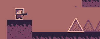
First of all, with the color palette you have chosen, the black and white colors should be forbidden! If you were going to use outlined letters, you should use these two colors (already part of the game) as in the picture.

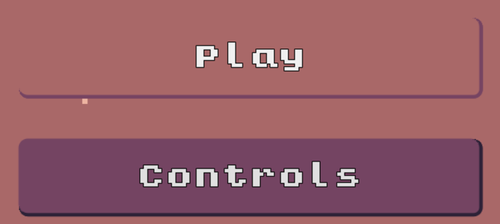
Another thing I found out of place is the fact that the game is not pixel-perfect. Everything is pixelated until you find these perfectly rounded corners in the buttons. The fact that the chosen button has the same color of the background doesn’t help.

I’d suggest outlining the spikes as, even if they’re not living beings (as it seems to be your rule), they’re close to the importance of the enemies.
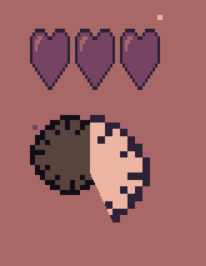
I put the game in fullscreen for the pictures and it causes a few visual bugs:

The clocks and the hearts ends up distorted and misplaced. You can deactivate the fullscreen option in the itch.io page.

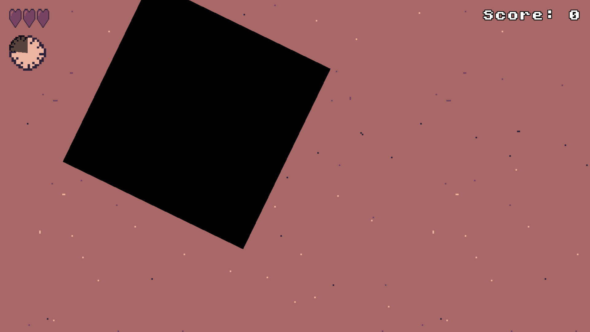
The transition is black and is not pixel-perfect by design. (I’d prefer if it scales without rotating)
The sound stuttering is a shit but I understand that’s not your fault as your game seems to be made in Godot and is a web build as ours so I’m not taking it into account.
If I am right and your game is made in Godot, I’d suggest setting your stretch mode to Viewport so the game can keep the pixel-perfect rule (thinking that probably you designed it from a lower resolution and some things are smoothened on error)
Nothing more! If you take any of these suggestions in a next version, please write me to check. Your game has a lot of potential! Sorry if I offended you, I am probably too nitpicking.

