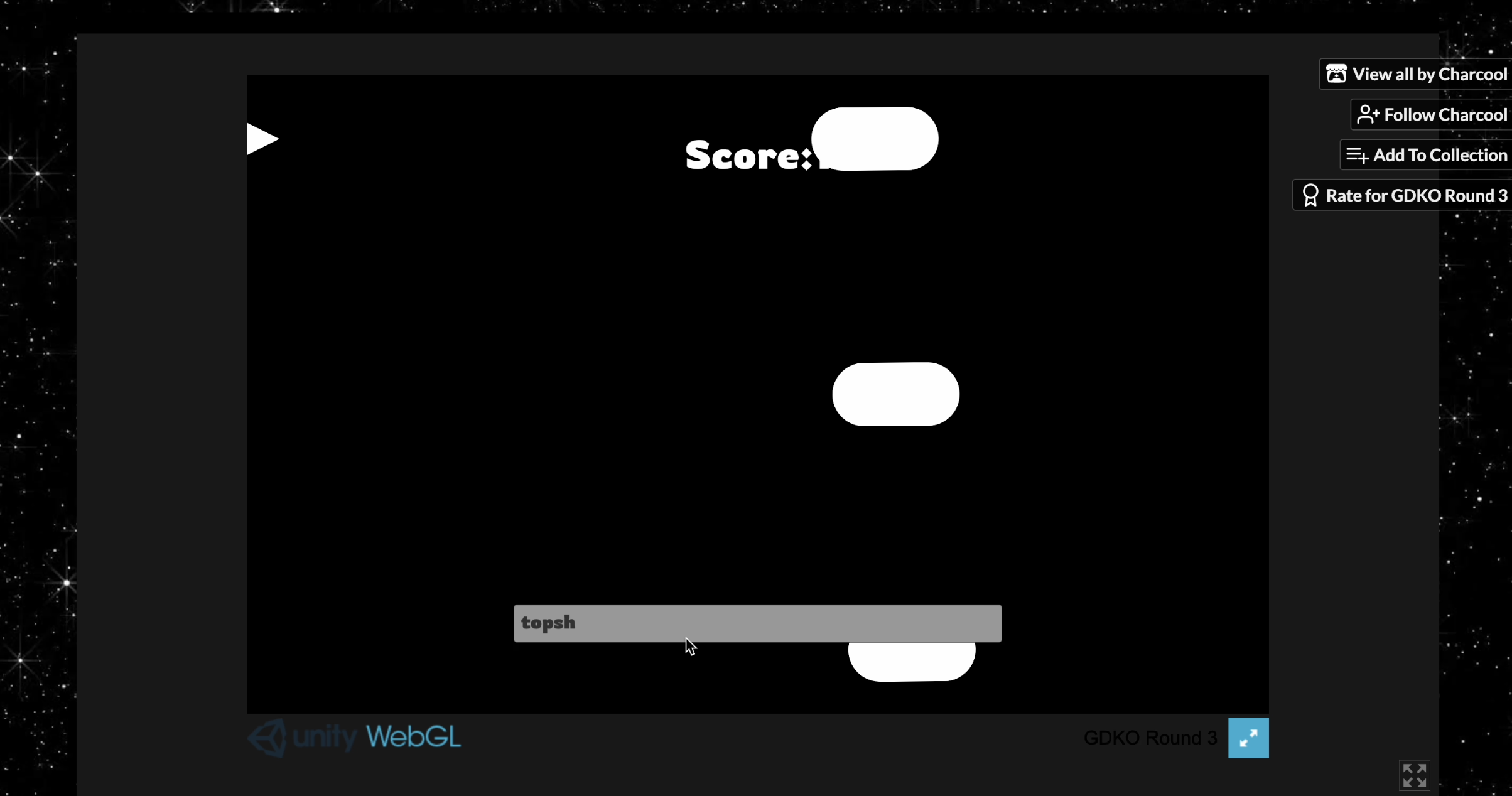
I'm with Kingjaw on changing your choices for the commands. Top was easy, but middle and bottom, just "mid" and "bot" then they're all three characters. I like that shoot is longer because there should be a little more anticipation and work for the attack.
Locking the story behind the scoring system was a great way to make it work really well with the gameplay. I know this isn't part of rating, but I love the attention and care you put into your thumbnail!
I wish I didn't have to select the text box at the start to begin typing, or you should have given more of a buffer before the enemies starting coming at me. I would also suggest an enemy type that you can't shoot so it forces the player to move.
I couldn't move up. Or more accurately, I could move up but then I was stuck:

"top" wouldn't clear out of my text box like shoot did, so then I was stuck up top.
Overall, this was a really fun entry and solid submission. Thanks for sharing it.

