Indie game storeFree gamesFun gamesHorror games
Game developmentAssetsComics
SalesBundles
Jobs
TagsGame Engines

I like this, it's fun. The controls are fluid and the different stages of the fight are challenging. Only the dialog is a bit strange. First, I think the dialog at the beginning is too long, but that might be personal preference. But having to read and click away dialog in the middle of the fight feels a bit unfair. And if you do just click it away, you have no idea what to do. Maybe the game should pause, so you can read it.

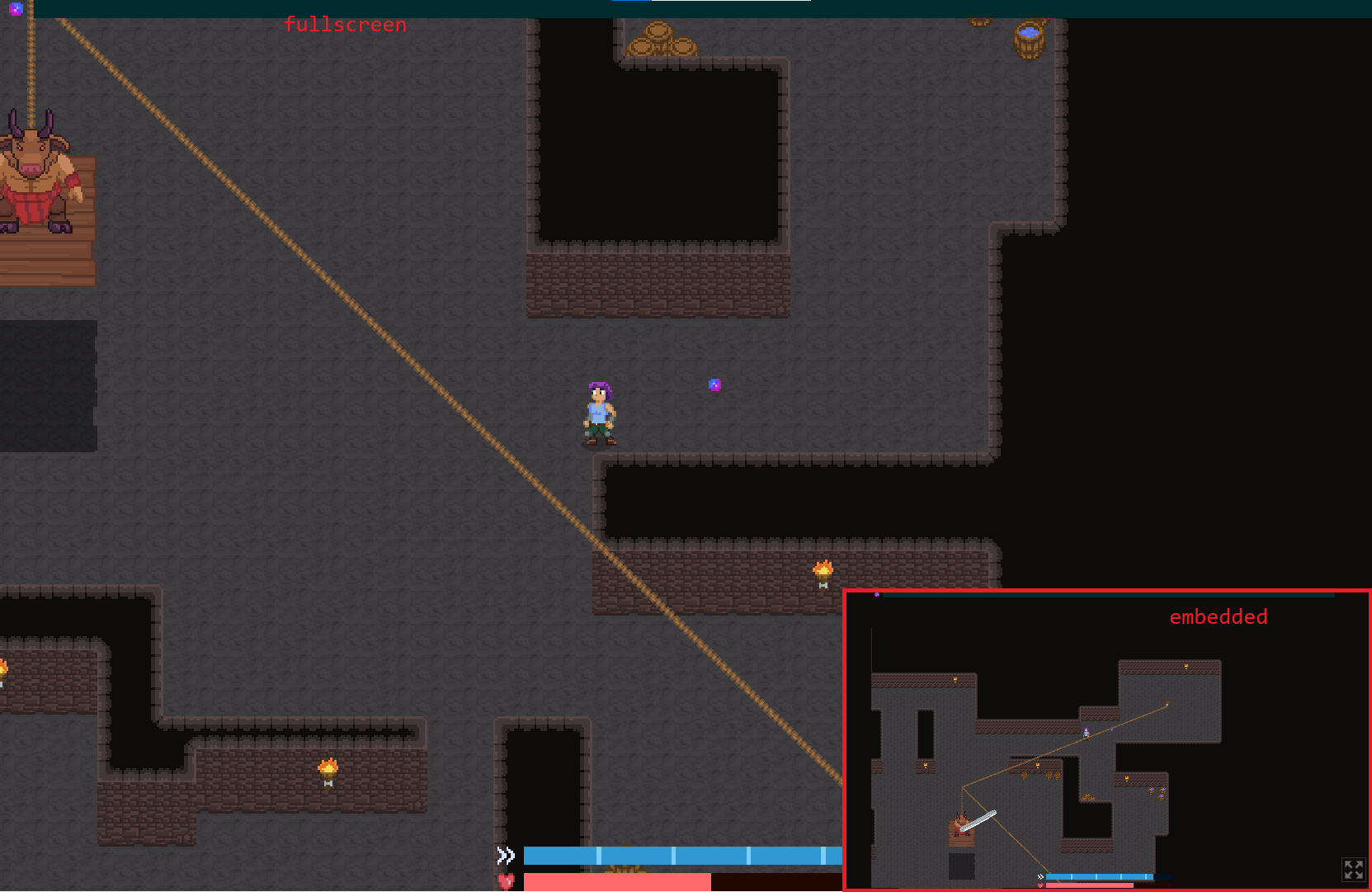
Also, is there something wrong with fullscreen? Without fullscreen I can see much more of the level:
(+1)

Hey, thanks for the great feedback! I agree that the starting dialogue is a bit excessive but we wanted to get a lot of info out. Maybe that should have been explained on the store page but we thought it was worth including in-game. I also see how the dialogue that appears while you can still move and get hit is a bit jarring, it's hard to read and play at the same time.

The fullscreen thing seems to be specific to the WebGL build. We didn't have much time to test the web version and were having issues with it but really wanted to make it work. The camera zoom in fullscreen mode is the intended one.
Thanks again for the feedback and for playing our game :D