
Great update! When we talked about pixel sizes, I wanted suggest making environmental sprites 16x16 but keep them at a lower contrast, so the important elements would still be clearly visible. But I didn't have time to create an example of what I meant by that :D You did it anyway, and kudos for tackling that huge makeover. The result is a huge improvement!
Thanks for the compliment! The only real contrast is that the character art (and the wagon/insects) have a dark outline, I suppose this is what you meant? The thing I'm missing is some form shader distortion for the water and for the smoke after destroying buildings, but that's a bit much for me to figure out at the moment. Did you play through the game again to see all the new artwork?
2 years ago(+1)
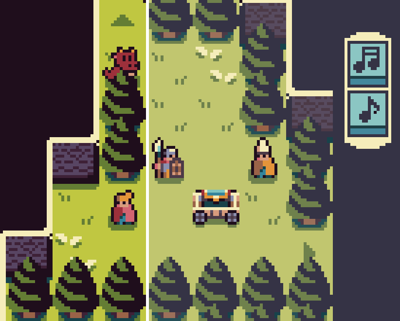
Yes the dark outline works very well. What I had i n mind was keeping very dark/black and saturated colors only for characters and actionnable items, and "muted" tones for environment. Here's a quick n'dirty mockup. Not sure it would work for the whole game though, it is a very different look, and I probably went too far to illustrate here, especially for the grass :D
Hmm that's an interesting idea, muting the background. I'm not going to redo all the art again now though, I already did that twice now haha. But I can see how it could benefit in bringing more attention toward the important parts. Currently I'm mulling over what game to make next, I'm considering making a series of games set in the same world as this one with new and reoccurring characters, this way I can reuse most stuff game->game with new twists to the base mechanics and only need some new art for the specific games. So more polished games for less effort xD