Thank you! Great minds think alike ;) Can't wait to see your font and of couse your game!
Phildjii
Creator of
Recent community posts
I like the setting, the style, the cuteness. However the one thing I'm not fond of is a pretty important one: the view is isometric, but movement is orthogonal. So when I want to go in a straight line, like following a path, I have to press two keys to move "straight", and it feels really not natural to me. It is okay at the beginning when levels are easy, but when I need to precisely jump or aim at a flower mid-air, it can be a bit frustrating. Yes I know I can change the view, but then terrain is less legible, and sometimes half the level is outside of the viewport. I still like the game, but didn't try to finish it (yet).
Yes the dark outline works very well. What I had i n mind was keeping very dark/black and saturated colors only for characters and actionnable items, and "muted" tones for environment. Here's a quick n'dirty mockup. Not sure it would work for the whole game though, it is a very different look, and I probably went too far to illustrate here, especially for the grass :D
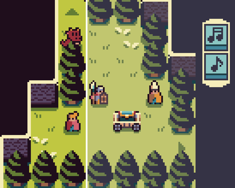
Great update! When we talked about pixel sizes, I wanted suggest making environmental sprites 16x16 but keep them at a lower contrast, so the important elements would still be clearly visible. But I didn't have time to create an example of what I meant by that :D You did it anyway, and kudos for tackling that huge makeover. The result is a huge improvement!
Really enjoyed this game! An interesting variation of a classic movement pattern. You managed to pack a lot of adventure in a tiny world, with varied landscapes, puzzles and encounters. Kudos to you! It also looks pretty good. I am usually not a fan of mixing pixel sizes, but it works well here and helps differentiate characters and landscapes.
Ahhh I hate this game! I also love it. But it has one flaw for my taste: a random track on every run makes the game feel very random. We can't design and tweak the vehicle for the obstacles in front of us, so any vehicle has a high probability of breaking on the first obstacle. I would rather choose a level and try to "solve" it. So, frustrating fun, but still fun :)
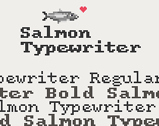
Salmon Typewriter is a typeface that aims to give the feel of text typed on those old, quirky typewriters. If your project includes old letters, vintage administrative paperwork, hard-boiled style narratives, it can help achieve the right atmosphere.
More screenshots on the page: Salmon Typewriter
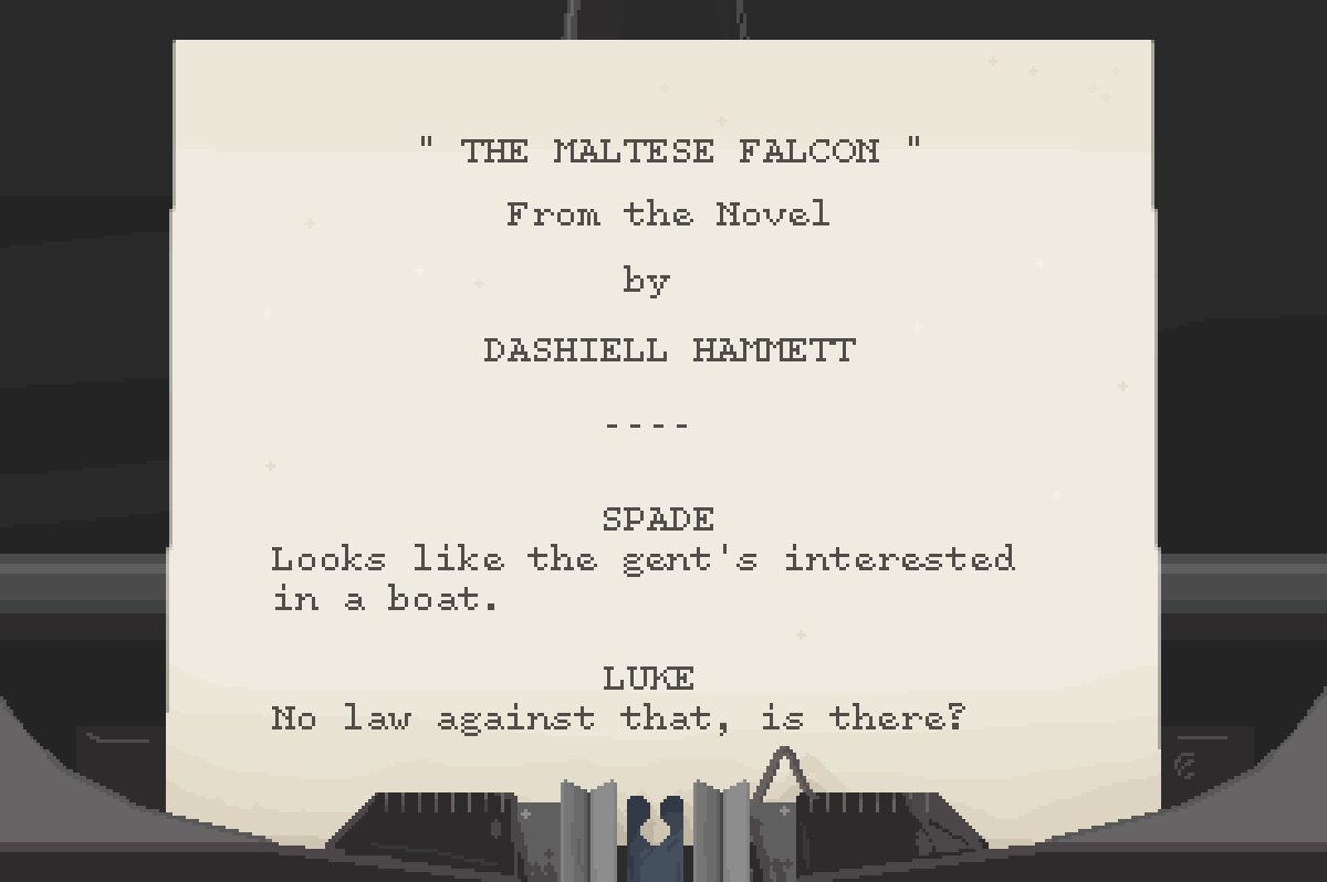
It is tricky. In the kerning table we could escape it like "\ " (backslash space) but that would be hard to read.
Or perhaps "\s"? As in regex it "matches whitespace".
Another way would be to use a double character, something legible like "!!"
I'm not sure it would be practical in glyph images, that would probably require some color coding, like "red indicates width".
Is there a way to specify kerning for a character before a space?
The reason I ask is I am making a duospaced font, so I can't use the monospace option. For characters that don't cover the whole tile, it is a problem because for example in Pixelfont the dot character is 3 pixel wide (single pixel centered in a 5px tile) instead of 5:
The trick it to add 2px between the dot and the next character. It works fine, expect I found no way to specify "increase kerning by 2px between a dot and a space". So with most ponctuation followed by a space, kerning is narrower than expected:
(top line is with monospace option, bottom one is my attempt at duospace)
Not sure how you export, but when I export a Mac app, Godot generates a .dmg file, which is a "disk image". I believe disk images avoid all these issues, which arise only if you upload a naked or zipped app. Godot started signing Mac apps recently (with v3.3), so now exported apps should just works right away, even when downloaded from the web if exported as a .dmg.
But I'm on a Mac, not sure about other OS.
Ok I found a way to run it. I had to run 'xattr -dr com.apple.quarantine Cabochon.app' on the command line so the app was not quarantined. I think Godot didn't sign the app correctly during export. It seemed to me it was fixed long ago but there may have been a regression in 3.3. There is an issue filed here https://github.com/godotengine/godot/issues/48076 if you want more info.
I love puzzle games, trains, and board games like Carcassonne… Needless to say I wanted to play your game!
Graphics are great, the concept works well. I liked the optimization aspect of the game, you really have to plan ahead. Overall it feels nicely polished already.
The game feels very random though, especially near the end when only a few spots are still available. Perhaps having a hand of tiles (2 or 3) instead of one would help?
First reaction as I first clicked on things: what the… ?? But it is actually pretty straightforward.
I like the idea, there is good potential, but of course as it is the experience is a bit monotonous: very few card types, no tension as we never feel threatened. But I can imagine a more fleshed out version with more cards and events being a lot of fun.
Also kudos for doing this alone. I've been there, it's hard :)
A really good use of inverse kinematics! Also the tutorial explains everything we need at the beginning, that's a nice touch that we often don't have the time to implement in jam games. When we
I would have liked an end goal though, I feel that endlessly getting upgrades without a clear way to succeed is not the most motivating. I would have liked to actually save the cat :)
Oh, I forgot: the macOS version works fine.
Nice game! I liked the minimal 1 bit art, it fits the underground move very well. The minimap is also pretty nice and gives useful information, well done. Characters felt balanced, and it was interesting to swap between them.
On the minus side, levels felt a bit empty. I think simply making levels smaller would make them feel more intense.
Oh I will have to look at these textures, that shouldn't happen. By any chance, was your browser zoomed in or out? Thank you for the feedback.
Truth be told, Asheraryam had implemented player vs player from the beginning (so we could test the gameplay before there was an AI) but it was buggy and was disabled before we submitted the game. You'll be happy to know that he plans to fix it and re-enable it after the jam ends.


