My unprofessional opinion. I downloaded the entire booklet and here's what I think.
1: There's a lot of dialog. I'm not sure there is even that much or if that font is hard to read but there' s definitely a lot.
2: I Love the art!! Lots of talent there. Making me jealous.
3: Story flow could use some help. seems a little choppy and sometimes I was confused by what panel came next.
4: Sense of humor was pretty good. With the flow of the story fixed it would be something I would read.
5: Plot was a little bland. It was fun, but also kinda repetitive after a few panels. (Nothing ever serious)
Overall I would rate it as such.
Art- 10 /10
Humor- 5.5/10
Plot- 5/10
Flow- 4/10
What needs the most work is the flow of the story as the panels show it, and definitely add a more serious tone to it sometimes.
Very good job though.
PS: I hate sexy anime, but that's just my opinion as a Christian. Keep up the good work!
Viewing post in opinions on my short comic?
Thanks for confirming some of my doubts. In the extended version of this comic I'm making, the text is a tad bigger and there's less dialogue, separated in speech bubbles. Some rough parts are still visible but it'll get better.
The plot in the first chapters'll be light on action and more focused on comedy, but it would set up opportunities for future action-themed chapters.
Thank you very much for the feedback!
Now that you mention you were cramming in I do find that some of the panels were quite intuitive in getting a lot of stuff across quickly.
I remember actually liking the one panel where you have just the faces with straight back and forth dialog. I liked that because it's a nice flow of quick humorous dialog, uninterrupted by anything. Putting that dialog in through 4 panels or so would have totally ruined it.
Btw, do you know anything about pixel art?
Yeah, I had the idea for the comedic dialogue but I imagined it better as a small panel with the conversation all gathered up in the same space.
I haven't done much pixel art, last one I did was in 2016 and was quite simple:
https://www.deviantart.com/aquapaulo/art/Cave-Baroness-Pixel-art-625139869
I was just wondering because I'm working on a game currently with a friend of mine and since it more a hobby thing I'm in charge of the art even though we're both programmers :P lol.
I've gotten decent at it but all I'm doing right now is drawing it roughly in 320x 320 and then resizing it and letting the algorithm do all the work for me :D
I would very much appreciate some tips if you wouldn't mind
I know some art stuff that could easily be adapted to a pixel art context.
-Color is important, make the protagonist recognizable with a small, vivid but not too vibrant, color scheme. Think about it. "Castlevania", "Shantae", "shovel Knight", "Momodora: Reverie Under the Moonlight", these four use protagonists with two or three distinguishable sets of color. Coordinate your backgrounds and enemies with your protagonist's design.
No one likes to play a game with blue backgrounds, blue enemies and a blue protagonist. Players want to know where their character is on the screen without actively having to search for them.
-Pixel art's not about correctly representing objects, it's about conveying them, keep that in mind. With two brown pixels and a pink pixel you can convey an open mouth, etc. Or not even open the mouths at all, people will still understand the character is talking.
-Don't overdo shading and don't resort to "pillow shading", search the term online for more info. It doesn't look appealing. Simple shading and some knowledge of color temperature is always nice.
-Be conscient of the resolution you're using, I didn't use proper resolutions when making a test pixel art game and the result was, when scaled up, everything was twitching and vibrating when the camera moved. The software was trying to stretch every vertical line of one pixel to a pixel and a third basically.
"Momodora: reverie under the moonlight" is a solid game to use as reference on what feels right. The protagonist has a black shirt and white outfit to compensate for both dark and light backgrounds and the controls are comfortable even though the game might be hard at times.
"Iconoclasts" also has fun mechanics and nice character and boss design.
"Shantae and the Pirate's Curse" also looks nice, look up gameplay for these and study them for a few moments, maybe even speedruns of them to see later elements and levels of the games quickly.
Good luck!
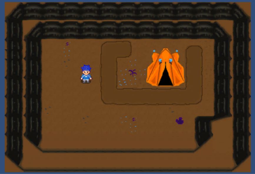
Here's the gist of what I've got so far. The tent and the bottom row of walls is just a rough draft but the rest is pretty much final cut.
I think the colors are pretty dynamic personally. As far as graphics I'm going for the feel of harvest moon, with the aesthetics of Pokemon.
It's gonna be an underground SCI-FI

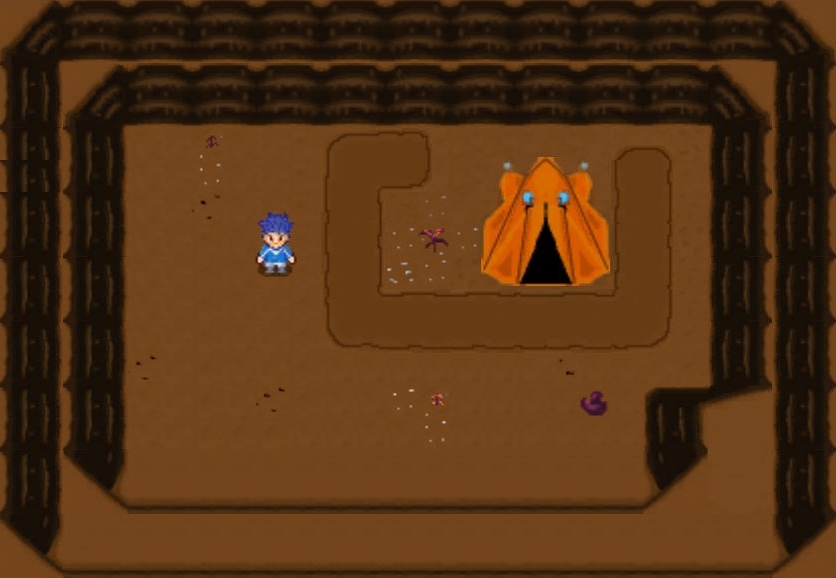
I think the ground could have more going on and more contrasts with the little rocks and plants. the tent and the protagonist's hair seem too vivid compared to the background.
The background also could use a single tone of color to bring more focus to the protagonist.
I tried to represent what I was saying but you might have a different opinion on how to handle these subjects.
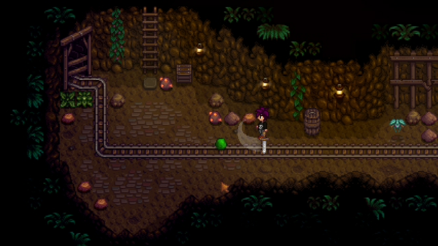
Stardew Valley has nice cave designs you could use as inspiration:
This is the effect and layer look I want. I want it to be a mining game where you mine down 4-5 levels.
I really like what you did with the stones, but I kinda liked my background even though I have to agree that yours does add more emphasis to the protagonist. Is that important?
Also, I was going for the vivid buildings to kinda have them stand out, but now that you say that, they really aren't important in the visual field.
I'll change them, thanks! :)

Sorry for the late reply, it was late in the evening when I remembered to check my inbox.
Emphasizing the protagonist is important but not constantly needed. With one light color and one dark color, the design helps itself in most backgrounds. Again, the player just needs to know where their character is on the screen.
You can keep vivid buildings as long as they're distinct from the protagonist and other objects/characters. Earthbound 3 has vivid buildings as well, but the characters have black lines around them so they don't blend into the background.
The robots can still have noticeable colors but do avoid using colors that can be confused as the protagonist's. You can still use blue for example, but you could resort to a more purple-ish blue or a less saturated blue. Just remember light, saturation and color can be helpful in indicating what's important in a scene. Like how pokeballs with items in them are vivid red even in a cave.
And the caves' ground would benefit from some kind of seamless, non-intrusive pattern to become more interesting.
I used to draw with paint net as well but nowadays there are more art programs available.
I now use paint tool sai 2. I selected anything other than the protagonist, rocks and tent, and applied a layer set to "Color" with brown over the selected part.
I recommend firealpaca, or even Krita for a free alternative if your computer can handle it, in mine it's a bit slow but gets the job done.
I'm off to sleep for now, I'm on a different time zone but feel free to leave a reply whenever you want.
I don't often check itch io but I do have a deviantart account with the same name, but without the exclamation point in this username.

