On Sale: GamesAssetsToolsTabletopComics
Indie game storeFree gamesFun gamesHorror games
Game developmentAssetsComics
SalesBundles
Jobs
TagsGame Engines
(+1)

hands down one of the best games in terms of level design .I finished the game, even if I was stuck for like 20 min in that one long level where you need to click one plant and going through a bunch of enemies, because I didn't understand that touching the bouncing plants would make the other one stop growing ( but it's seems that am just too dump)

I just love how the new gameplay elements just build into eachother and not just add new stuff for the sake of it. But it seems that some levels are more focused on platforming than puzzle solving and the pureling platforming ones are my least favorite, I personally find those ones just frustrating because of the controls.

Yeah, the game can be a pain sometimes because of how rough the controls are, the jump is really floaty and uncontrolable ( not the best for precise platforming segments) and I HATE  the plant that you can bonce with it, the direction that it takes me is always wrong and either give me a very high uncontrolable speed or a very slow one. you shouldn't have taken into account the way the player jumps into it, for example make the ones facing up to only give you a speed that goes up, witch makes it more predictable and controlable, like the springs in celeste they are very fun to use because you always know where it will throw you.

and for learning more about platformer controls check this out, I personally wish I learned some of these things more sooner: :https://gmtk.itch.io/platformer-toolkit


And in terms of art, you gotta be carefull with your color choices, in some situations I can't make the difference between what I can walk in and the backround, you should have chosen a more lighter color for backround and darker for the walkable tiles. and just use a better color palette, you can find one in the internet.

Here's a quick example I made, It's in no way better than yours and I quickly made it to illustrate my point about having a noticable diference in the use of color.
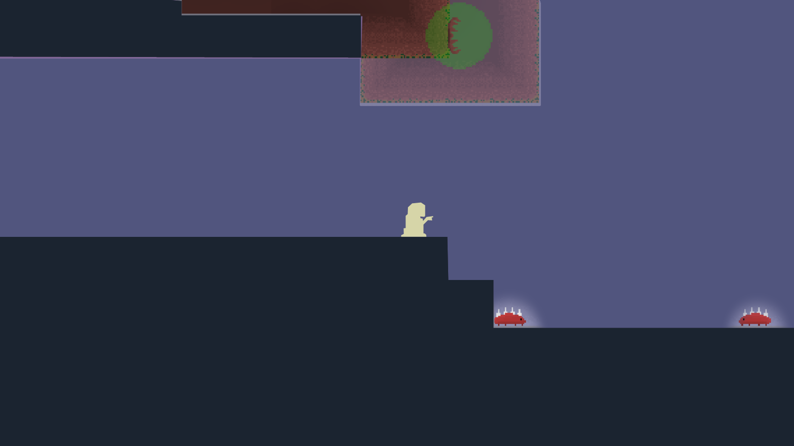
(1 edit)

Thank you for playing and your review! I'm glad you generally like it.

I think majority of the problems with Necro Druid come from the fact that I don't actually play nor really like logical/puzzle games. I'm a 2D platformer/metroidvania enjoyer, and so I naturally gravitated into making the majority of the game into a precision platformer rather than a puzzle platformer, splitting the game content into two different philosophies of gameplay.

While I understand your frustration, I can't agree with you regarding controls. Aside from occasional bugs with collisions and accidental super-jump exploit*, controls work as intended. Contrary to you, I find it easily controllable to navigate player during and after jumping, so I guess YMMV.

Similarly, Bouncy Plant (aside from the super-jump exploit*) works as intended. I think that your varying experiences with its force might (in some situations) come from using the jump button at the moment of impact with Bouncy Plant or from jumping from one BP directly into another BP. The fact that it bounces the player away depending on the place of touch allowed me to structure the levels the way I wanted. Changing that would fundamentally change the level design and made the Bouncy Plant extremely boring.

Regarding the color scheme, I'll remember that for the future. However, I don't really see how one could confuse the background area with the interactable area as I feel they are already distinct enough. None of my (3) play-testers has shared such insight with me.

Once again, thanks for playing and your input!

* super-jump happens when you press the jump button in a quick succession of landing on a Bouncy Plant, making your force of jump much stronger than it should be

(1 edit) (+1)

I also love 2d platfomers and mertoidvenias,they are my favorite kinda games of all time , but my "dislike" of the platforming comes mainly from the use of the mouse to grow the plants ( whichwas difficult with the moving camera,when the camera was zoomed out, just like one of the levels, I didn't have a big problem but most of the levels aren't) and I just prefer a more weighy jump ( that you can control by how much time you press the jump button) in general , the physics just feel very rough, I wonder if you're using the default values of unity's rigidbody .I prefre my jumps snapey  like hollow knight and celeste but if you personally like it that way then so be it.

The reason that you have a hard time noticing the backround problems is because you have been working for this game for 2 whole weeks, what you consider normal and intuitive might not be for someone like me, because with time I easily understood what the interactable areas are, but this is still a problem especially if you add more assets, or just for color blind people who will not notice the color difference at all, they need a place to be darker than the other, like how this text is black in a white backround and if you make them a similar value. people will have a hard time reading, so just make their life easier and have more contrast. But that's just my opinion off course .

You still did a good job and it's very cool that you put your assets for free, am sure that someone will find them really usefull.