Day 96, just finished a game jam few days ago, rating submissions and all that. Couldn't upload yesterday because of rough stomach pain and several puking.
Two things I want to show here, more effective collision shaping and new player design.
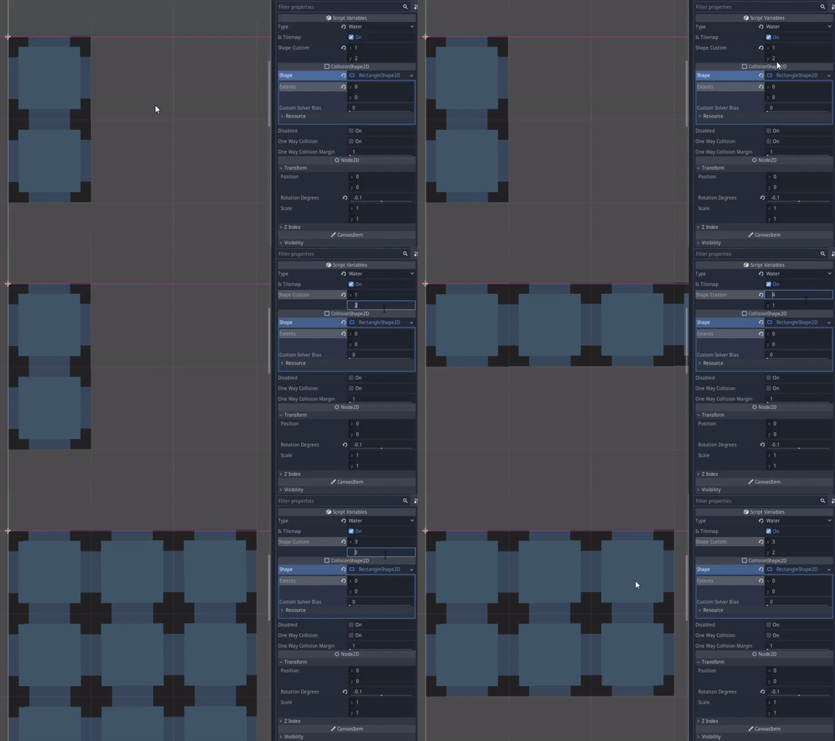
Let's see the collision shaping. This collision shaping only for the editor. It designed to have Vector(x and y) that determine it's shape at the start of the game. For the sake of efficiency of tiling :) Since slapping the collision to the spike tiles can damage the player at least 2 times, I have to manually make the collision myself. But making the collision is tedious |:( you have to add the collision node, adding and configuring the shaping, and if you duplicate it, you have to make it unique. So I make this to make it easier. Extra effort can make things easier and quicker.

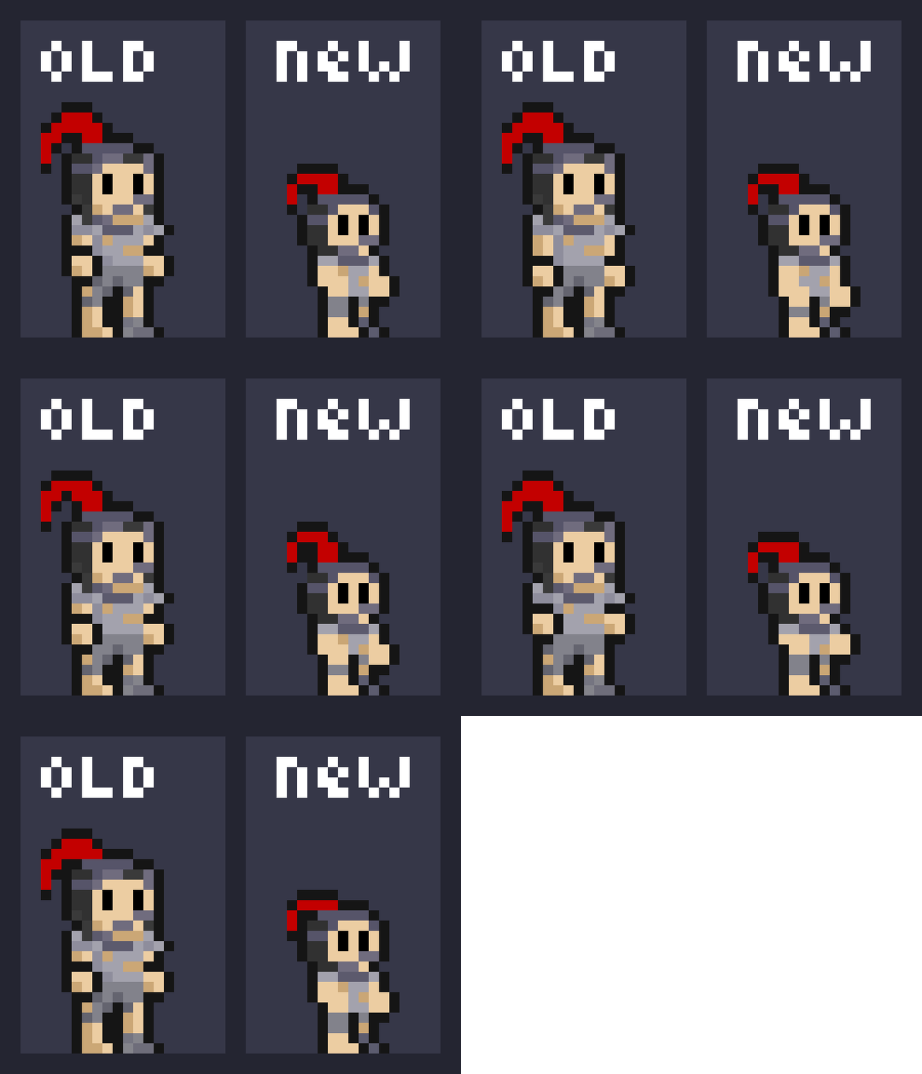
Let's see the other one, the player now have a new design. If you are an eagle-eyed player, you might notice the player and Minlie are scaled down, if you think about that, good job of the guessing :D They have been scaled down to 0.75:0.75, or 25% smaller. The player's old height is 24 px tall so he can't fit into two tiles or 16 px corridor in 1:1 scale. Minlie is scaled down as well because if not, she would be the size of the player. So I make the new design. He looks like he's been drinking youth potions or look like Mini Mario :) Either way he's now at the proper 16 px tall and less than 8 px wide, and the same fate go to Minlie as well.

Okay that is all people, goodbye and see you next time ;)

