Indie game storeFree gamesFun gamesHorror games
Game developmentAssetsComics
SalesBundles
Jobs
TagsGame Engines

Tyro Knight Vers 0.1

A topic by ScopeRicrit created Apr 05, 2022 Views: 3,651 Replies: 72
Viewing posts 1 to 61
(5 edits) (+1)

Hello, a solo dev here, trying to make a little bit short game. The second game technically made public and first ever devlog, for you seeing this post, thank you :)

Current Prototype Available Version 0.1

Summary

Tyro Knight is a 2D Platformer where you are a knight(obviously from the title), you fell into a cave. Your main goal is to escape the cave. You encounter some magical gems in the process. These gems is used for puzzles to progress the game. I'm gonna make the level a bit metroidvania-like design.

Note: The word 'Tyro' in the title is a synonym for beginner.

Updates

Day 1. For now, I won't share the game's unique concepts because I need to make player movement first

I'll give you some picture
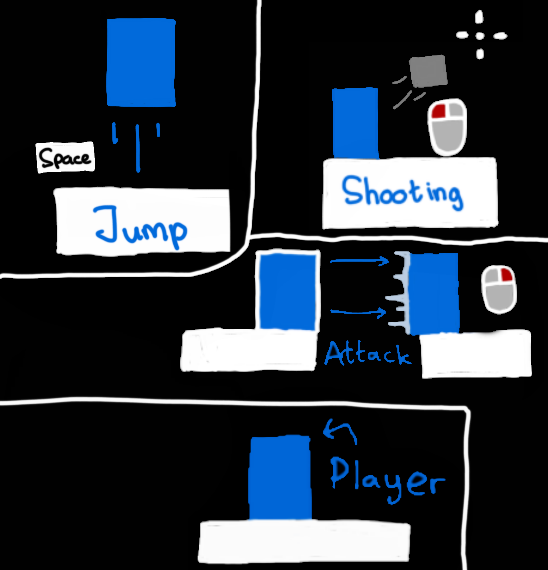
Just gonna skip straight to the attack and shooting. 

In this game, Attacking is where you turn on hitbox and dash. The main use is to attack of course, and to cross some gaps. This is also used for puzzles.

Shooting is well, shooting a bullet to a indicator. This mechanic is mainly used for puzzles, this can be used to attack, but not effective.

Next day, I will post about the unique concept, I need a little bit suggestions on that. That's all, see you tomorrow :)

(5 edits) (+2)

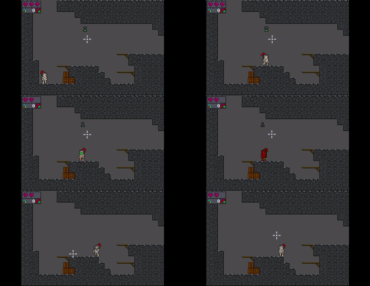
Day 2. The player's movement is finished, yay :D

Here a gif about the game now. Low quality, but still a good gif

The white aim thingy is the cursor for the shooting. The player 'shine' to when the player attacks for now, and the red square that being shot at? That is one of the gems I'm talking about, it's one of the game's unique concept.

Note: The gems is inspired by Peteksi's To a Starling, just that :)

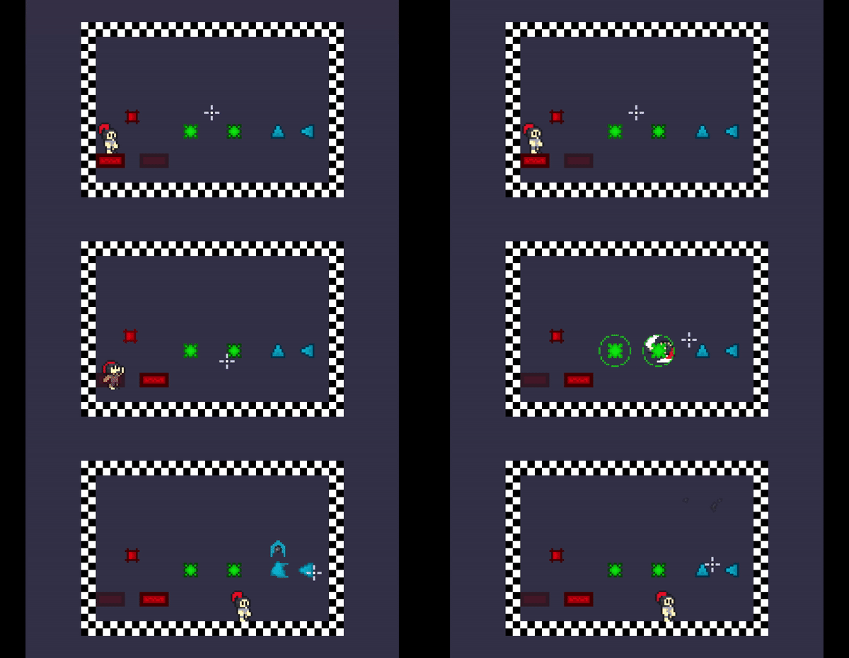
The game has three type of gems. The red one is designed that if it being shot, some specific platforms in the room is changes. Ghost platform(dark red) becomes real platform(light red) and vice versa, shoot at it again and the platforms change again. This design is locked, I won't change the red gem.

The other two is the thing I have trouble with. It only because I don't have ideas for these two gems design. The color of two gems is green and blue. I just need some suggestions on the rest design. I'll update this post on day 3 for the design I chose. I might choose random, but if it works out I'll keep the design. 

You can reply to this post about the suggestions. 

Thank you, I'll see you tomorrow :)

(2 edits) (+1)

Day 3. So there no suggestions, that's fine I'll get ideas anyway :) also I just finished the second gem design and also another thing for the game.

So here's the gif


So the green gem have 4 walls with 1 is ghost, hit it with attacking, wall 1 is real, wall 2 is ghost, hit it again, wall 2 real, wall 3 ghost, and so on. This can be used to make players go a route without getting too lost, used for a multiple route areas. This design can be changed completely though.

The other thing for the game is the camera. The game has camera now that change position when the player is on the edge of the screen.

Now there's only one gem left to design, will update about the last gem. But now, maybe I make other impactful things for the game.

Thank you and see you tomorrow :)

(+2)

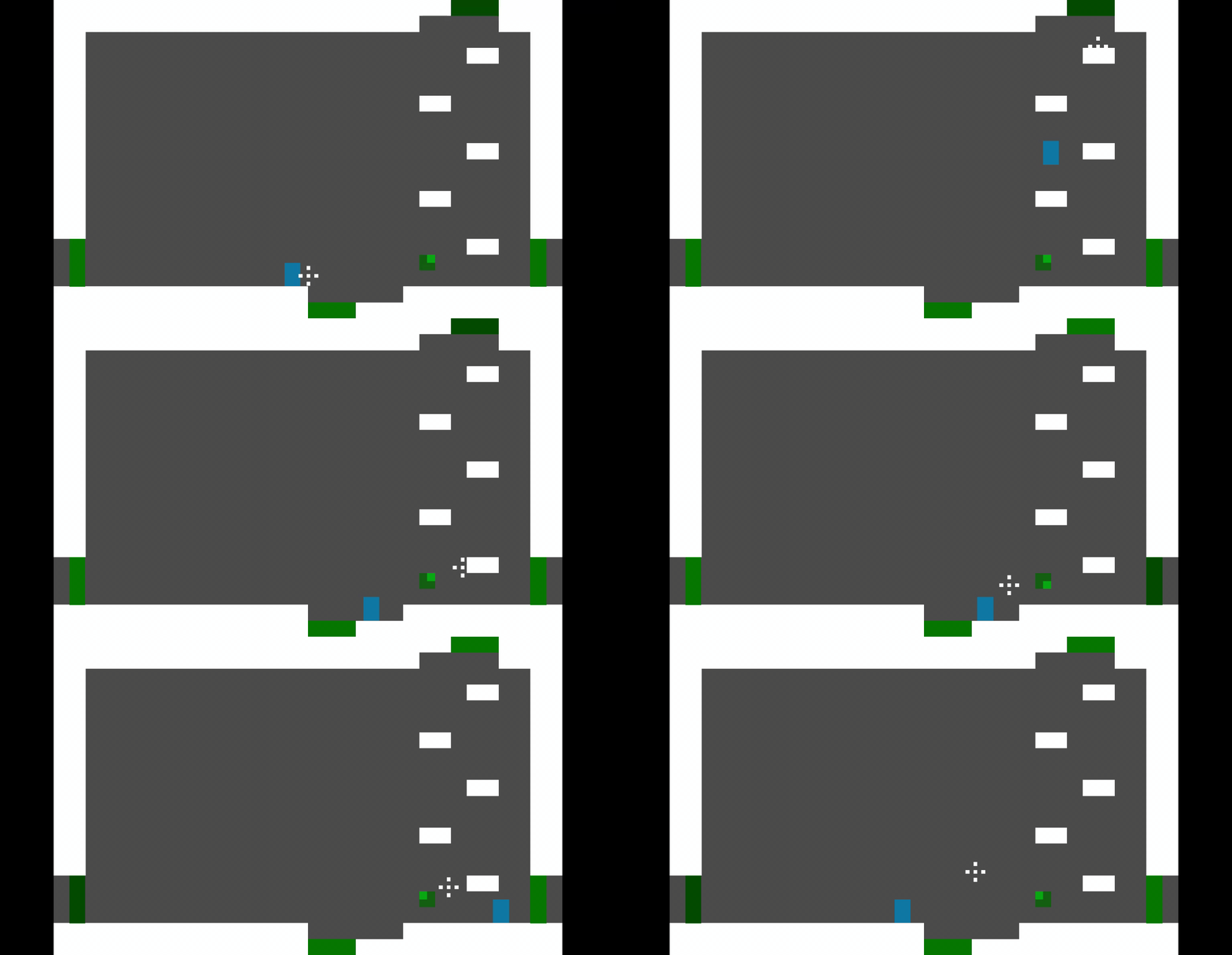
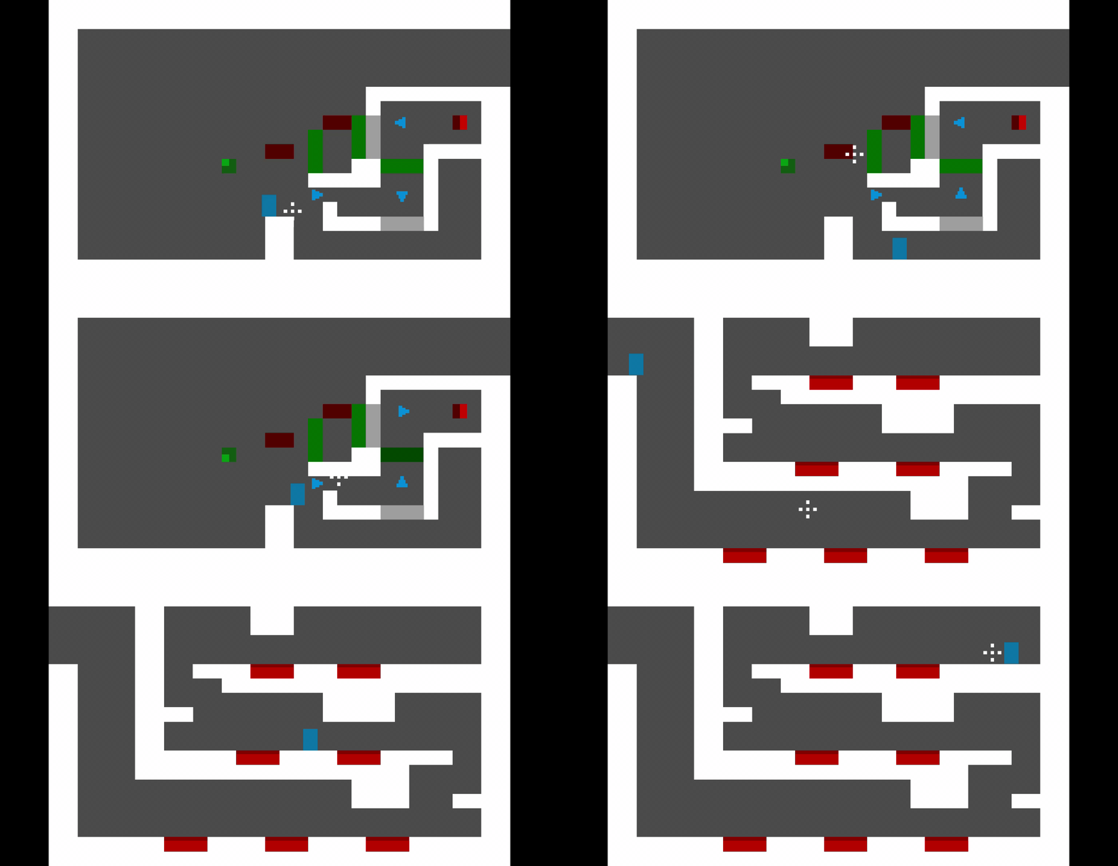
Day 4, The last gem design has been made, all gem has been made into the game :D There another thing I design as well so here's the gif.


The blue gem is triangle (now I look at it, it looks like arrows). It change the direction of the bullet to the direction it points (ok it really like arrows now :/  ), to change its rotation, use bullet that go through special tile(greyer tiles). It can be used to make bullet go to specific direction at some step, for example step one is change the direction to left to hit red gem, then step two is change direction to the right, to the previously real red wall, now a ghost red wall to hit something else.

Note: The green gem now activated by shooting now, not attacking :)

Also I just put another stuff to the game, spikes. You already know the design by seeing the gif, touch it and then you bounce hurt :|

Actually that's it for now, I need hours just to think the blue gem, but now it's just think about other a bit less important things to add to the game, which is a bit easier because most don't need innovations, but more to choice to apply to the design, like ladder that player can go up when in front of it and door that leads to another door that might need keys. But still, applying these design is still good for me as long as the stuff is not too much, I will watch out about my choices for the game.

Well that's that people, thank you and see you tomorrow :)

(+1)

Day 5, so only 1 design made because the issues that comes with it and few more issue in other stuff, but it all done :)

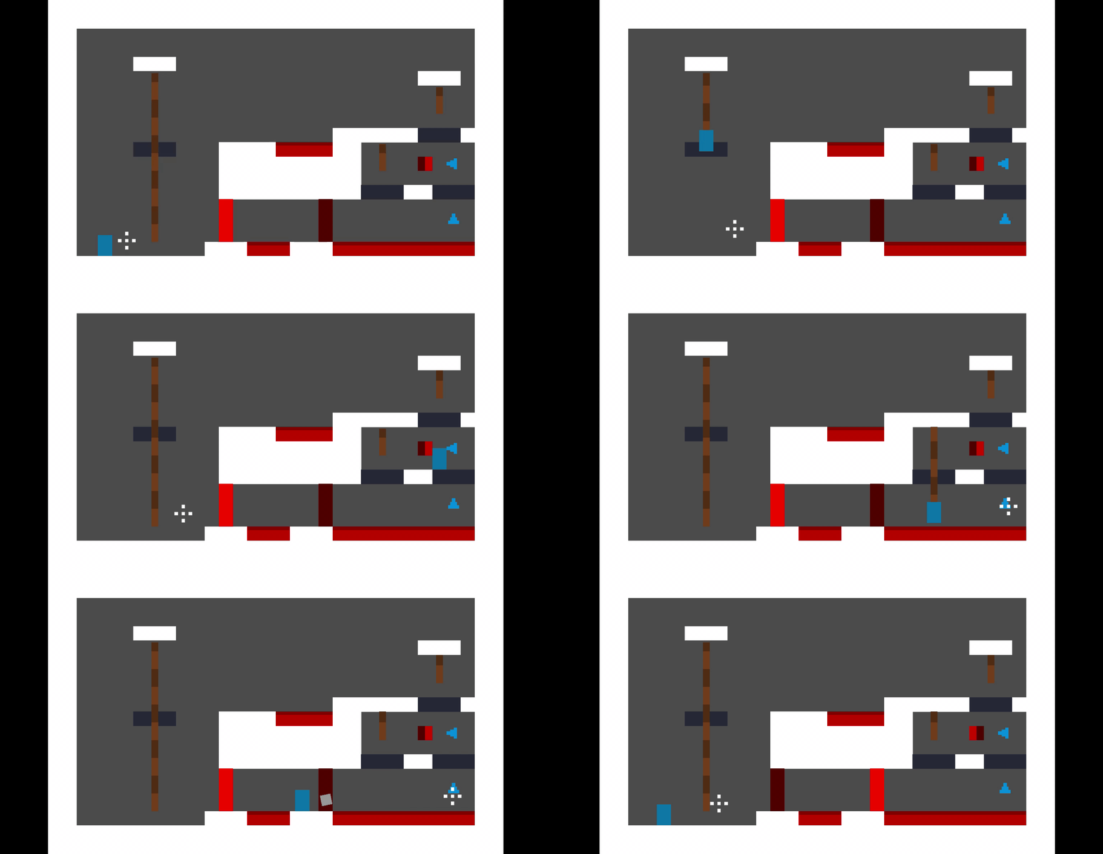
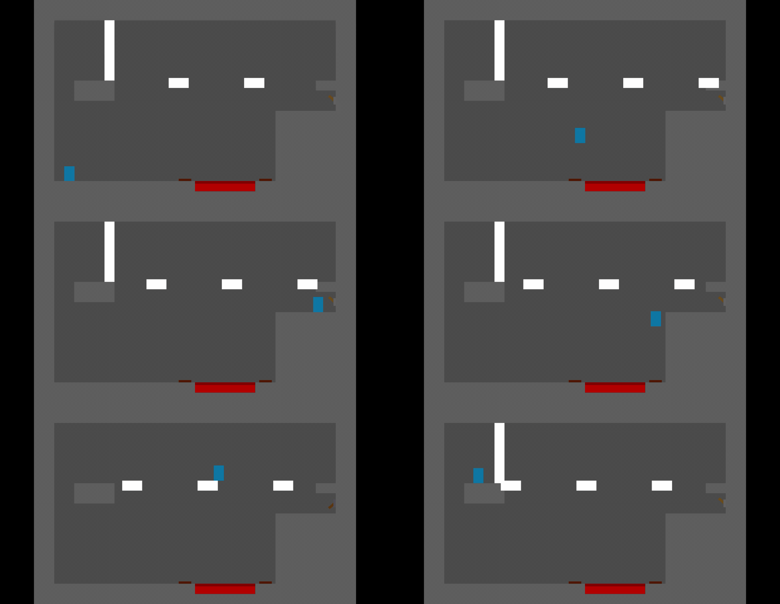
So here the gif focused for the design, the rope.


The rope is used to reach places elevator style thing, when the player grab it, the player can go up and down. The player can shoot and attack technically midair, when the player gets off, it length return to the max ungrab length when not grabbed. This design can be used not only for puzzles, but for platforming as well.

This is not important, you can skip this paragraf. I added two max length for this, max ungrab length(gonna call it ungrab length), and max length, if the rope's length is less than the ungrab length, it will go down until it hits the ungrab length, if more, it will go up, ungrab length will run when not being grabbed(a bit obvious, also technically not really max, just point where to stop) , the max length is run when grabbed, it stop going down when the length reach the max length.

The rope probably defies few logic in the final product, but don't ask :|

And that's all people, good bye and will see you tomorrow ;)

Neat concept! The puzzle elements seem to be coming along nicely so far.

One word of caution–I’m not sure if you’ve accounted for this yet, but the red/green/blue switches might make your game difficult for colorblind players. It’s not an insurmountable issue though, giving them a unique level of value (lightness), adding a subtle pattern to each, or messing with the shapes a bit could probably help make it accessible. I would recommend thinking about it now if you haven’t though, since it would suck to finish the project then realize that it’s an issue!

(+1)

Wow, Thank you for the comment, Hughes. It already taken into account. The green gem shape is gonna be circle (originally making it 45° rotated square thing, but Nah grids say no). I maybe add a colorblind feature for good measure. Still, thank you for the comment

(3 edits) (+2)

Day 7, day 6 there was no post because there some issue and its night for me so I post today. There's three design I made :D, but there's some issue (not error) that might impact the game D:

You know what I'll do, here's the gif

Sorry if the gif is too small, I switch to another converter

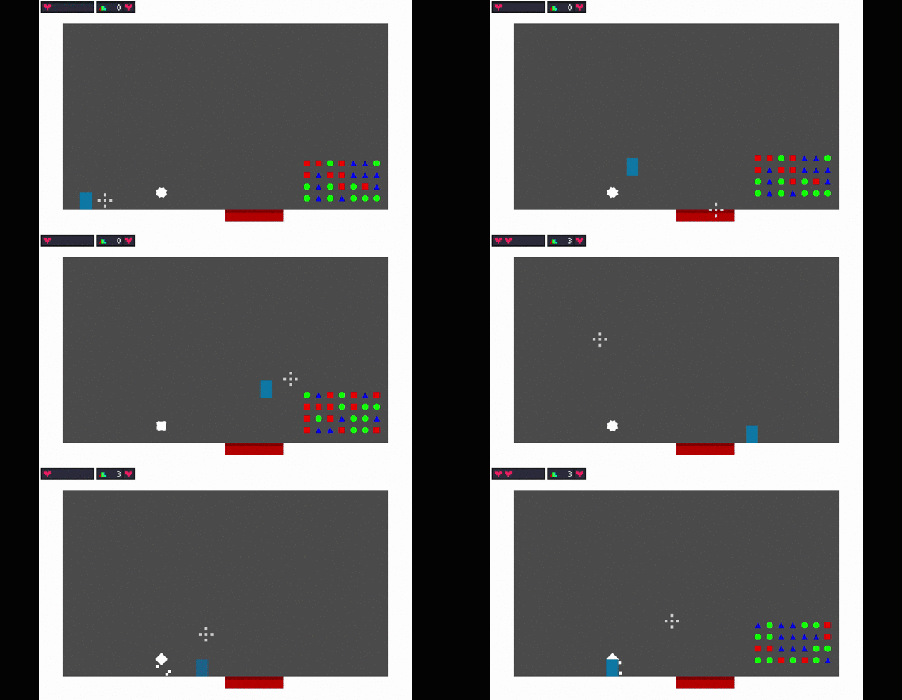
The three stuff I added, checkpoint, healthbar and healing, and coin system (ok now I see it as four :/), I'm gonna explain how I added these, these explanation is not important, you can skip to the "Done Explain".

1. Checkpoint, I added checkpoint by making the spawnpoint, the spawnpoint is an autoload (global variable/ stuff that already there when the game start and doesn't change even if the scene reset). The player position start on the spawnpoint, if the player touch the checkpoint, the spawnpoint's position will be change to the last checkpoint the player touch, now when the player died, the scene resets, but the spawnpoint don't, the player's position is not at the checkpoint, but the player's position is at the spawnpoint's position at is at the checkpoint's position. The checkpoint can only activated once.

2. Coin System, the coins are in different shape and different colors, these are only for visual purpose. The player touch it and the counter adds by 1, basic platforming stuff I know, but there's a gimmick tied to this (I don't know if this count as gimmick), the player can heal with the coin system. The max coins to have is 100, not 99

3. Healthbar, I added UI, the heart texture is tiling, so the texture is repeated. The healing is also a bit easy, if the player have 25 or more coins, they can heal, just click the heart beside the gem counter. Health adds by 1, Coins subtracts by 25. And the method I use to make this? I just put a heal button (the heart beside the gem counter), that it. The health of the player is 5.

Done Explain, I'm sorry if its too complex for some of you or that I didn't explain well enough, I stumble upon an error at day 6, I find the solution at day 7.  Again sorry :(

These stuff are important, as important as the gems, it cause the player to be careful in the game and not too careless when playing, the game's level design are large, so packing extra. But the is another issue for these, the player can cheese the game D: If you look closely at the gif, the coins reset regardless if the checkpoint is activated before or after being collected. The player can just take all the coins, activate the checkpoint and died on purpose, and taking the coin again since it is resets. Autoload couldn't help either, the coin are added to the scene by tiles, so they aren't part of the autoload group, and thus resetable. I might fixed this someday, but this issue will stay.

Well that's a lot of words to type, There some positive feelings along the way when making this project, it feels satisfying that I've done actually this far for a project, fixing bugs and handle issues, made an innovative design, and actually finished a project you love and care. I now felt it. I am still determined to finish this game for you people who is here to watch my progress, thank you for seeing this.

Although I think I should say this at the day this finished, okay. And that's all for today people, good bye and will see you tomorrow ;)

(+1)

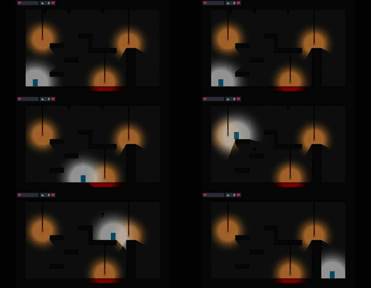
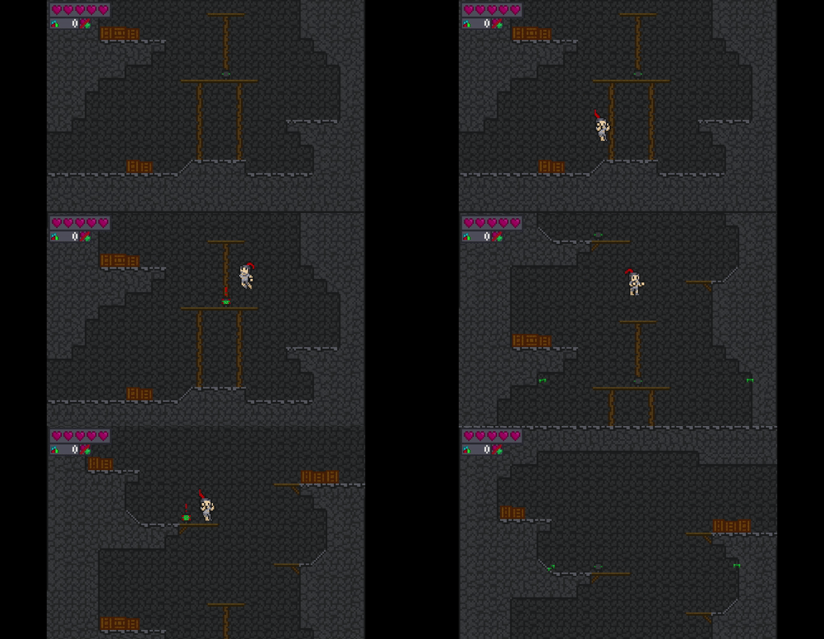
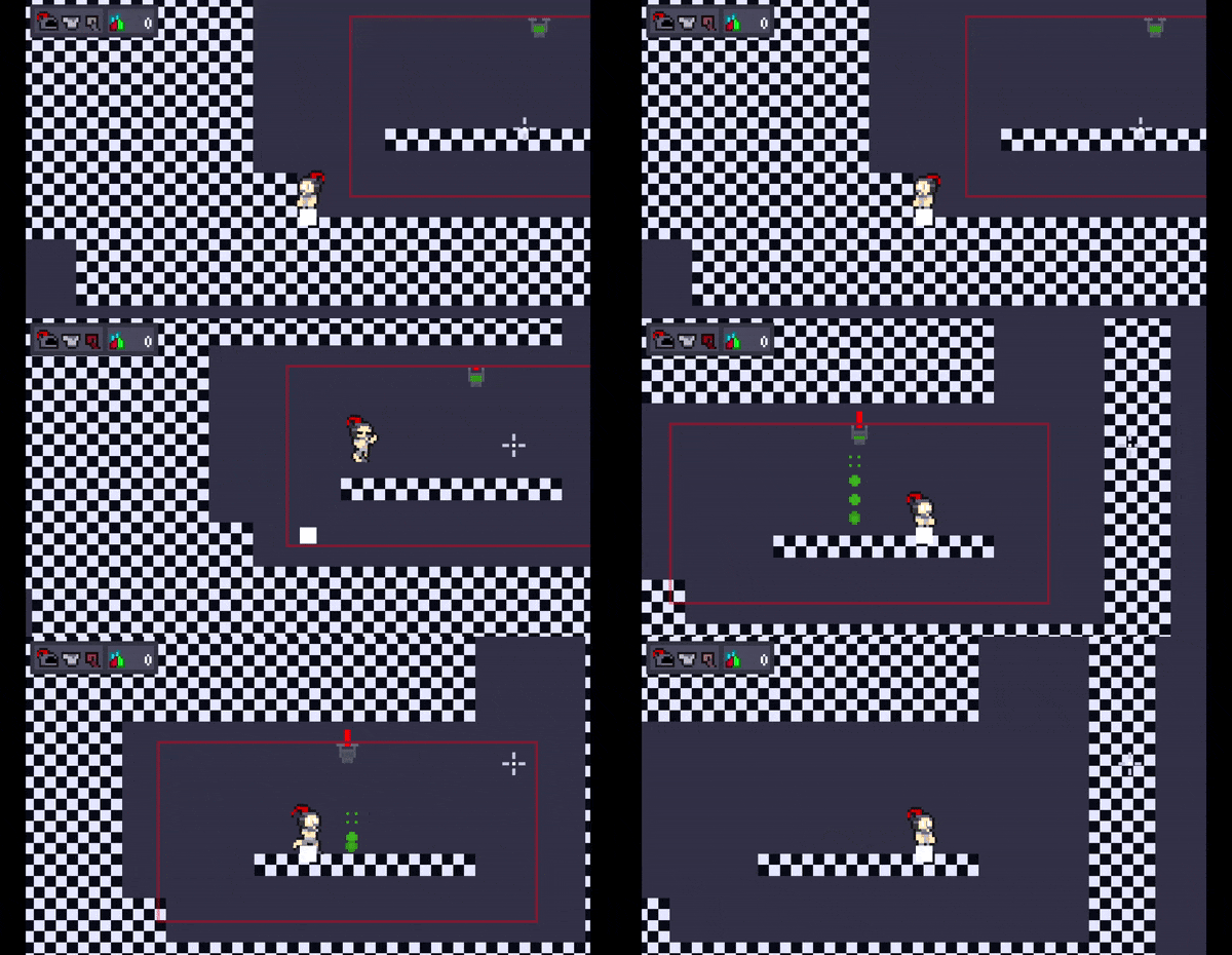
Day 9, day 8 was focused on the coin for checkpoint issue, still not yet fixed, maybe someday :( There are two stuff I added today that a bit for the gameplay, but mostly for the setting and environment, here the gif about the lantern and the dripstones.

The player now has light, I mean, this game took place in a cave, so make sense its dark and the player carry a light source. The lantern's rope behave the same with the grabbing rope, only this time it can't be grabbed and the added light at the end of the rope, it cannot be interactable. The dripstone fall if the player was below it, I planned to give it 50% chance not falling (most likely applied), and destroyed if being shot(most likely not applied).

This is made to make the cave feel like well, cave, with the added challenge of the darkness, and watching out for the dripstones. The environment of the game is important to me, if I'm too careless, the environment feels off, or even ugly and unfit for the settings at the final product. But still variety can be great for a game's environment, I'll can make variety to the game's, it's potential is pretty much limitless at default, so why shouldn't I? It can be long to add, but possible :)

Well that's all people, goodbye and will see you tomorrow ;)

(+1)

Day 10, I officially give up about the coin issue, I'm just gonna make the player being restored at the checkpoint instead of the time being restarted thing. Now that is out, now I talk about the lever and the moving platform.

Here's a very short gif

The lever when pulled down, the platform moves, that's it. The moving platform can be made to move without the lever, these are only for platforming purpose. The lever can be made for something else entirely like for door, or new thing.

Now I'm sorry I didn't really make innovative or cool designs, but I hit a idea block, I don't have any ideas, the idea storage is empty. I planned for stairs, but it didn't really work out. Maybe I find a random generator, combining other people's design to a new good one, or even go out for a while and get ideas in the process, all this are possible.

Well, that actually all people, good bye and will see you tomorrow

great! You doing so good dev logs!

(1 edit) (+1)

Thank you :D while day 10 is rough, still appreciate the comment about the devlog, Thank you

(+1)

Day 11, finally got some neat things added here, three ideas today that is not mundane :D Now lets see it

Here's the great gif. Changes to another converter


The lever that being pulled to control the moving platform, gone and being changed. Now the lever open a passage for certain amount of time, the blocking passage (gonna call it pillar) have a certain length, this can be extra challenge.

Note: The lever can not be reseted while being active, so the player must wait the timer.

The moving platform is going at a specific path at specific speed, few seconds and another pop out, this is for platforming purpose, better then the controlled one.

Note: The player do not move along the platform when jumping

And the last one is the springs, bounce player at specific height, again platforming purpose.

It feels great having ideas again and implementing them successfully too, especially if the designs are changeable into something interesting, adding the potential to the designs and the mechanics around it, the only thing stopping it is my decisions, and that at least is a bit easy to overcome :)

And thats all people, goodbye and will see you tomorrow ;)

(2 edits) (+1)

Day 12, there are no designs today because I'm focusing on uploading the game's prototype and art. Don't worry, the art is only for the player, the weapon, and the gems ;)

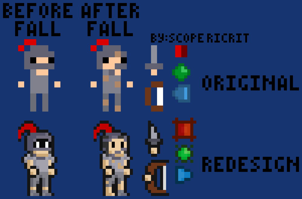
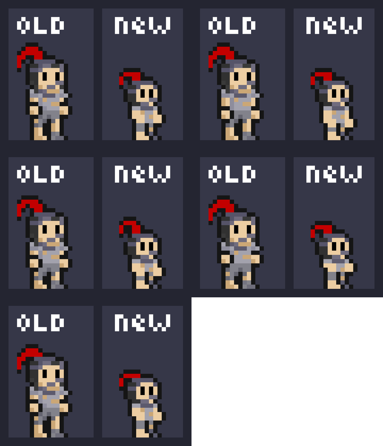
Here's the art design for the original and redesign, this time is in png.

There's a lot of differences between the original I made before this project and the redesign.

1. The art is super simplistic and small in the original, so no outline for the original.

2. Green gems originally be timed and stop for few seconds if activated by attacking left click.

3. The Blue ones originally is shooting blue bullets for the puzzle and a special tile reflects the bullet to other directions.

4. The redesign player is gonna holding a lantern tied on the plume (the red feather thing on the helmet)

5. The original is very short sword, the redesign is dagger. The bow is thicker and longer in length in the redesign.

The art is not gonna have animations yet, because its gonna be pain to make :/ Also gonna put 'by : ...' thingy for the image, it might be dumb :|

Okay now that's out of the way, now I want to ask:

1. Is this design and style good? I mean I see it good, but different perspective have very different taste, maybe need a feedback on it.

2. Is copyright infringement a big problem for starting people like me? I'm worried that my work is stolen. I need a little bit of tips about that, Null is literally just a white cube (from my previous game, you can check that out if you want, not really good though). This question is optional to answer (doesn't mean the first one is required)

Well, that's all people, goodbye and most likely will not see you tomorrow because I want to make the prototype now :/

So there's no nothing huh... Thats fine you guys just do the feedback on the prototype I'm still making, just need to make the level design and thats a bit because of the combination of the puzzles. But still, love to see feedbacks. Okay thats all people ;)

I think the redesign is an improvement, overall. I’m not really sure what you’re asking about re: copyright infringement though… are you worried people will take your art or something? Worried that you’re infringing someone else’s work? Not really clear from the question.

(1 edit)

Thank you for the reply Hughes. I worried  about the former one. I just worried that someone will stole my art and possibly even my OC (original character) and blame me. I'm a little bit too worried about that. I'm gonna stop thinking about that, sorry :(

Ah, you’re not alone. Most people have those worries, especially early on. I wouldn’t sweat it too much though, for a few reasons:

  • IANAL, but I believe in most places Copyright is automatically assigned to the creator of a work. Making and posting a character, provided it doesn’t already exist, is enough to make it legally yours… so as long as you don’t have people taking your designs directly off of your hard-drive there should be proof that you own your work.
  • With that said, while IP theft does happen and reports/DMCA can be used to deal with them…it’s not usually something that will hurt you much in the long run and it’s not worth the time to actively hunt down unless you’re a big business that can spare the effort. Personally, what I do is deal with anything I run into (usually starting with a quick message) but otherwise don’t spend time looking for folks who infringe. Most people copying work don’t mean badly, they just don’t know better.

In other words, your worries are totally natural but I’d reassure you that it shouldn’t be a major issue.

(1 edit)

Wow Thank you very much Hughes. I thought copyright infringement was so serious that it will hurt in short and long run, Now I have no afraid, again Thank you very much.

(+1)

Might be late to reply

But ur doing an incredible job

and the redesigned character looks way more awesome

liked the idea of the dangling lantern btw :)


It might be hard working on the same game everyday and posting devlogs about it .. with almost no reply per post, but don't let that get you down 

sooner or later people will come across your work and will give you their feedback.

keep up the good work , you will get stronger by the day


Hope u make it to the top 


Good luck

(+1)

Day 18 or 17, let just call it 18. Alright the prototype is finished. Its all done, officially playable.

In the prototype, only the gems and few secondary mechanics are added to the game, and its a very short metroidvania platformer with barely ten rooms. The art is also does not animating, it will be pain to make animation for the art, especially this early, maybe someday. There are few tutorials, but I didn't know if its count as interactable, and same for colorblind, I don't know if I have to add the colorblind feature and not just shapes to call it a colorblind friendly. The basic controls are in the pages.

And of course, you can give feedback in the page's comment, it can be a bug or glitches reports, or an idea for a mechanic surrounding the core features. I will see them and most likely reply on them.

Here's the link, or just click my profile and see it for yourself if you are not a link user.

Well that is all people, good bye and will see you someday ;)

Also before some of you ask, this is not a horror game >:(

(1 edit) (+1)

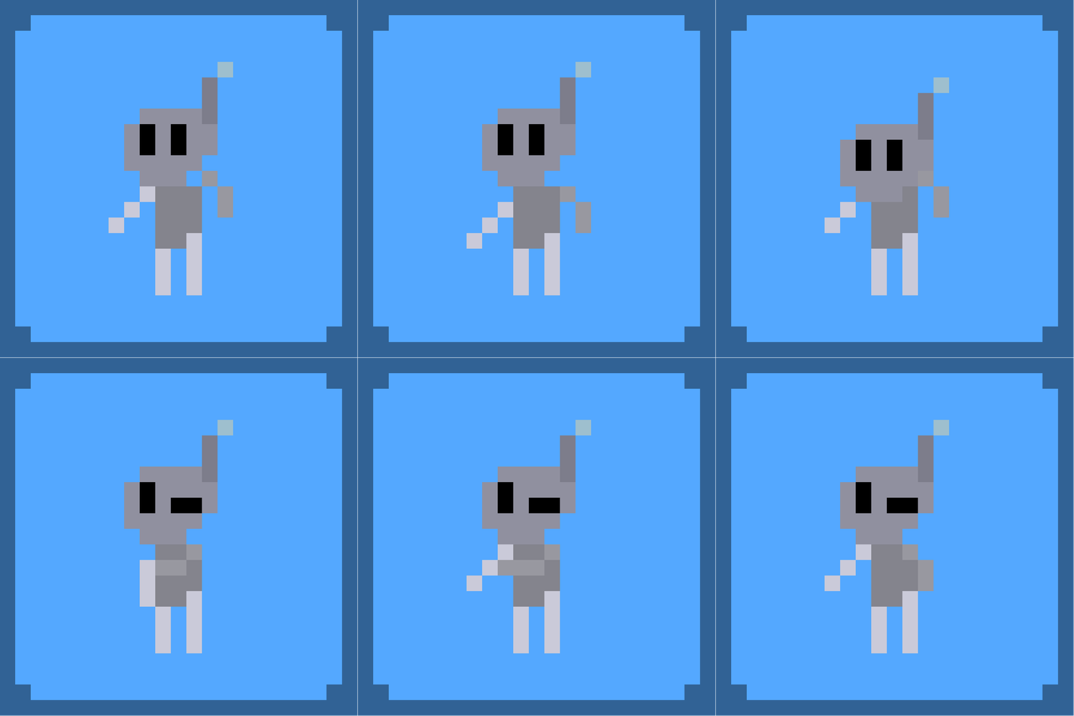
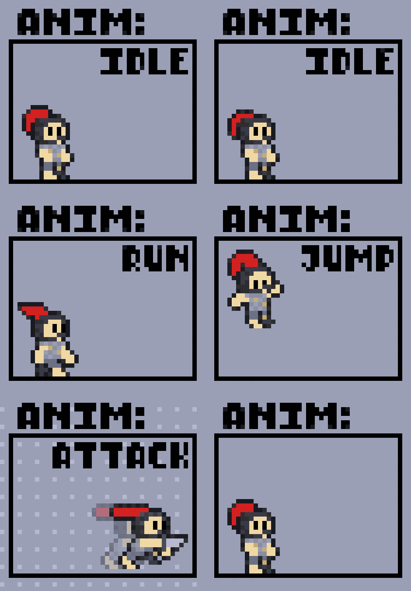
Day 19, I'm now focused on the animations. Thought it will be a lot pain, turns out it only a little bit of pain (unless I go to all things must be big and animated thing)

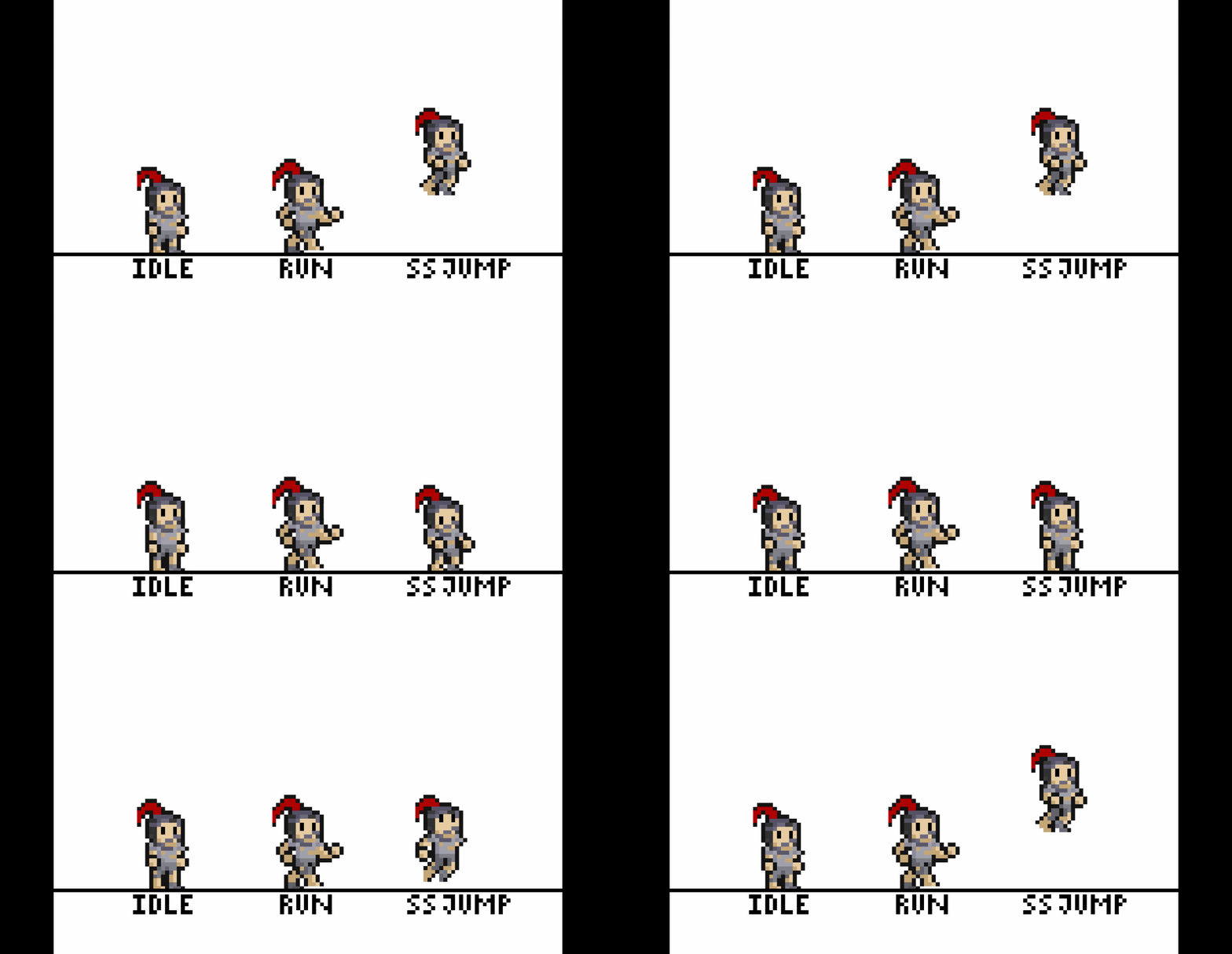
So, here is the gif, I screen record it so it a little bit weird and laggy feel, and also that 'ss' thing, somehow it exist, I don't know what happen. sorry :(


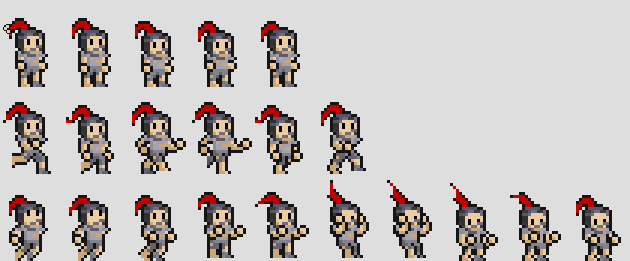
or just look at the png version, this is 3 times the original size.


The animation of the player for now is really just idle, run, and jump. The rest is on the way.

This is already big for me, the idle and run are easy, jump is a bit more, it will be like this (not important, you can skip to 'Done Explaining').

1. When jump is started and the player goes up, it will play the first 2 frame (from the bottom set of frames);

2. Then when player starts falling, it plays frame 3,4, and 5;

3. After frame 5, it plays frame 6 and 7;

4. When the player land, it will play the rest of the frames before play the idle animation

Done Explaining, don't understand that? Its okay, it is not important anyway :)

Now about the attack, still making the structure because there are no such thing as dash attack animation, even if they exist, it might not fit with the player's dagger dash.

About the shooting, not even planned yet. But most likely just pebble throw, I change shooting arrow to throwing rocks.

I still care about this game alright, trust me. I'm absent for days just to make the game's prototype. 

Well that's all people, goodbye and see you tomorrow ;)

(2 edits) (+4)

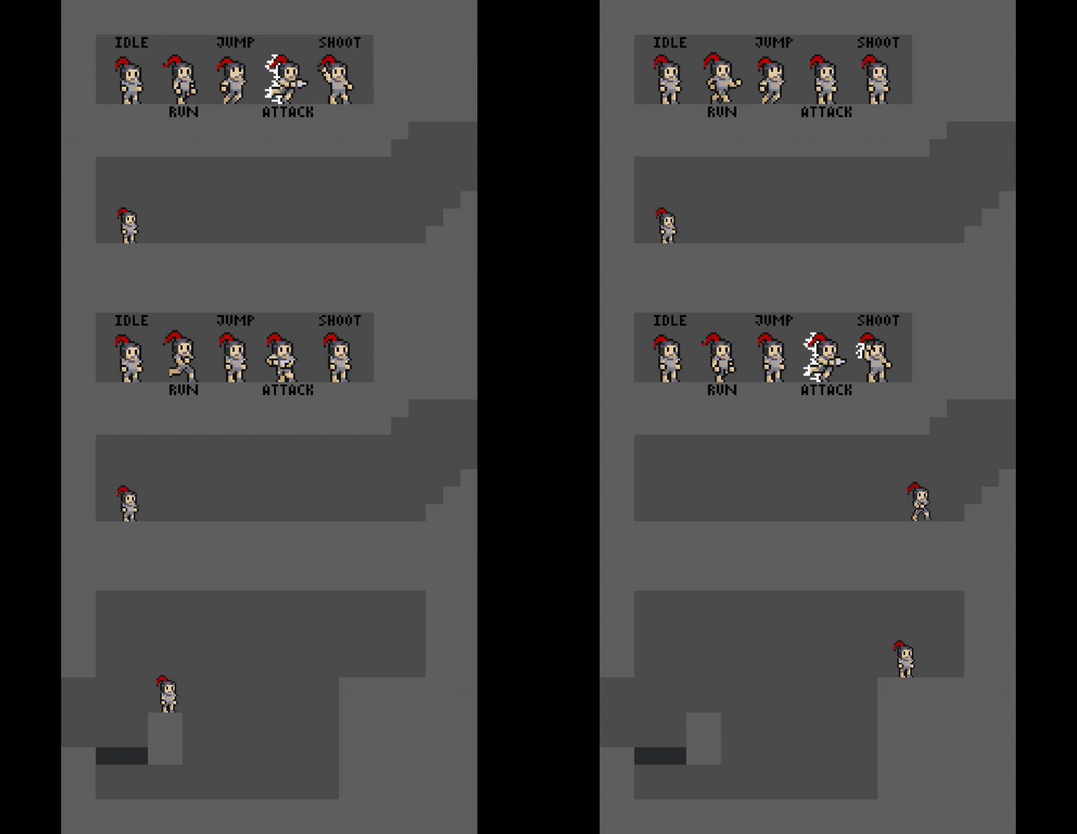
Day 21, the animation for the player is finished, maybe I will make some fixes for it, but still. Now only the gems is need of animation. Also extra movement bits.

Here's the footage, a little bit less laggy now.

 All the player's animation is presented up there, the shoot is more to throwing now, and the bullets you throw are now rocks, which is because a little bit logical to throw random rocks than arrow that you can use for defense, and also it eliminate charging bow shenanigans :\
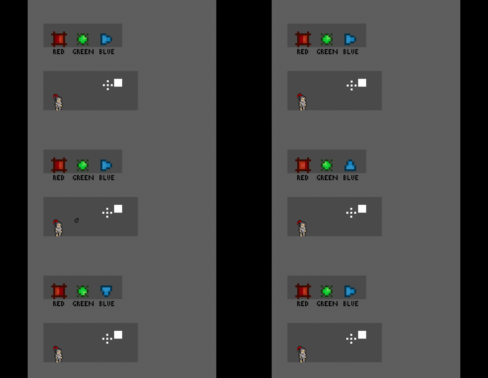
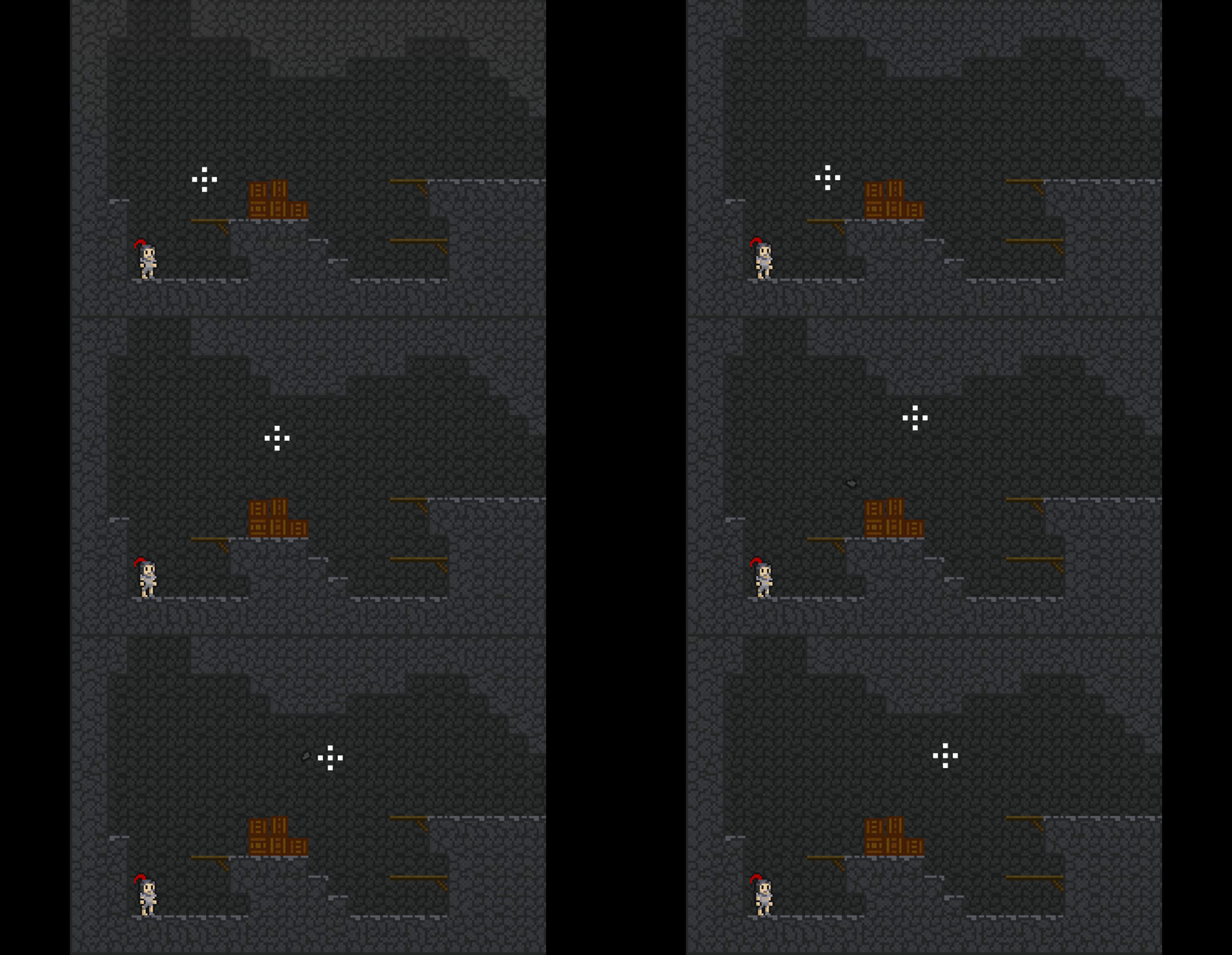
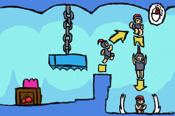
Now the second one I wanna talk about is that the player can jump few frame after falling off a cliff, but I do discover a new unintentional feature. The player attacks and dashing few frames after the dash you can jump again, it can be similar double jump (maybe) and I can use it as mechanic , but I don't know maybe make it just an easter egg or something. I had no idea how difficult it is for players to do this jump so I don't know whether I should added this jump or not, it might has an impact for the platforming. Maybe someday in a prototype update.

Well, that's about it really, I'm busy for other stuff so a little bit less time to make the game, but still a lot of time in my opinion. Still this game has potentials I sure it has, just need some good inspiration for the game and we're great.

Well that's all people, good bye and will see you someday ;)

(+2)

Day 22, the gem's animation is finished :D the texture of the gems (and red platforms, green wall, rock throw) is done.

Here's the gif, which is in my opinion the least work done to it (for now at least :\  )
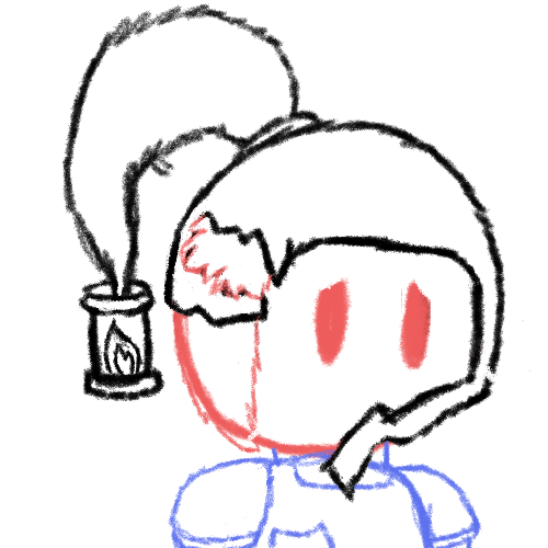

If you thought this is perfect loop, trust me its not.

The gems is more different shape for colorblind players (still don't know if this enough to claim it as colorblind friendly), the controls (attack and shoot) can be hold and still activating after a second it activated and the projectile is now rock, not arrow. I'm not gonna show the rest because it will take more seconds of footage.

And also I completely forgot to say this, but if you don't notice, I made the room smaller, its now 192 pixel wide and 128 pixel tall (or if a tile's length is 8 pixel, 24 tiles wide and 16 tiles tall). It limits the room's content and puzzle to work with, making it a bit easier and quicker for me to made and make a little more cramp feeling.

Now I'm working on the world's tiles and maybe more art for other thing to made, but its small and simple enough to not be a long pain to make.

My time for the game has increased overnight :) but someday will decreased overnight :( I can do more for the game now, still no inspiration but at least I made something.

Well that is all people, goodbye and will see you someday ;) 

(+2)

Day 24, Still working on the art, the world's one is pretty much done, just need to make the art for few more and maybe making the prototype again (probably the day after tomorrow)

Here's the gif, pretty short, but still good :)

Now there are few things here, planks for jump through / one way platforms, boxes for decoration only, animation for rocks(or projectile) that been destroyed and also stone tiles. And I also planned some layers of stones that darken the further it is in the background for a little bit of cave detail, this might be hard but I'm gonna do it. But for me this is still not enough, but already a lot of cave vibe (lighting and lanterns already done, but for the sake of playtesting, will not apply them yet :| ).

And now, if it weren't obvious enough, the player is in a big mine full of gems. Is it abandoned or not, does it have a lot of small area or few big area, I don't know. I'm still making concepts of it, maybe after the prototype, I get to the real working of the true build and no more small prototypes (maybe a big ones, like alpha or beta or something).

Well that is all people, goodbye and will see you tomorrow ;)

This looks great! Interesting cave. Cool pixel art, nice animations! And atmosphere to explore this cave!

Deleted 2 years ago
(+1)

Hey there, thank you for playing the game :D And to answer your question, When commenting, look for a square with triangle and a circle in it above the textbox to add image. And the GIF maximum size is 3 MB. Sorry if I sound too formal

Deleted 2 years ago
(+1)

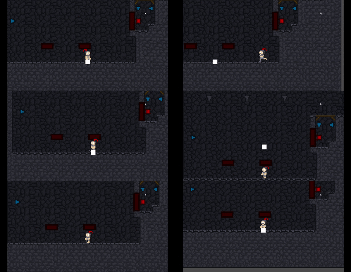
Oh yea sorry not replying yesterday. I only upload 1 GIF per day (because I can cramp all new features into one single footages :) ), but maybe you can upload more per day. Now the only problem I experience when I upload GIFs is the size of the GIF is more that 3 MB, only that honestly, it because (from my experience) of is the mp4 converter plus slow internet (maybe, dont know if this solid :| ) causing to upload more slower and making it bigger. Again it only my experience, your cause of not uploading is most likely not. And also sorry for my dumb reply yesterday, I replied when my brain were numb in my morning :\
Deleted 2 years ago
(1 edit)

Day 28, there a lot of things added to the game. One is not ready yet. But I'm gonna talk about brand new struggle that quickly eliminated, but waste almost if not more than an hour of my time (also plus some few things) 

Here's the gif, low in quality, but still understandable. 


I'm gonna explaining the quick scene.

1. Redesigned UI on the upper left

2. New technically enemy, it shoots bullet to left and right whenever it detects the player, it can detect as far as the room. 

3. Remember that stairs that didn't work out? It because it is technically a slope, and look closely and you see a slope at the floor, so what happen? It because the player slides on it, its not really what I want, I tried a solution it doesn't work. Turns out there is a obvious solution, stop_on_slope = true (yes, it is real :| )

Now that's done, let's talk about that thing shall we, though this not really important, so you can skip it and done reading. 

Now the gif might looks bad, or even unwatchable for some, but I have no choice :(

You see, itch io can only hold images with the size of only 3 MB max, this includes GIF and MP4. So I convert the mp4 to gif which can be smaller, simple enough right? Yes, but... 

My usual converter usually reduce the mp4 to a gif below the limit  but now not only the gif increase the size above the limit, but the gif is now double the size of the mp4 (12 MB for a short 6 MB video) which is small but with limit of 3 MB, the size is like infinity and beyond.

And oh boy it confuse me effectively. I try convert with the other one, but it still doubles. Reduce the length of the video, reduce it a tiny tiny bit. I finally gave up and search a new one and thankfully I found one that not only can convert but can cut the video much more easier.

But the gif is barely above 3 MB, so I need to reduce quality and cut the footage a little. And now we're here, with a 2.9 MB gif, with the length of 7 or 6 seconds (yes, that short), that is the phewest phew I ever have. 

I want to thank that converter so much (not sponsor), or else I post this tomorrow. And I think it because of bad internet that cause it to double. 

Now that's all people, goodbye and see you tomorrow (Great, Now I have bad feelings that the size will be triple) 

Day 33, Alright I'm back with some good news, the gif is smooth now and have 1 MB in size, perfection :) Alright let's just go to the things

Here is two gif this time, pretty pretty good.

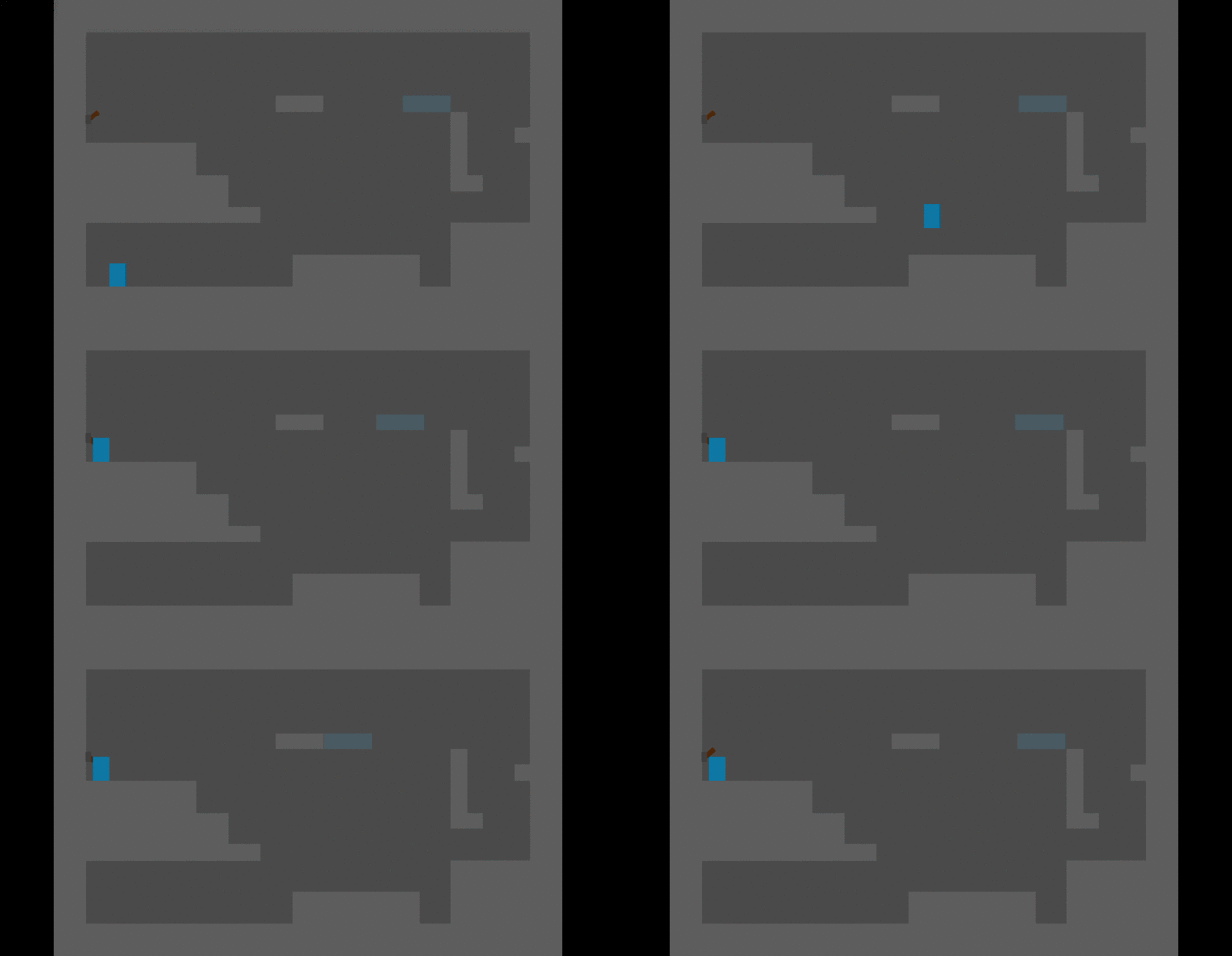
Ah yes, I forgot to apply the background. Here some unused stuff (not these stuff from the gifs). In the last footage, I want to apply a scrolling camera that go two rooms instead of one, its feels neat to swapping between metroid(room) camera and a scrolling camera. But now it was scrapped, it not really work for one reasons, maybe I bring it back to life someday, but we'll never know :( Also slopes also scrapped because it a bit useless and only for aesthetic and a blocky room pretty much fine.

Now to the stuff:

1. New enemy, fly over you and shooting three bullets before dropping it self to you, only down.

2. Added acceleration and friction, don't worry, it will not feel like running on ice, going for Celeste running kind here, short acceleration and friction, also added it to the enemy but now that feels like ice, still adjust it.

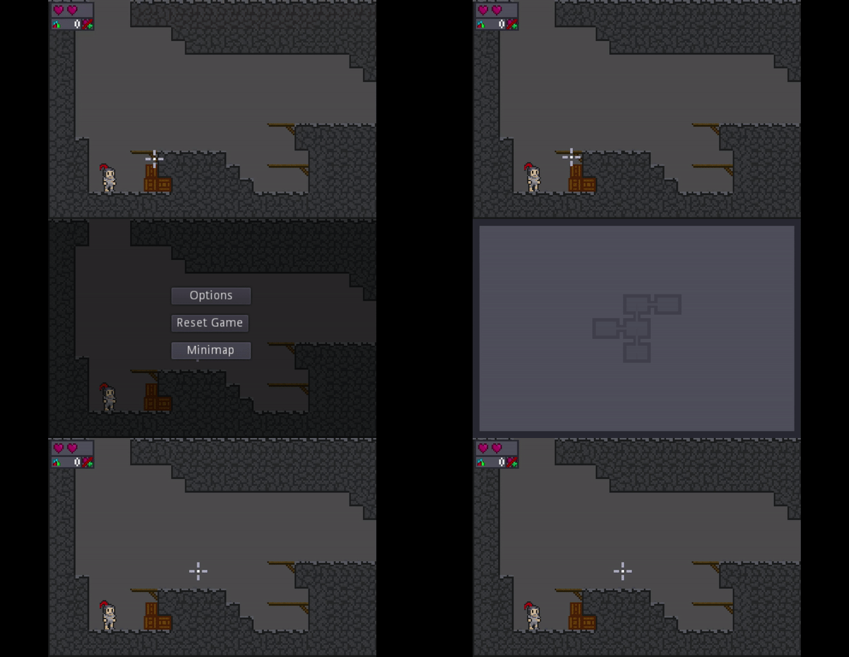
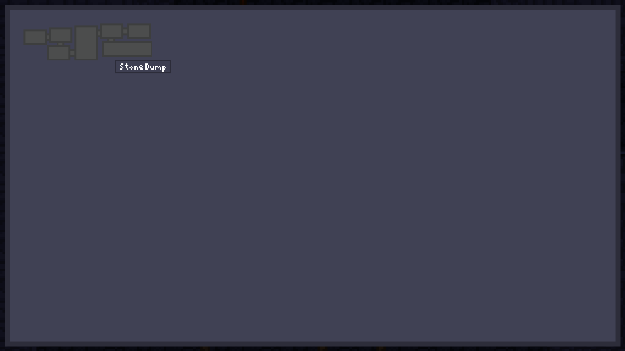
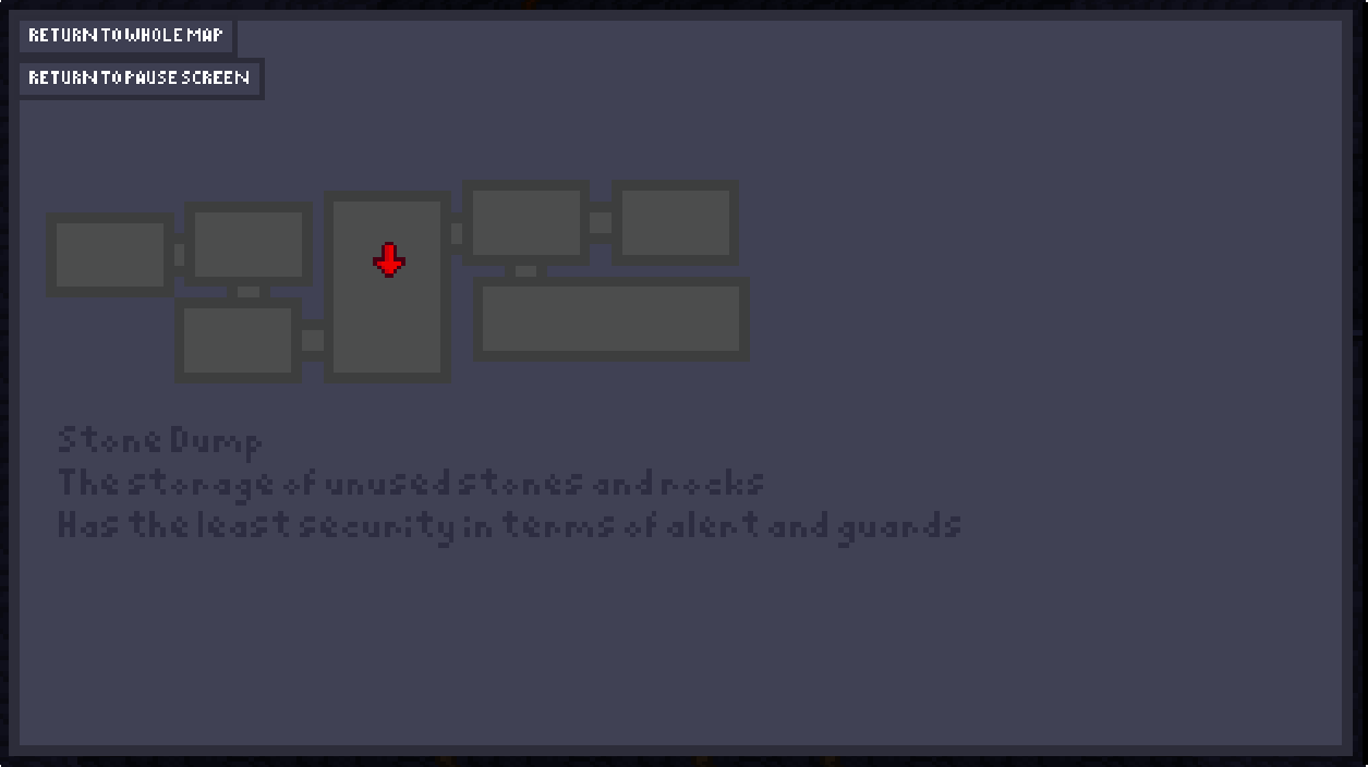
3. And the big one, minimap, a room will show up in the map if the player gets in one, you can see it in the pause menu, pretty much inspired by Raider Kid and The Ruby Chest (the game is in itch io if you want to search, I pretty much copy this mechanic). The rooms in the minimap have a line connecting to each other, and the player is marked of course. Though this minimap don't work yet, I'm still in the process of making it. This of course can make navigating through the cave easier, and probably going to secret rooms easier, since the connecting line exposed them a little bit.

Well that's all people, goodbye and will see you someday ;) Finally a lot of things to apply and inspirations too, feels great :D

(1 edit)

Day 34, alright I honestly got no new concept, there's only some bug fixes and few more graphic updates. I don't need it anyway, this post is more to future planning for the projects.

No new concepts, so no gif to give

So I've been working on the game's second prototype, just need to layout the level design, do my best to balance out the platforming and puzzle, and most importantly the fun in this game. And I need to know the possibility of the layout can be, whether red tile can be used as floating platform, using a blue gem to change the rotation of another blue gem (yes, that is possible), and more. I really hope I can make this game fun, which is really it supposed purpose.

Now I'm gonna talk about the planning stuff.

So when I upload the prototype into the world of itch io, I'm gonna go on hiatus(don't know if spelled it right) or not working for this game for maybe one week for other more smaller projects, maybe a game jam or something, why? Well simple, learning. This project isn't actually my second game, it is second in public, this is the third fully worked project, but that true second project was never released because of lack of innovations and true fun, its a platformer, basically my first experiences is in platformer. That project took few month or maybe a year (most likely months) to make, which was massive in indie standard, and that time was wasted for a boring, uninteresting game with hard difficulty. This game, I am not proud of that.

But still, that because of lack of productivity and back then I pretty the newest for the engine (Godot), back then I don't even know how to make animation in code. Now  I'm more experience, still a beginner, but I still knew what I was doing. And now I know it could be done pretty quick, proven by my own previous game, A Probable Null, which still has holes, but still good enough. And I'm now wanna learn again but bigger and bigger overtime, to know how to innovate better, collaborate better, and the best of all, make the overall experience greater. After the prototype though, I still want some feedback for this game.

Well that is all people, goodbye and will see you someday.

Day 41, Alright everyone the prototype is done and ready to launch, I won't fix any bugs present because I'm participate in a game jam. Still feedback on the game in general are greatly appreciated. Also I made a mistake where I don't put the prototype link in the first post, and as a result some people who visit this devlog might didn't think there are existing prototype, This mistake won't be repeated. Also also there some small changes like texture updates and few big notable ones.  

Well that is all people, goodbye and enjoy the game :)

Day 44, The game I made for the game jam has failed by a focus on story mistake :( Okay let's get to the chase.

No new mechanic were being made except for the scrapped scrolling camera, it has been revived yay :D

But there is new concept: The game's areas. Here's the picture of the concept art in the form of PNG


Wow when I made this it look basic but now it look like an actual concept art. Also this is a metroidvania what a surprise right.

I gonna explain some of these stuff:

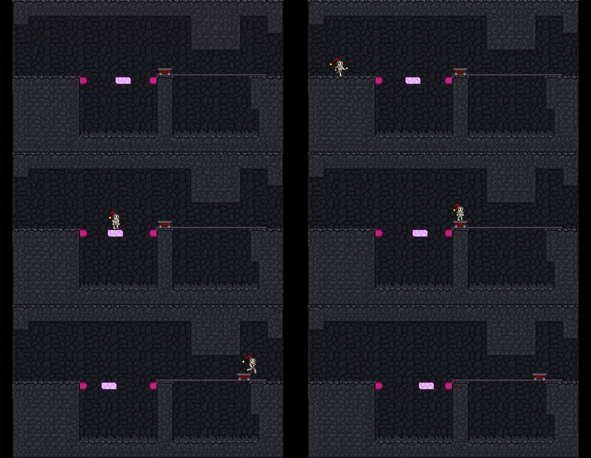
1. Minecarts can run automatically or using magnets to move around above rails, magnets that you can use for ropes with a metal block at the end.

2. Gliding Paper is a one way moving platform gliding down, most likely used for one way trip through large gap.

3. Jelly is used just like bouncing springs.

4. Gear that can be rotated by throwing rocks at them, most likely scrapped and replaced

5. Crystals has no concept yet, might be scrapped.

Like a good metroidvania, it has connected, branching areas that have some different or completely distinct mechanics in each area that make the experience fresh.

The existents of this areas can be easily explained, like Stone Dump, being a place to dump stones to use later; Asteroid Corpse being a destroyed asteroid (Except for the OakGear Piles, gonna change it to OakGear Machines). But still, can't hide from the fact that these area can fail and gone, reduce to atoms. So these areas can changed partially or completely in structure and concept.

That's all people goodbye and see you someday ;)

(2 edits)

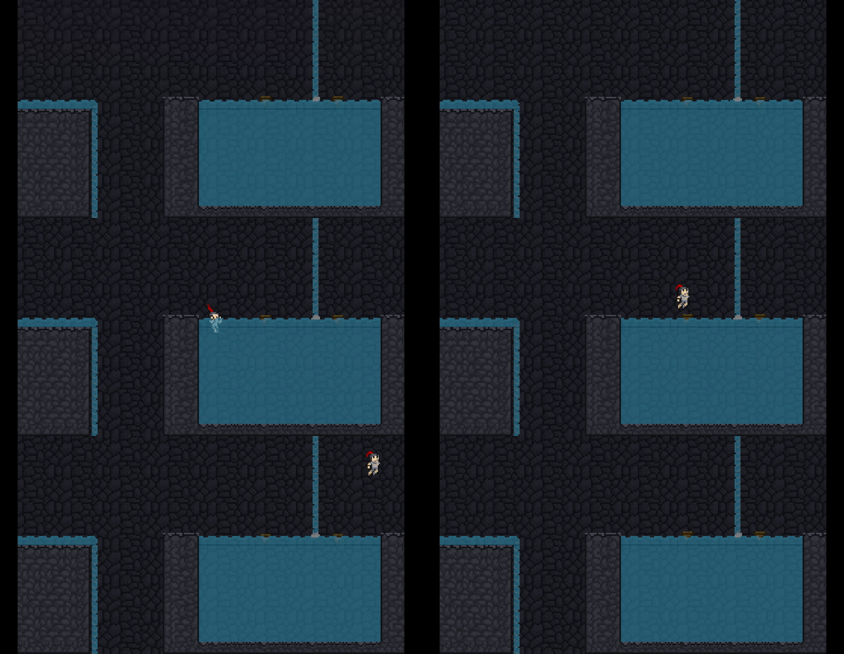
Day 47, The Bursten Riverfall (Water-mechanic area) and JellyPaper Canteen are in the works, Stone Dump pretty finished.

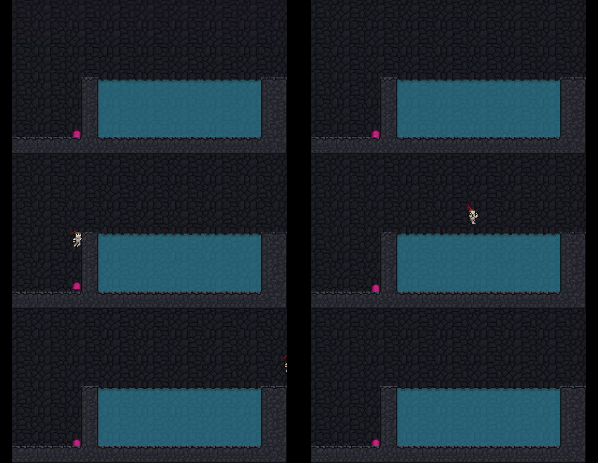
And behold, a very smooth gif about two mechanics B)


As you can see, there are water tile now, and waterfall are in the works. And no, the water does not make you swim only, you can still dash and throw inside the water, albeit with slower movement except for the dash, its still normal. And you can dash anytime in the water even if you are afloat. A Breathing Meter... I don't think that will ever exist :\
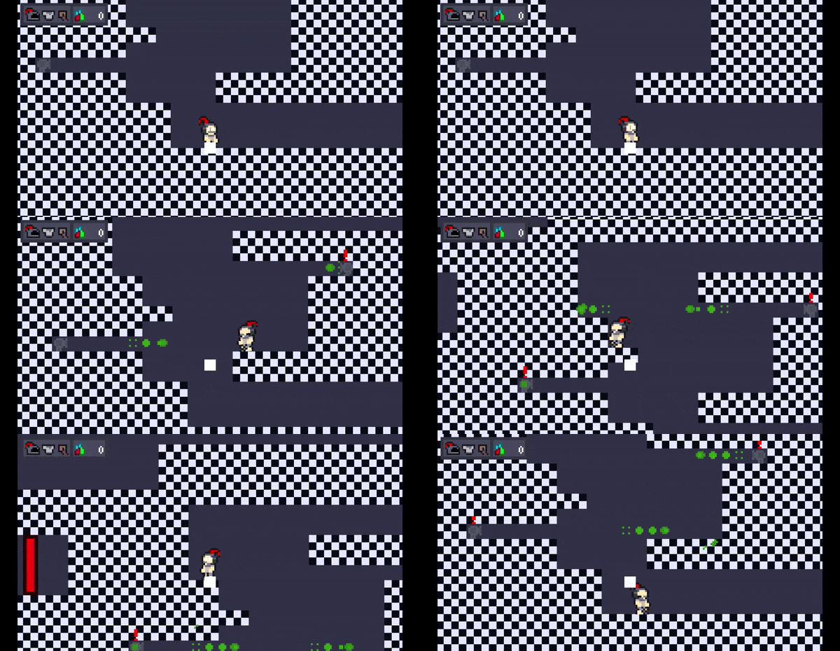
And that pink thing over there? That's jelly, you can bounce on them, this is literally the re-art of the springs. But it also do something else interesting. There is a dash jump in this game, which is jumping right after a dash. You can dash after a jelly bounce, which means that you can literally double jump. Bounce on jelly, dash, and jump. BOOM! I created a double jump accidently, another glasses for me B)

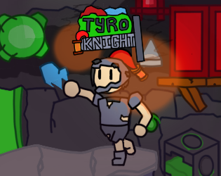
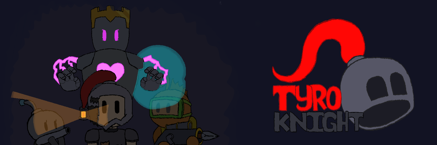
There another thing I want to announce, new title cover. It contained all existing mechanic in the current prototype. Just take a look!


This little image gonna be present today, still it gonna be changed later on AND most importantly yeah other people have different taste. So if you can and want, please leave feedback on this image. It really helpful. And also the prototype is gonna listed in browse and search.

Okay then that's all people, goodbye and will see you someday ;)

Oh yea I participate in another game jam so wish me luck :D

(+1)

Day 45, the waterfall is finished, one new platform is introduced, and a system is implemented to the game :)

Here is another smooth gif


Note: That line is just rendering issue

1. I counted every part of the waterfall, the top of the edge of the cliff, the middle where it flows down, and the bottom where it splashes. Though it just an aesthetic choice. 

2. Speaking of flow, there's flowing water, it pushes the player at specific speed, most likely used for a gap where even dashing can't get you over or as a bit of a challenge, like throwing when moving or trying to not fall off the cliff by the water. This is also aesthetic and a bit of logic choice, I mean flowing water pushes you a little bit :|

3. If you look closely at the pool of water on the right, there is a floating platform for this area with an added feature. You have to be careful for the platform's underside, the bottom is sharp.

4. A new physics system is added to the player, inertia? (Really, I don't know if inertia is right for this) You jump along the flowing water or moving platform. This was done by adding another velocity to the player.

Okay then that's all people, good bye and will see you next time ;)

(+2)

Day 46, there are no new mechanics introduced because I've made a new book. No not like lore book  , no no. It's room design book. Tyro Knight Room Book (I know, creative name there :) ) 

Now I can't provide a photo of the book because of privacy reasons (And also because the book looks messy and look like a child's very first art and craft but hey something is something :| )

This little gem is of course gonna be used for the game's rooms design. It has room ID and the stage the room was in. Why didn't I just used a skecthing app to draw the level out? Well... Because I'm not gonna touch the computer alias where I'm make the game literally for a month for vacation reasons. This book is handy so I wouldn't just think the room there and then forgot about it. And also this book is inspired by Goodgis

Well then that's all people, good bye and will see you next time ;) 

Day 47, there's two mechanic introduced of the area's concept, Moving Paper Platforms and Magnet Minecart. "But we already have feather moving platform :0" I hear some of you saying, but the feather platform doesn't work, I will explained it(and for those that don't know, go to day 11 for more detail).

Here's the clip


Here's the mechanic being introduced:

1. Moving Paper Platform.   It doesn't look like it, but that moving platform is made out of paper, moved by good ol' magic, bounce and switch direction by jelly, and no that particular jelly doesn't work for our little knight here. Why not use the feather platform with paper texture? Well feather platform changed the knight's both velocity because of it's collision, so the player fall off the side, this is not how it work, definitely not. And it uses pathing to get to the point it go, so applying inertia is impossible without direction calculation. So I remake it into current design, this time using actual velocity, so inertia is easy now. Also it only go left and right ;:\

2. Magnet Minecart.   The minecart is basically sideway rope, this time used over rail gap. The lore bit is you insert the magnet for the rope and use it like a lever, moving it left or right, it only go to rail bump, no beyond, sadly the animation weren't made yet for our knight :( Also there's lantern variation to the new minecart

Remember, this two is used in different maybe far apart areas, so they not make each other useless.

Also here's some minor changes to our little knight:

1. Added blinking to the animation

2. Improve the throwing and the grabbing rope animation

Well that's all people, goodbye and see you next time ;)

(1 edit)

Day 55, I am back now, no new mechanic this time, it's a full on boss now, Laratin Minlie (I can't stop giving names to something or someone).

Here's gonna be the first boss in the game, she is a girl. The gif is super massive, I don't want to resize it if it mean resizing every single frame.

Here's Minlie, trust me, I don't copy Minnie Mouse name alright, at least it's better than Minty.

Minlie was in progress of making, so no footage. Her battle take place at the end Stone Dump and the entrance of the Bursten Riverfall.

She has a cannon hand that shoots long rods, she also has leap legs, if she bounce(jumping right after landing, like on a trampoline) and create a shockwave. This particular boss is a little bit inspired by The False Knight from Hollow Knight (mhm, the word Knight is real trending in the industry) in term of personality and gameplay.

She's panic with sweats when her health is low, just like him and she uses projectiles (which is upside-down falling spikes) when panicking, and she's not a guard, she still training, you suddenly met her, and there's no bell alarm installed at Stone Dump nor Riverfall. Well I accidently copy the second one, what is meant is the player uses the upside-down spikes to partly damage her, and she using it against you.

There's still a lot of things about her, but this time, I won't spoil here, I don't want to spoil to far.

Now that's all people, goodbye and wait also I had a Twitter account now for marketing purpose, you can go check it out now. I'll start post today ;) Okay goodbye

(1 edit)

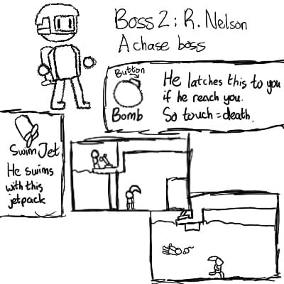
Day 61 - A new concept art was made and a new design for the game is created :)

Meet Rizilt Nelson, call him Nelson. As you can see, he is a chase boss, of course he's chasing the player. The player has to reach the end to defeat him.

What you might not see, is his mechanics. Now I don't really want to spoil too much like Minlie's did, but I made Minlie as a way to teach the player the red gem and the blue gem (sorry green gem :(  ) and to show her personality which is confident with her weapons, but very nervous if injured badly or weak against enemies (Oh yea so technically she is a stone cyborg, she has machine-like body parts :l I didn't expect that trust me.)

Nelson is a scuba diver, you encounter him after Minlie (not immediately after Minlie). He is protective, especially toward children. He's afraid of heights, but he's good underwater because you float in water, you don't fall and break your bones if you already swimming, and he no need oxygen to live. Also, that tank is fuel for his movement. You can basically tell where you encounter him, yup at the second area, Bursten Riverfall. The rest of his appearance is already explained in the concept art. I don't know if I gonna make him a species for a bit of uniqueness, maybe a fish or a crocodile.

Now Nelson done, let's talk about the second thing I wanna talk about, Notes.

Notes are on the wall for the player to read, these have helpful tips on the mechanics of the game, teaching the player what does it do, what to do with it, or just to know their origin.

These we're already implemented before as a tutorial, but I want to get a fuller use of it, so if it had the potential to teach the player the mechanics, then why not.

I want to make the boss now but I need to complete Stone Dump first and then apply Minlie... and then the Riverfall..... Oh

(1 edit)

Day 62 - No new concept today because I just made a full-on soundtrack for this game. 

Again, I can't provide the soundtrack because it's beyond max size and there is no such thing as uploading audio for a comment :/

But what I can do is provide the png of the soundtrack and the soundtrack is uploaded at my twitter post, yay :D


This soundtrack's name is Creep Of A Long Fall, played at the first area, Stone Dump. It intends to have a mysterious and creepy vibe.

You literally and figuratively fall into a possible abandoned mine, barely survive the fall and immediately weaken, how is it not scary at first :|

Now, this soundtrack won't be played every time the player get to the Stone Dump, after reaching Riverfall, the soundtrack is calmer, knowing that every mine, especially a live mine has another exit and you seek that same exit.

And before I go, I want you to know that this is the first soundtrack that went public ever, I tried in the past, but wasn't really good. Also I got another thing, but tomorrow alright ;)

(+1)

Day 63 - A few things is added, but only one new idea. Most were inspired literally today (or yesterday) by the GMTK, one or two... or three on my own.

Here's the picture for the one that I that one new idea, it already developed, and no not bosses again >:|


Ooh sorry if its too big, I didn't expect these to be huge :\

What you'll seeing here in the first one is the minimap, looks normal right? In the second one, it is what I call the sub-minimap.

Sub-minimap covers an sub-area of a area, and actually the sub-minimap points out where the player was. There's a view button near the sub-area, click it and see the sub-area and the descriptive text for the larger area it was in (like Kirby, but only it's timeline or backstory of the area, not complete lore). While this look like a recipe for clicks and clicks desperate to find where the player are, remember, the areas is high in variety (hopefully I can put variety) and so the areas in the map are colored differently, the results are much fewer clicking button needed, so don't worry ;)

I know the contents of the devlog in now uninteresting, but I just can't really focus on a ideas, see the rest of the devlog and concept we might get ourselves scope creep (ha my name) like situation. Sorry friends I hope I can solve or adapt to it.

Now the problem done in the conversation, lets talk about the other updates:

-Added jump buffer, lean, and squash and stretch to the player(jump buffer for helping the player, the rest is for juice and seasoning);

-Makes vertical scrolling camera to move when the player's on the floor so it won't bobbing up and down (So no mild sickness);

-The Green gem design is changed, throw rocks at them teleports the player between them (very major why I didn't fully talk about it a lot);

-Accessibility menu is still in works.

The first and the second are super inspired by GMTK's very recent Platformer Toolkit, the game make you learn the component of platformers (there are no best answer for the platforming). I suggest you check it out if you make platformer for a living. Here's the link https://gmtk.itch.io/platformer-toolkit (please note that I did no copyright or piracy of this I just recommend, I was too worry that I unintentionally sparks a controversy :(  )

Also I want to make game-building more efficient and faster by building some system on some stuff, I already do that already on few. And an accessibility menu on colorblindness and deafness, colorblind is in focus, there are only one audio in the game that is music. 

Ok goodbye friends and see you next time ;) (Oh boy this gonna be hard time)

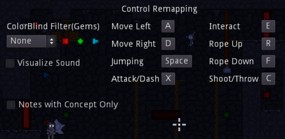
Day 77, I almost got nothing to talk about except for one thing or few things that I forgot, the accessibility menu.

Hey I'm back, still alive. Back from vacation now, still want to gamedev while and after :)

Anyways, here's a screenshot scooped up by copy screen and paste on canvas.

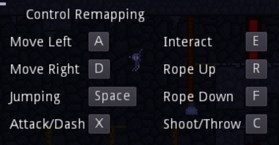
To clarify, there are four options for this menu. Let me explain all.

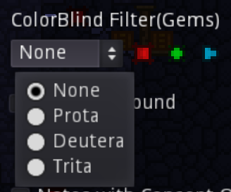
1. Colorblind Filter

This change the color of the gems, the core mechanics of the game, in case the shape doesn't cut it. 

Though the configured color is not really great, maybe I change it to something else; 


2. Remapping Controls

If you new to access, it lets you change the controls to any key you want. Dashing and throwing is defaulted to X and C, but can also used for mouse Left-Click and Right-Click, so you can play this keyboard only, but not mouse only. And also when grabbing rope, going up and down is default to R and F.


3. Simplified Notes

There are helpful notes regarding every mechanics except for most enemy, all bosses, and few others, those who don't understands easily or just a quick reader can see the concepts from the notes by enabling the option, the name will change soon.

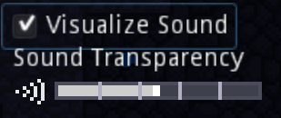
4. Visualized Sounds

There are sound effects planned very soon for the game, Visualized Sound can occur near an possibly important informations like upside-down spikes ready to drop or an upcoming minecart from a tunnel. You can configure the transparency of the sound.


And that's all people, here's a bonus for this day. Low quality, but most likely acceptable in the community of memes.

Day 83, the second demo is released, the game's officially changed from version 0.0 into version 0.1 :D


Though tbh, the game is still the exact same... but shorter in terms of level design, but the water area RiverFall is still in wip phase so don't you dare think that I didn't care about level design >:( And other things is added to the game, like pause screen, accessibility settings, the first boss in the game, Minlie, tutorial notes, and more.

And also this is the new game cover now, is it good? is it ugly? I don't care, I figured the cover out in the future :) And to save you a little bit of time, here's the link https://scopericrit.itch.io/tyro-knight

Alright everyone goodbye and see you next time, thank you for seeing my progress and have fun.

Day 96, just finished a game jam few days ago, rating submissions and all that. Couldn't upload yesterday because of rough stomach pain and several puking.

Two things I want to show here, more effective collision shaping and new player design.

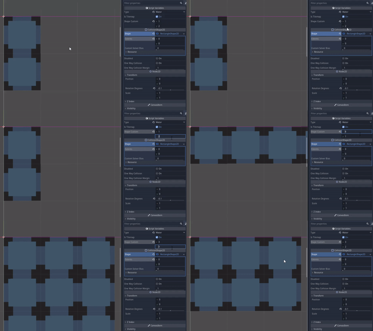
Let's see the collision shaping. This collision shaping only for the editor. It designed to have Vector(x and y) that determine it's shape at the start of the game. For the sake of efficiency of tiling :) Since slapping the collision to the spike tiles can damage the player at least 2 times, I have to manually make the collision myself. But making the collision is tedious |:( you have to add the collision node, adding and configuring the shaping, and if you duplicate it, you have to make it unique. So I make this to make it easier. Extra effort can make things easier and quicker.


Let's see the other one, the player now have a new design. If you are an eagle-eyed player, you might notice the player and Minlie are scaled down, if you think about that, good job of the guessing :D They have been scaled down to 0.75:0.75, or 25% smaller. The player's old height is 24 px tall so he can't fit into two tiles or 16 px corridor in 1:1 scale. Minlie is scaled down as well because if not, she would be the size of the player. So I make the new design. He looks like he's been drinking youth potions or look like Mini Mario :) Either way he's now at the proper 16 px tall and less than 8 px wide, and the same fate go to Minlie as well.


Okay that is all people, goodbye and see you next time ;)

Day 117, yes the day count are now accurate now, previously I count them in my head and turns out it was wrong by a lot of margins :(

I have two things to talk about:

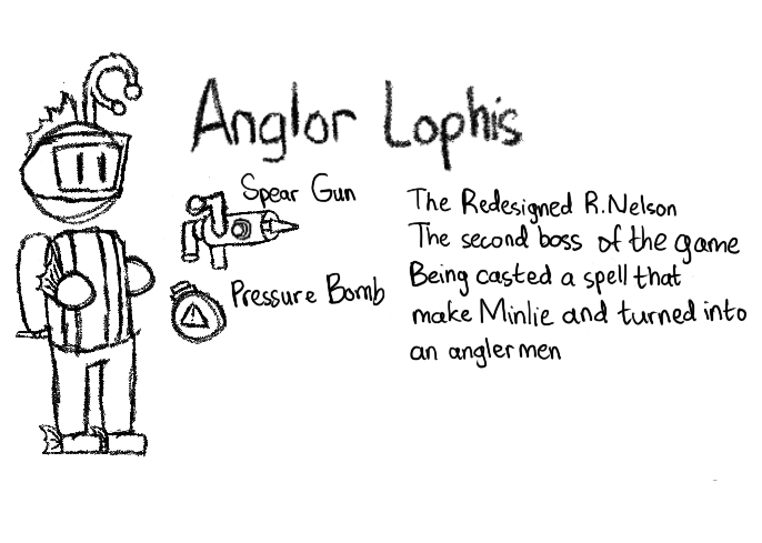
1. Remember R. Nelson? The second boss of the game? I've change his design into a cavern anglerfish being casted a spell that makes humanoids, including Minlie

He's turned into an angler man-fish named Anglor Lophis. I for some reason make a concept art instead of... you know... continue the progress :/


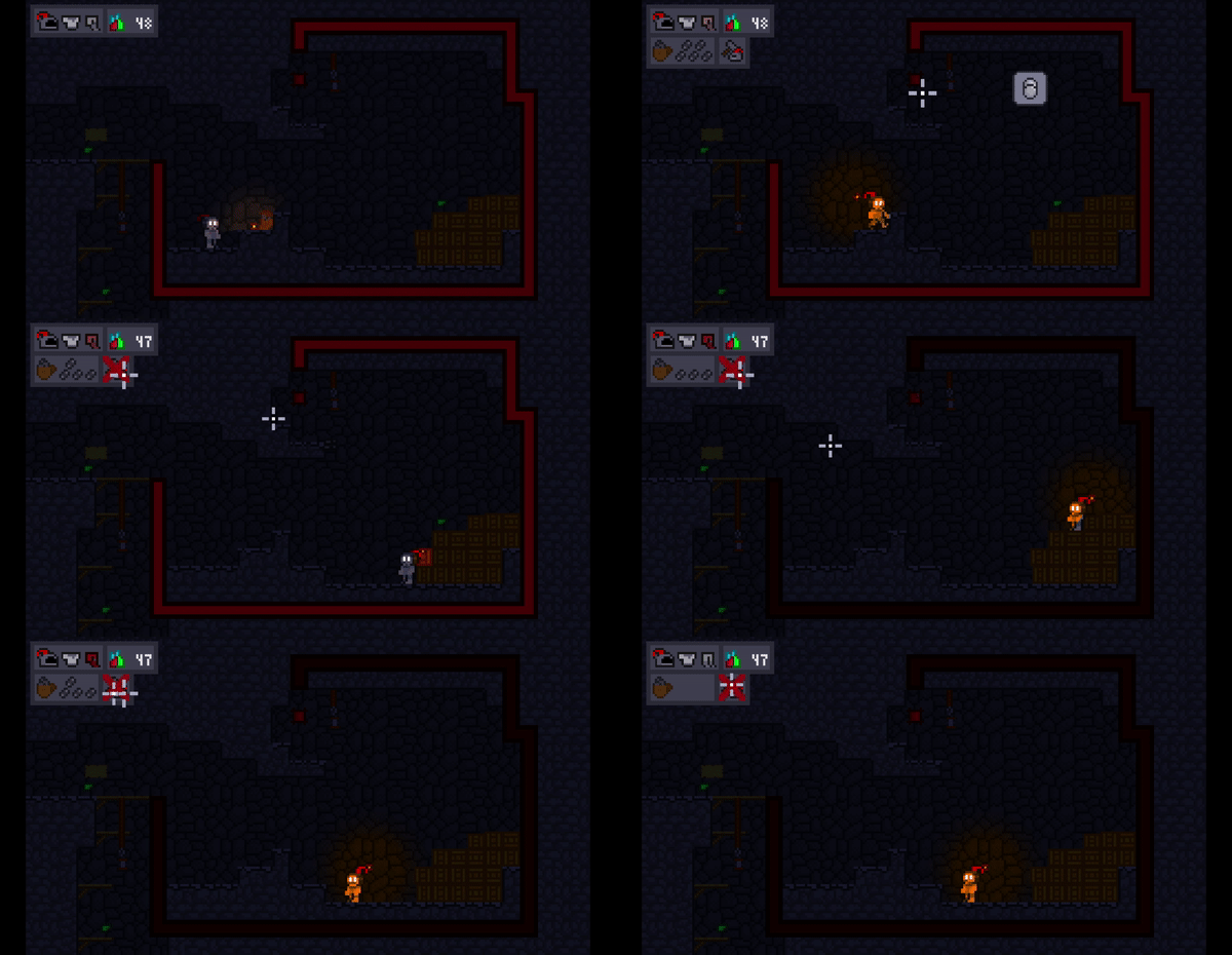
2. The player shooting system is now reworked completely, why? Because of a game-breaking dilemma. Originally, you are required to get ammos(gemrocks or just coins) to progress. But you have three lives and it probably won't be upgraded, so healing is a smart gamer move

But how to you healed? 25 of the ammos required to progress. So either you died a lot or softlock the game because you ran out of the ammos

So now we have a new auto refill 5 bullet system where the refill timer is slower the more ammo you have, the new healthbar or armorbar being the helmet, chestplate, leggings and boots. And you required 5 bullets to heal or repair your armor


So that's all people, and the New hurt animation for the player is still worked and I got a list of tasks for this game so no this game is NOT abandoned ;) 

(2 edits)

Day 125 - I think got a more consistent schedule for uploading on this devlog, once for every week.

Okay, I got two things to talk about, Hurt Juices, and Minlie Reworked Battle.

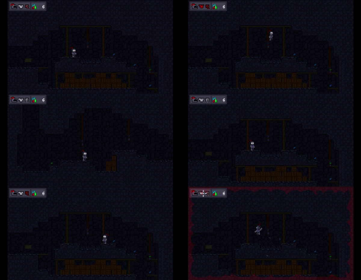
1. Hurt Juices, no it's not a potion given from a scammer with harmful effect. It just a new animation for the player and a red vignette playing whenever the player is damaged, and also armor particles shatters out when damaged.

The player is damaged by the spikes

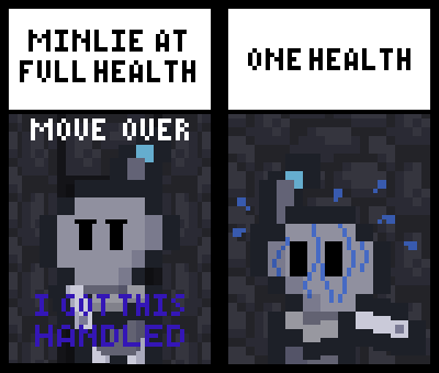
2. Minlie, I'm planning and still in process of reworking her battle. One reason is to make her battle more interesting, she pretty much just hop and shoot and that's it, so I made the... no. The second reason is to reduce the spoiler damage that I've done few weeks ago. That's the reasons, that's it. Before I go, I want to show what her new appearence was, just like the player, Minlie was scaled down into 75% of her size, if not she's the size of the player. So now she's two pixel shorter.

New Minlie Appearence, She's now two pixel shorter
(+1)

Hi!

The game looks fantastic! Just a few questions:

1. What game engine are you using?

2. Are you planning to release it on steam or anything like that

:D have a great day

(+1)

1. Godot Engine vers 3.4

2. Just here on itch io, I don't feel like the game is fit for Steam, besides if I were, I gotta do two whole marketing, I'm just one person

(2 edits)

Day 133 - I've drawn a concept art instead of working on Minlie again, at least the concepts gonna be used, most likely :/

Here's the drawing

Concept art for the Riverfall area

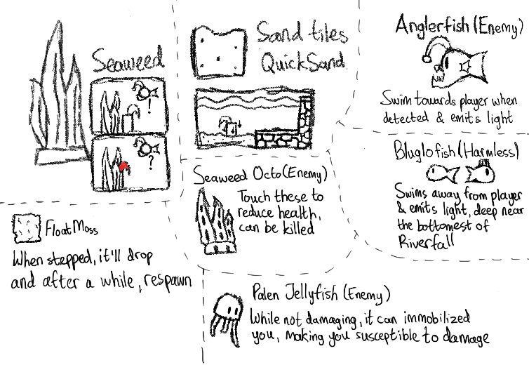
There's a lot of it, 3 Tiles and 4 Creatures. Let me explain them

1. Seaweeds, allow you to hide from enemies stealthily, allowing you to heal or to do puzzle solvement if a lot of enemies are right near it

2. Quicksand, it sinks you and a few seconds in it will damage you, maybe holding jump to get free for hand accessibility 

3. Floating MossBlocks, drops after stepped on and do a respawnment after it descent to the watery void

4.  Anglerfish, the classic follows you around if detected you, only be limited by water and emitting light

5. Bluglo fish, basically a fish version of firefly, hiding at the bottom of the water area where it'll be pitch dark

6. Seaweed Octo, if seaweeds don't interest you then the seaweed camouflaging octopuses will(likely), damages you when you touch them, and with the dark(lighting) nature in deep waters, they can be hard to distinguish. Luckily they can be turned into sushi

7. Palen Jellyfish

White jellyfishes that don't kill you but immobilized you, leaving you vulnerable for a second. Maybe I can make it immobilized other enemies(I don't think it's count as friendly fire because they not friends to begin with)

(1 edit)

Day 145, no updates at all for two weeks because I'm participating and ultimately failing the Brackeys Game Jam 2022.2 Now I'm back on The Tyro Knight development. Still, gonna do new updates once per week.

You know what, gonna reveal one of Minlie's new attack, the lantern attack. It just Minlie throwing lanterns, inspired by Mortimer Freeze's phase 2 ice cube attack and Werner Werman's cherry bombs from Cuphead where it targets your current position and arc towards it. The only difference is that it has no extra bullet after landing and exploding.


(17 edits)

Day 152 - No interesting updates now, so I spout out some of my plans and stuff

  • The main thing is the third area, IceBox Storage. Basically after battling Angler Lophis or the second boss, the player gets in the mine's freezer storage, inside were obviously ice blocks with ice physics (don't worry, I'll tune it as much as possible), but also food items in the level system, like jelly springs and boxes. I planned the player to gain the ability to ground pound or roof pound(dash upward, yes a bad name) with produce a damaging shockwave when you hit the floor, at first inspired by A Hat In Time's Ice Hat.
The third area concept, Icebox Storage
  • The second main thing is the new fonts. You can pick basic, thick, square, and square thick fonts from the option menu. And also planned some dialog system.
The fonts(basic, thick, square, square-thick) and the dialog art
  • The lantern ammo thrown by Minlie are now in perfect arc.
  • Both the metroid/one room and the scroller/long room cameras will be thanos-snapped, with the cameras that stopped at desirable spots taking both 

Okay that's it

(4 edits)

Day 161 - Only the creation of a minor thing in gameplay but strong in story

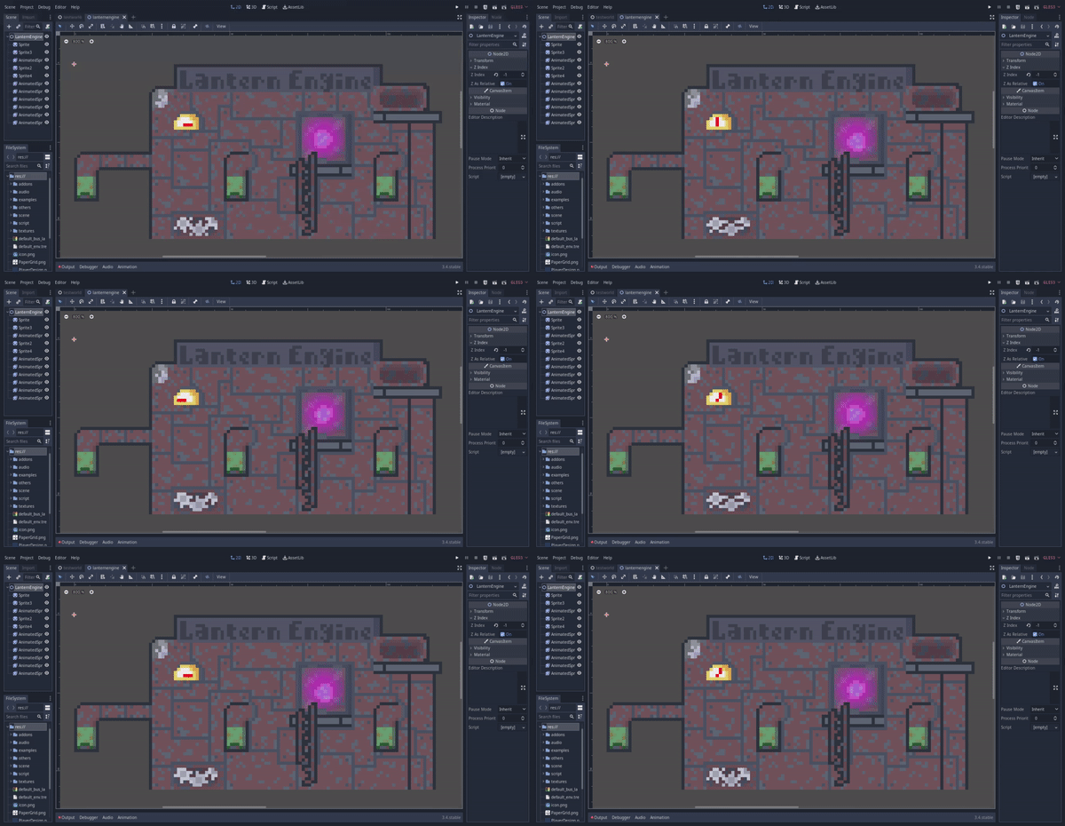
The thing is the lantern engine, a very old and corroded machine that produce small lanterns that we eventually used for our plume(the helmet feather thing). 

It was originally used for Minlie, the first boss where she takes the lanterns to throw at us in the abandoned area Stone Dump. But now it will be used for the second water-flooded area, Bursten Riverfall.

The lantern engine running

(1 edit)

Day 167 - Still working on Minlie, this is the only interesting thing I have


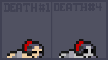
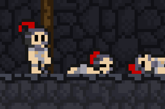
The plan is whenever the player died the body will be summoned. And no, there will be no corpse run. After three more deaths, the body will be a skeleton. One more and the body will gone.

(2 edits)

Day 174 - The dead bodies of the player has worked successfully, and the new title logo has been made. 

First, the dead bodies, now every time you died, a body will summon, three more deaths after spawn and it will be a skeleton, one more and the skeleton will go poof. 


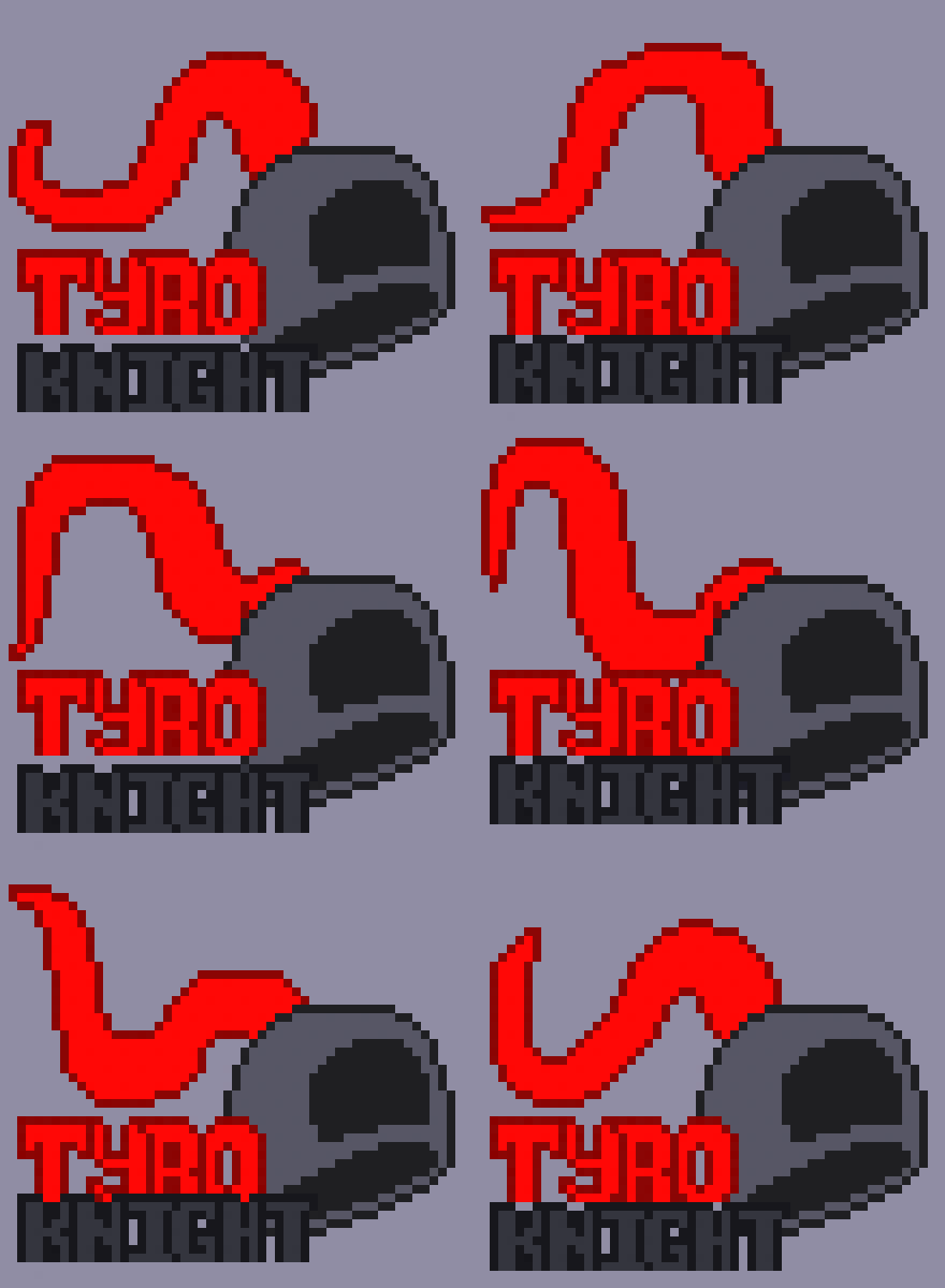
The second one is the new title logo for the Tyro Knight. 

Anyways the gif features a knight's helmet with the plume being blown by the wind, the words 'Tyro Knight' is right beside it. 

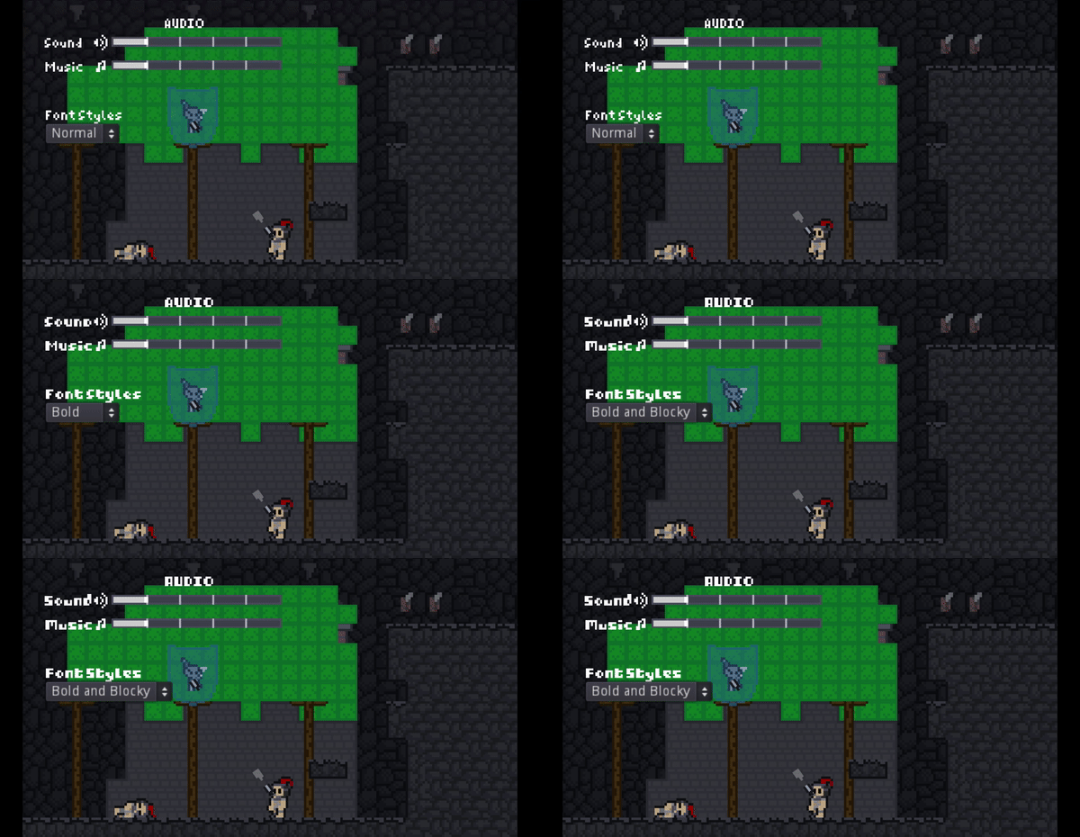
Day 182, Wow I'm progressing at a slow rate, anyways this is what I got besides Minlie, there is a new Font Style option in the pause menu, now you can choose between basic, bold, blocky, bold and blocky.

Day 188, I have done nothing except for finishing Minlie's fight and few small things... great. I have made a new profile picture for twitter, and a banner for itch io and twitter. They will focus on Tyro(the knight). Here's the sketch of the profile pic. 

And besides that I have done few minor things:

• Scrapping the metroid cameras and the scrolling cameras for a camera that follows the player. The new camera can look ahead of Tyro and you can look up and down. 

• Giving juice to the gems by making them shake when activated

Also, now I now call the knight, the protagonist of the game Tyro :) 

Day 196 - Have some issues with the recording gamebar, have to delete and reinstall Xbox just to gain the record ability

This is the new camera now


Long ago I created one room and two room camera, but now I replace them with the camera that follow you, basic 2d platformer camera. But it not just that, I took all of the camera features from The Platformer Toolkit, from GMTK(Game Maker's Toolkit). Lookahead(makes the camera look a head of Tyro, with the white square as a indicator of where the camera suppose to be) and Ignore Jumps(only moves the camera when Tyro is on the floor, excluding dashing and ground abilites involving movement), with looking up and down included.

Yes yes, Minlie is not finished yet, I just gave you the look of the battlefield

(1 edit)

Day 203 - Three enemies in Stone Dump are planned, two already been made, one have the footage.

1. Shooter, a replacement of the Splitguard(shoots both left and right when it detects Tyro/player at the same height), now it will shoots either left or right and sometimes present in walls. This is the gif.

2. Slime Drone, just a refined and polished version of the original. It flies to Tyro when detect him; shoots down when above Tyro; and if it s two ammo ran out, it will fall down to Tyro.


3. Loop Ranger, a turret that move in a loop, targeting and shooting Tyro.

Minlie is almost finished, she can be finished tomorrow at least, without disturbance.

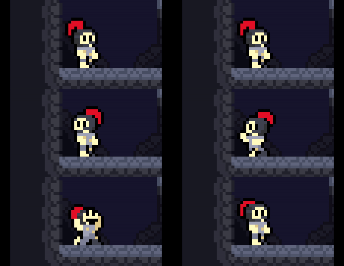
Hi. I can’t believe that you can keep working and updating the devlog on this game for so long. Amazing! As in the gif, it’s a very nice mechanic you have there. However, the black and white caro pattern in the environment really makes my head spinning. Is it a placeholder art? I hope it is!

(+1)

Thank you :) Been and will working this with a passion. And yes, the pattern tiles is a placeholder art, making finalized level design later on.

(+1)

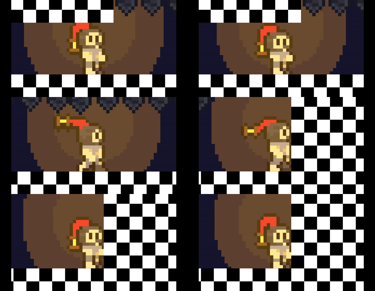
Day 230, another redesign for the player

Tbh I'm surprised I did this for 200 days, that make me realize how slow progress are


I love how excited the character looks in idle animation. Eager to get back in action.

(1 edit) (+1)

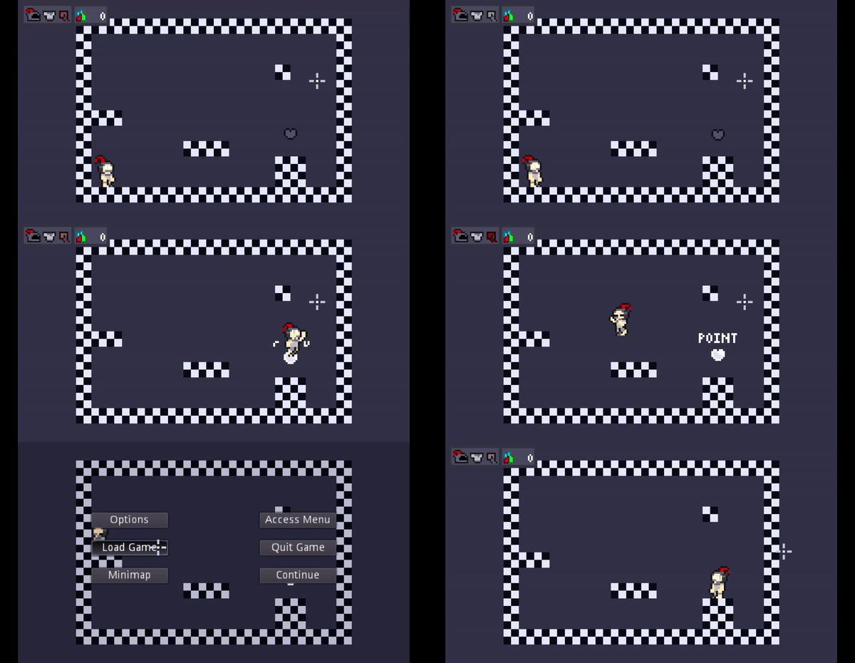
Day 238 - Checkpoints 

1. Checkpoints is that heart in the right side. It is black and hollow if its off. It is white and glowing if its on. 

2. It will save all your progress in your drive if it activated. And yes, it includes gem placement in the level(which is a miracle since no exploits will happen from that damn damn checkpoint >:( ) 

3. Loading it from the pause menu or just kill the player will reload the player position, health, all things that been saved

4. If a new one is on, the old will become off(which is important since there might be backtracking) 

5. It will save if you press the interact button(E), not just by the player's touch(so no unwanted checking) 

Alright then, another feature of the week that reflects how slow progress are, see you next time! ;) 


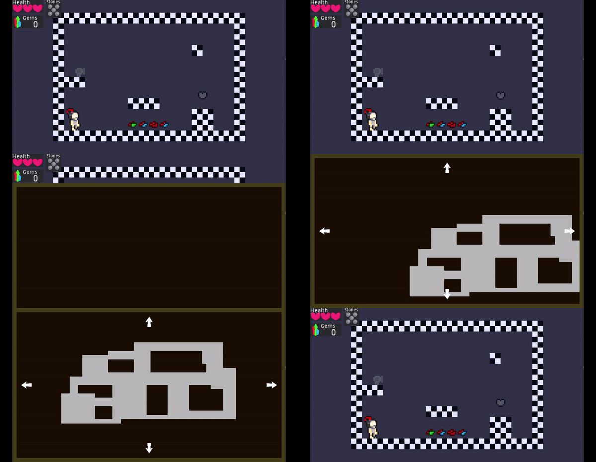
Day 246 - Minimaps (wow everything is getting reworked)

1. Open the minimap by pressing the M key or the 'Stats' view

2. Move it around in 8 directions

3. Planned to include markers

- Question Marks for important unexplored events

- Player Mark for the player's current location

- Skull Player Marks for all player's corpse locations

Day 251 - New profile pic and banner for Twitter


Day 259 - I will not upload progress this week because I have a surgery two days ago(day 257) 

I have a great pain in the abdomen once a month starting from July or even earlier. The symptoms are of course abdomen pain, vomiting, a little bit of shaking, and diarrhea as far as I remember. 

My family thought it's just some stomach acid issues or me eating too long so they heating my belly with hot water, make me sleep and gave me some stomach medicine, that is until three days ago(day 256) 

At first I had my usual pain delivered to my stomach, until suddenly my bottom right part of the abdomen felt one of if not the most painful pain in my whole life. I end up shaking it almost felt like having a seizure. I end up going to the hospital to get checked. 

They said that either it's from genetics or some food get stuck inside my appendix that cause some inflammation. I did a surgery on cutting the appendix two days ago(day 257). They said that my appendix is a little bit leaked so they had to clean up the area so no infection will occur. 

Now I'm still in recovery, thank you for listening

Merry Christmas and Happy New Year! 

Day 273 - A lot of things I want to talk about

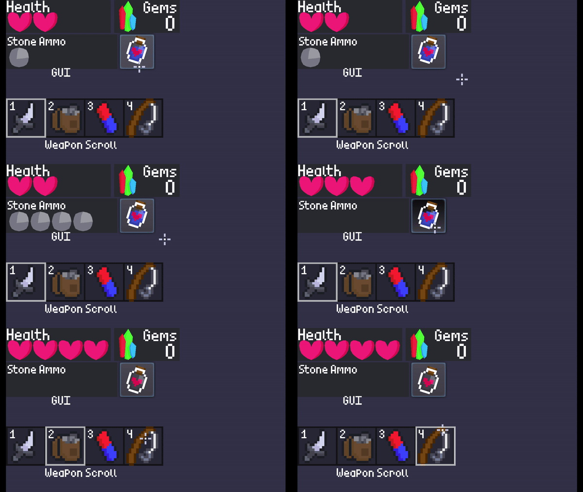
1. New looks of the gem

2. Holding Shift while pressing Right-Click causes Tyro, the player to throw purple rocks. Those purple rock can rotate the blue gems, instead of using special purple tiles

3. New GUI, yay :D

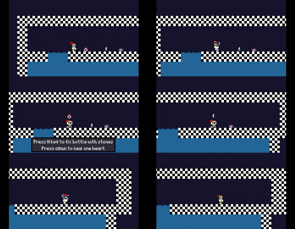
4. Now the player have four health instead of three

5. Clicking the potion to:

 - Fill it up by storing 4 stones in it (if its empty)

- Cause the player to heal by consuming it (if its filled up)

6. New font, no choosing sadly :(

7. Weapon Scrollbar, used so the abilities can be activated using Left-Click

8. Refill stone ammo by holding L-Shift, Tyro can't move when refill. 5 stones max, no 6 

9. Doing something that make Mojang proud, weaponizing fishing rods and turning it into an ability

- Hold F (or Left-Click if it's equipped in the GUI weaponbar) will make Tyro charge the rod

- Charging for 1 second will make the rod ready to be launched

- Release F or Left-Click when the rod is ready will launched the rod to the mouse position

- Release when the rod is not ready or waiting for too long will cancel the charge

- Any enemy that are hooked will be damaged while some mechanisms will be activated

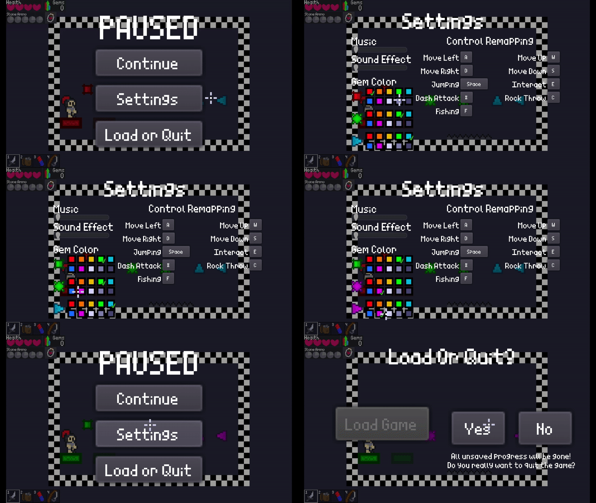
10. New pause menu, yay :D

- Music and SFX settings

- Colorblind accessibility by color the gems into 10 colors

- Control settings

- Load save file and Quit game option (no saving files becus you must saved by checkpoints)

 Finally a productive time!

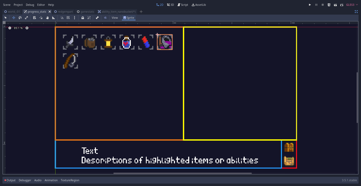
Day 286 

1. Water tiles, swims in water obviously

2. Sand tiles, you can suffocate in it after few seconds


3. Animation of collecting new interesting things, even a broken knight can celebrate

4. First look of the Progress Menu

- Orange box(top left) is for the abilities and permanent items

- Yellow box(top right) is for temporary items and others

- Blue box(bottom left) is the descriptions

- Small red box(bottom right) is the chest icons as the inventory view and map icons as explored area view

I want tbh, I feel good making a lot of stuff recently!

Day 301 - Sorry for waiting out 2 weeks, I'm just damn slow

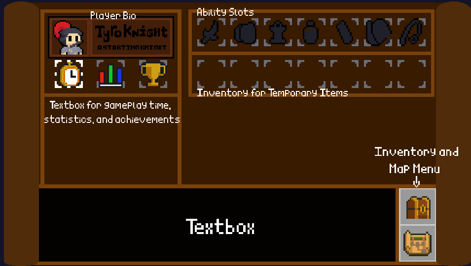
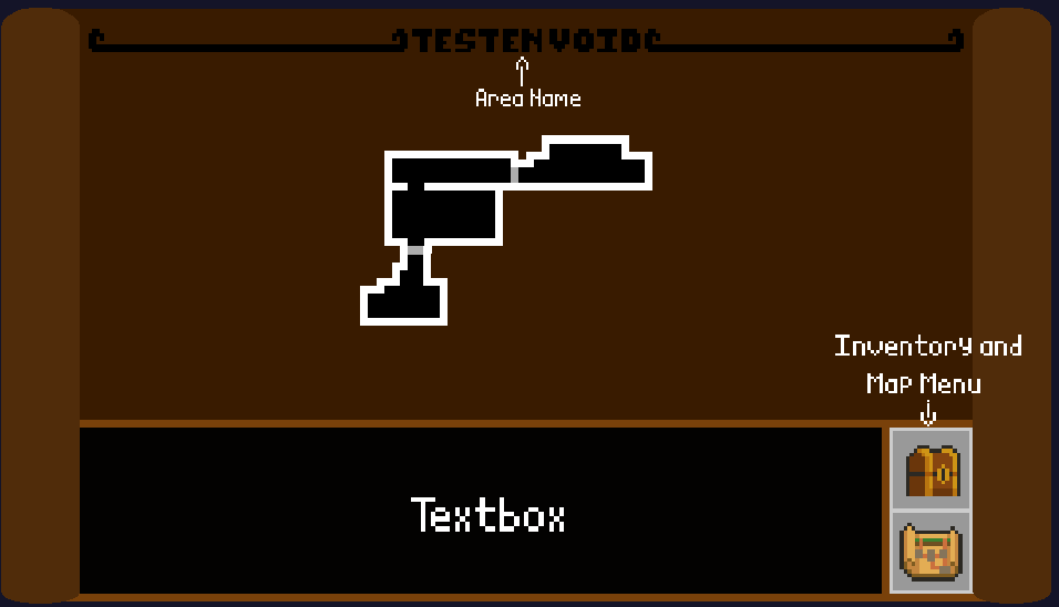
- Final progress menu

- - Inventory + Player Bio (Picture 1) (And yes, the name of Tyro is Tyro Knight :>)

- - Map (Picture 2)


- Gathering items animation of Tyro, look at him :D


Day 301 - Sorry for waiting out 2 weeks, I'm just damn slow

- Final progress menu

- - Inventory + Player Bio (Picture 1) (And yes, the name of Tyro is Tyro Knight :>)

- - Map (Picture 2)


- Gathering items animation of Tyro, look at him :D

Day 321

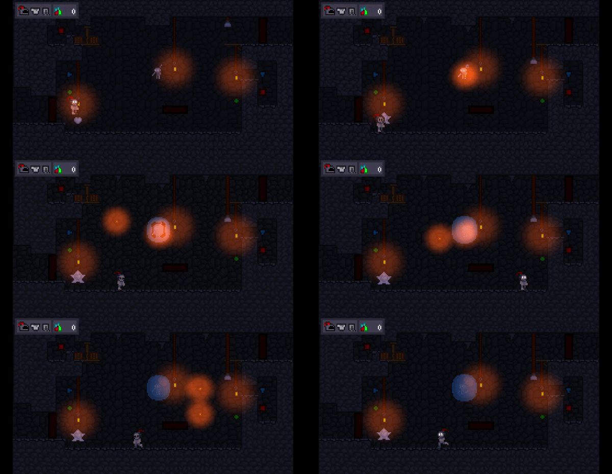
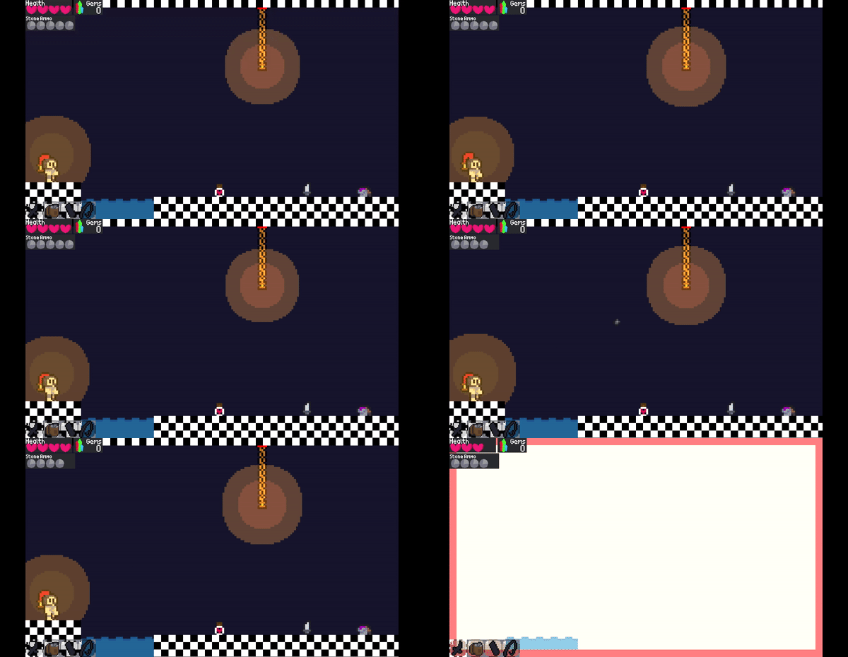
1. Reimplemented Lanterns, now wooden chained, and they can be detached and explode(no knights were hurt in the footage)

2. Light Animation

3. Roofspikes, the same as the predecassor

Day 348

1. Game Intro, with MY logo in it! :D


2. Level Intro

3. Some nice decorations to really show how this cave were at least has people living in it

4. Movement dusts

Okay, If I'm want to be honest, I felt awful, because this devlog became a reminder every single time that I am a slow and lazy person with an already limited time from school. The sole reason I started and continue this devlog to this day is for at least SOMEONE to see my game, but overtime it looks like this devlog is getting more and more obscure, so much so that I might discontinue this devlog to focus more on Twitter, or at the very least put some images that I likely cringe on for few days after.

And look at my progress, it is almost a whole YEAR since April 5 2022, the day the fourth iteration of this is born, and I'm not joking, THE FOURTH, and I'm not even reach a finished prototype since probably 6 months ago! I am sorry for the rattle, I hope you don't mind. I feel bad for my self. Thank you for reading it, if you here in the first place.