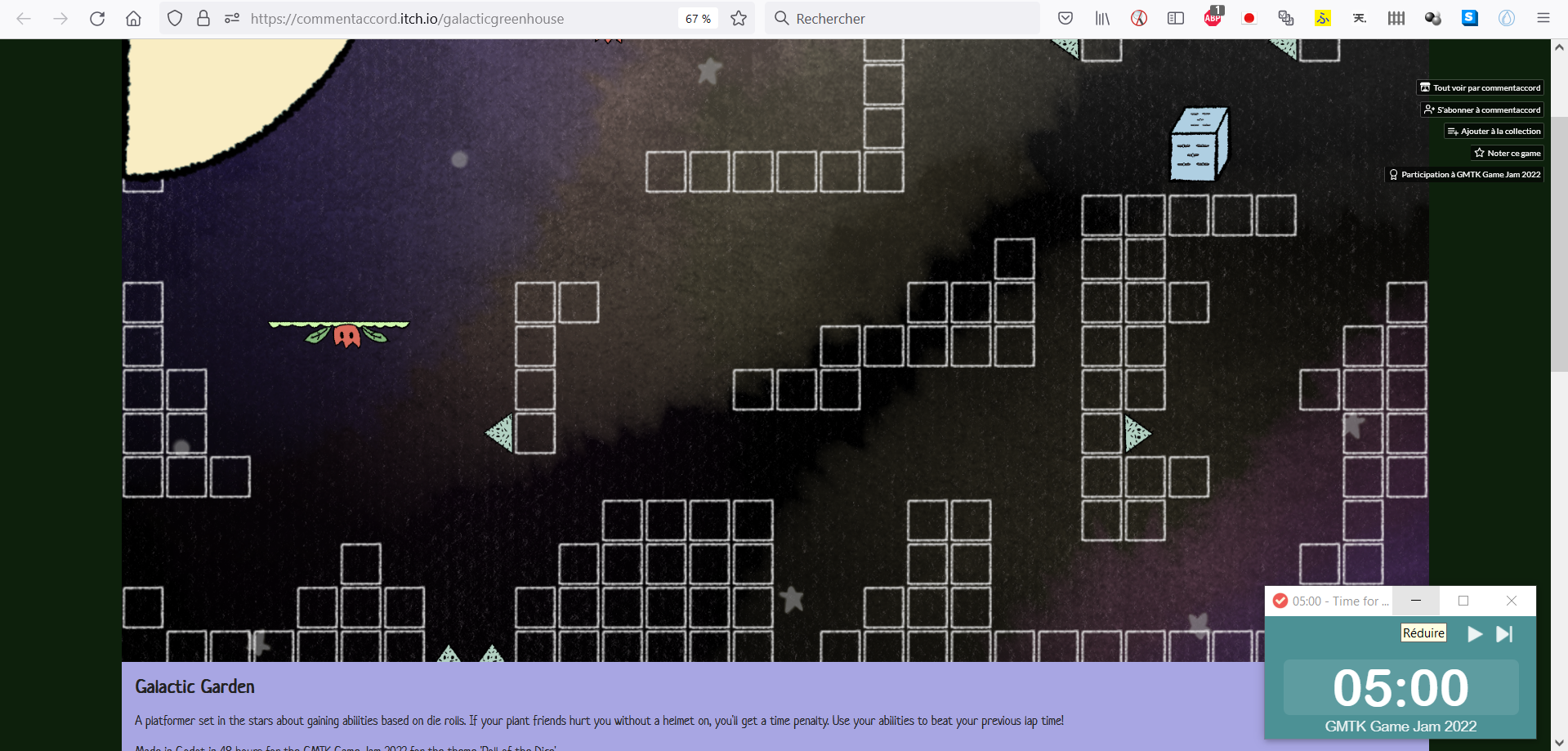
Semi-on-the-fly notes:
- The first notes from the menu music remind me of Corneria, the very first level from Starwing / Star Fox! :)
Also true at some point in game, actually.
And the music relates well to the space setting through its ‘tubular notes’ and synthesiser. - Controls are QWERTY-only instead of layout-independent, BUT arrow keys are enabled.
- Even the sound for taking hits/damage is soothing. :)
- The navigator version can have issues when toggling fullscreen (I use Firefox): the upper-left text can disappear, and the upper-left disc quarter can sometimes get displayed in the upper middle, or disappear. And the background is sometimes not resized correctly.
Navigator versions often have such problems which are generally independent on the developer, so, just saying to help, not to blame! ;) - Are we invincible? I know I took way too many shots.
(Ah, I get it, the time penalty is the only penalty there is! The game is non-violent. :) Sweet take!) - I like how the level is designed; I mean, the platform challenge. :)
- This interpretation (ie getting a random ability) of the theme was shared with many other games. But… it is cute, here. :3
- Does the level cycle infinitely? Oh, I should have read better, there are indeed laps.
- Trying to jump in a hole: oh, I just disappear below! :o Is this unexpected? The camera still follows me horizontally. (Apparently, the same happened to Ardos.)

- Some tiles/squares are blue; does this have a gameplay meaning, or is it for decoration purposes (glass, for example)?
- The gloves remind me of PROJECT Radioactive’s wall jump! A bit hard to master, as Ardos has hinted at. Ah, actually, yours prevents from just using one wall, but allows getting higher by alternating between two opposite walls!
Getting an upgrade (and then a second one) for the gloves, I am not sure of the difference; maybe I would need more upgrades to find out.
By the way, I think it may be nice to find a way to display the level for each abilities the player currently has, even though this may be a hard task (because it can get cumbersome seeing how many there are). - I agree with Bobby_Z (on the game page) that having several ways of proceeding through the level is nice and welcome given the main concept. Another game I saw which also thought of it is Bloll (it was the 15th game I had taken a look at, incidentally).
I tend to agree with several other comments here; the game is cute and has a nice base platform gameplay (I felt the controls well, so maybe what VKChiuselli refers to is how there should be some more visual and audio cues?). Some additional indications will help understanding more (including when you finish a lap).
I think you also made an effort to have a context, so I think you could have provided a small story with it, and can still do. :) I also think that if you extend the game, then ‘full’ levels instead of laps could make it more interesting, especially if you manage to put objects/locations which are only reachable through. (Or several levels each with some number of laps? Or, you have to perform at least some number of laps to have the right upgrades to reach aforesaid locations?)
PS: thank you for this sweet cute game. :) (I think I sometimes forgot to thank creators… :s I am always thankful, so my thanks are always there, even when implicit!)

