We've been hard at work this week with improving and polishing the game based on feedback. The video below shows some, but not all, of the improvements that have been made.
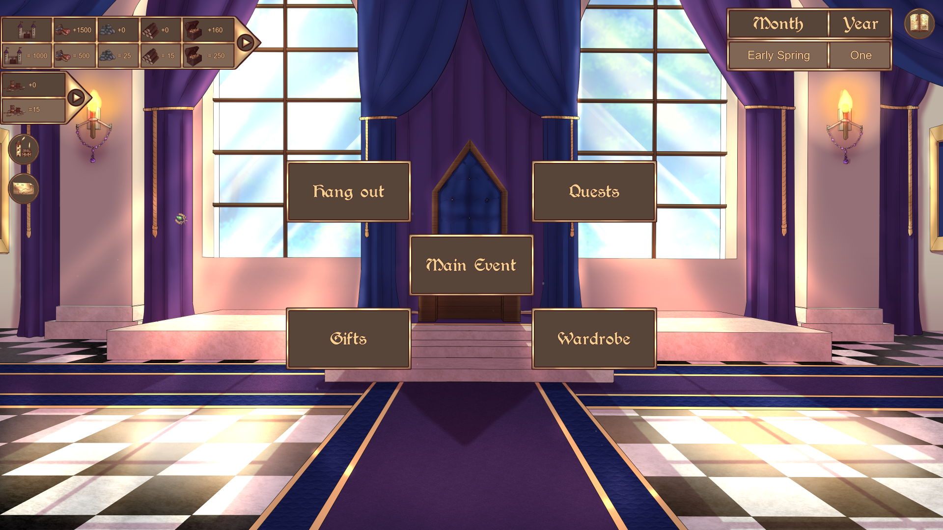
Icons have been added for resources, such as gold, wood, stone. They are used in multiple places: popups that record resource changes, build and upgrade-menus, the trade menu and in the top left bars that show current and monthly resources. This is also shown in the following screenshot:
The top bar shows town resources and other information. The lower bar shows the player's personal finances mainly used to buy gifts. Both bars are split in two parts, with the upper section showing the monthly income of that resource and the lower section showing the current amount of that resource. The town resource bar has five sections showing (from left to right): current population (which does not increase monthly), food, stone, wood and gold.
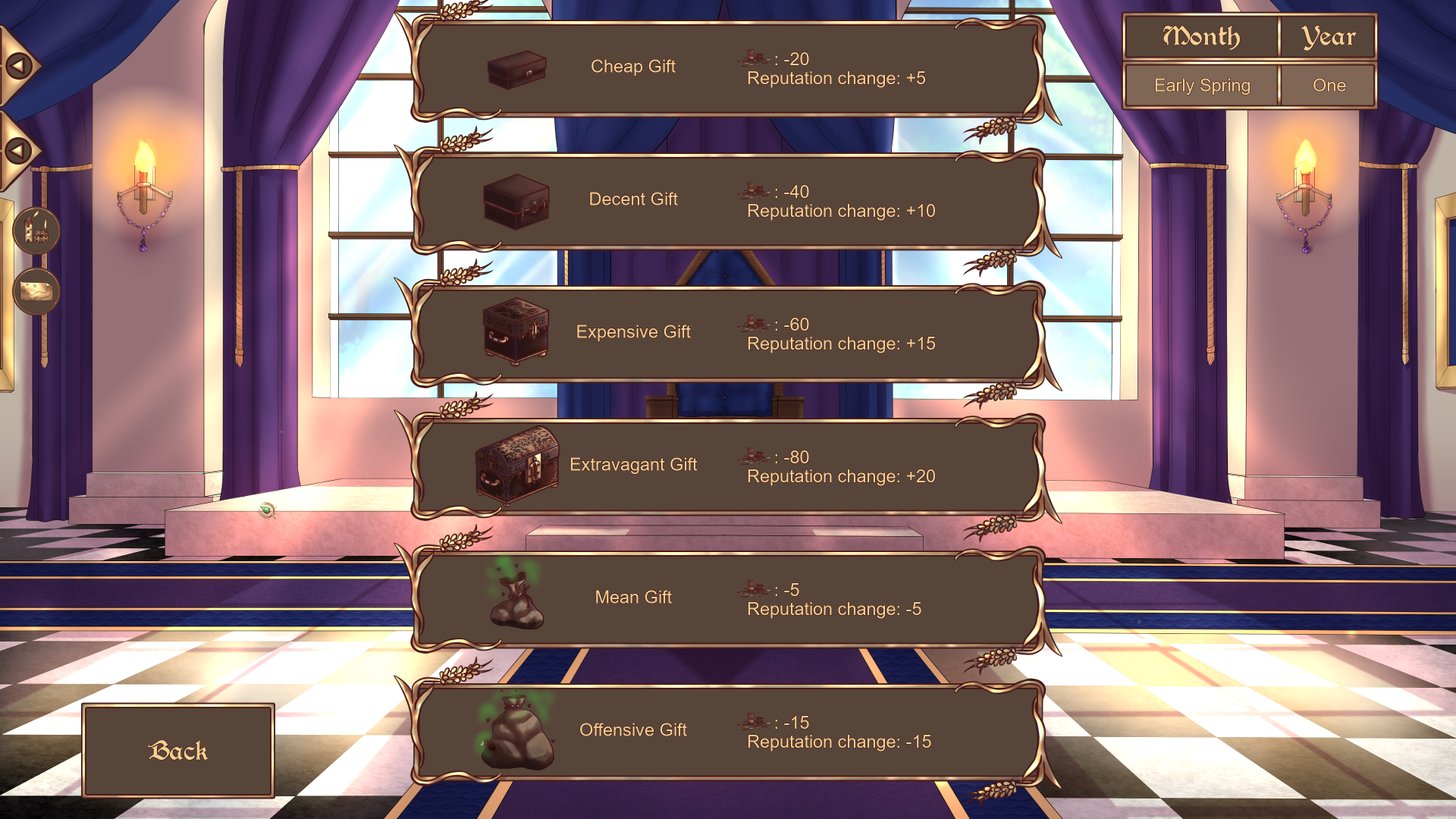
Gifts have also received icons to more easily show the price and impact of the gifts. This is shown further in the following screenshot:

As such, the gift menu now displays an icon for the gift, the name of the gift, the price of the gift (in coins, the new name for what was previously called "personal wealth") and the increase or decrease in reputation. This menu also uses anew resource icon for coins, much like the resource bars previously mentioned.
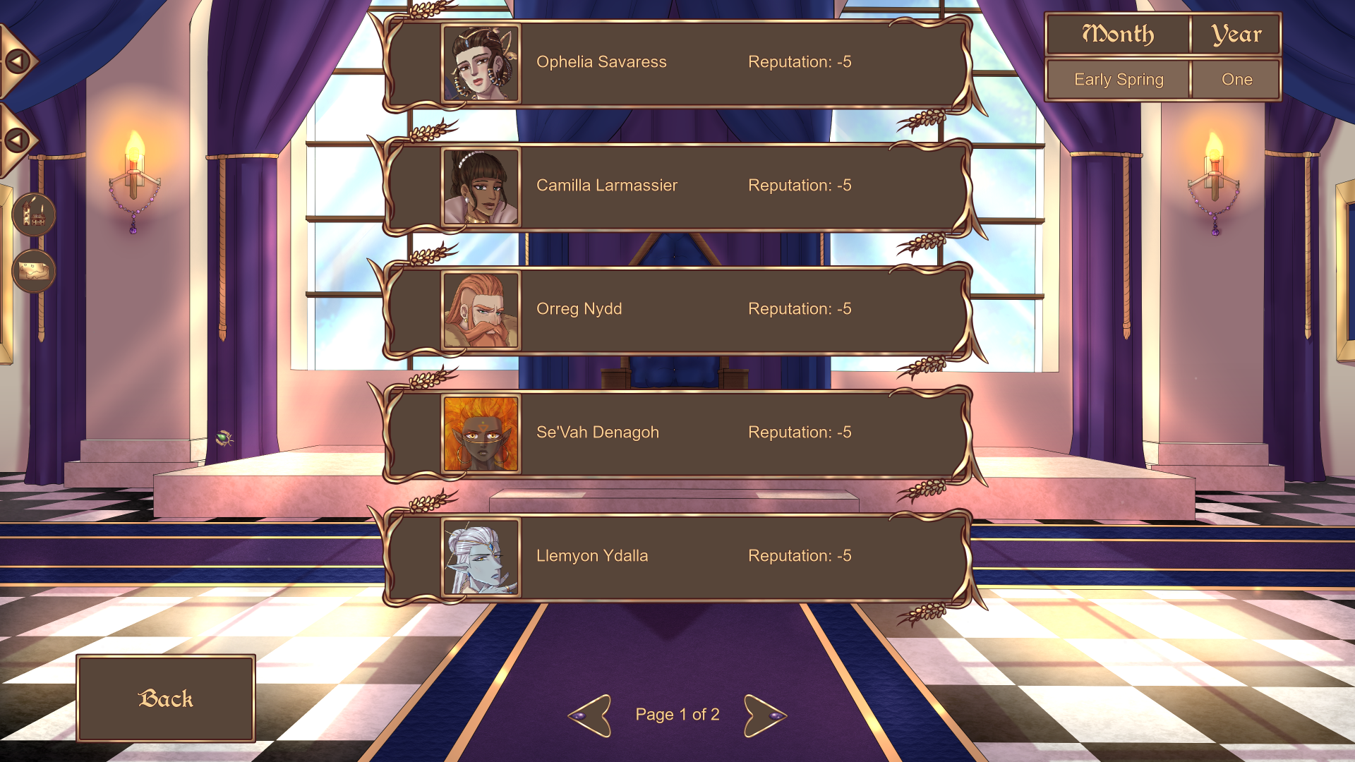
Then there has been an update to the menus showing who can receive a gift. The following screenshot illustrates this:

Now, the menu shows a picture of the character in question. Not shown in the video or screenshots is that a character who has their birthday during the current in-game month has a highlighted box/button, to more easily distinguish them from others. Also, the portraits shown in the screenshots are also used in popups for reputation changes, as well as in the hang out-menu. The hang out menu has also been improved with an image (the same hearts that are used in the roster menu, showing the romance level) instead of text to show which hang out is available.
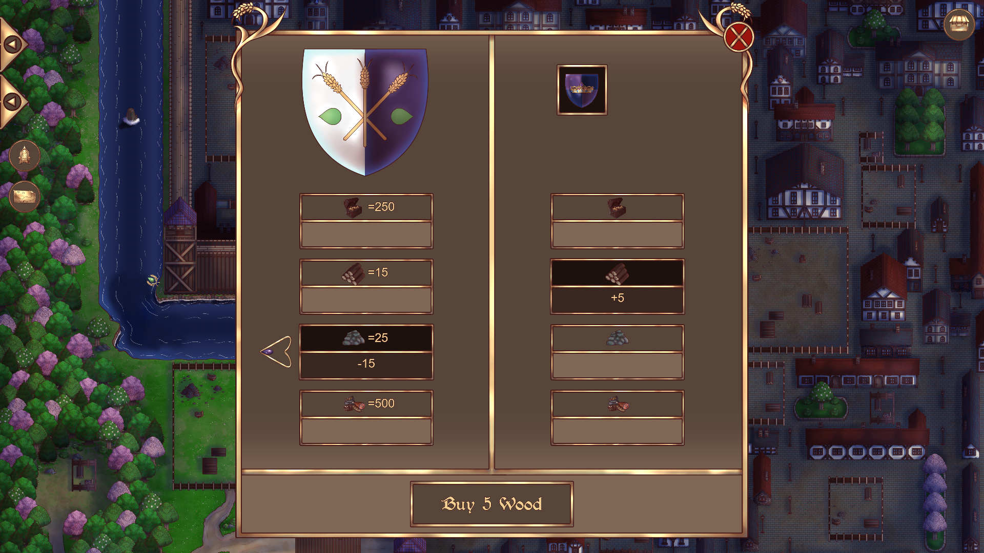
Last but not least, the trading menu has been updated, as shown below:

Now, the trading menu uses the new resource icons. The current amount of resources owned by the player is also displayed at all times. Instead of having the price per one chunk of resources (right), it now displays how much the player will receive of that resource. Arrows for changing the player's resources (the resources which are sold) are now only displayed if it is possible to go in that particular direction. That is, if it's possible to increase or decrease amount sold based on current resources. Some balancing is still needed for trading costs (especially food, which has been updated in other parts of the game, but the update is not represented in the trading menu).
We will continue to work hard on the game from now until the free demo release in the near future!

