Indie game storeFree gamesFun gamesHorror games
Game developmentAssetsComics
SalesBundles
Jobs
TagsGame Engines

Thanks for the feedback, do you have any ideas of how the controls could be changed in order to make them more intuitive?

I would change the axis. because the way I see the map is that the bottom left corner is the corner closest to the screen. But with the way it currently is the bottom left corner would be the left most corner. Kinda hard to explain so I made this. Meaning the A and D keys would move the way the W and  S keys moved originally. You could make a setting option to change the way it moves maybe if you still like the original movement.
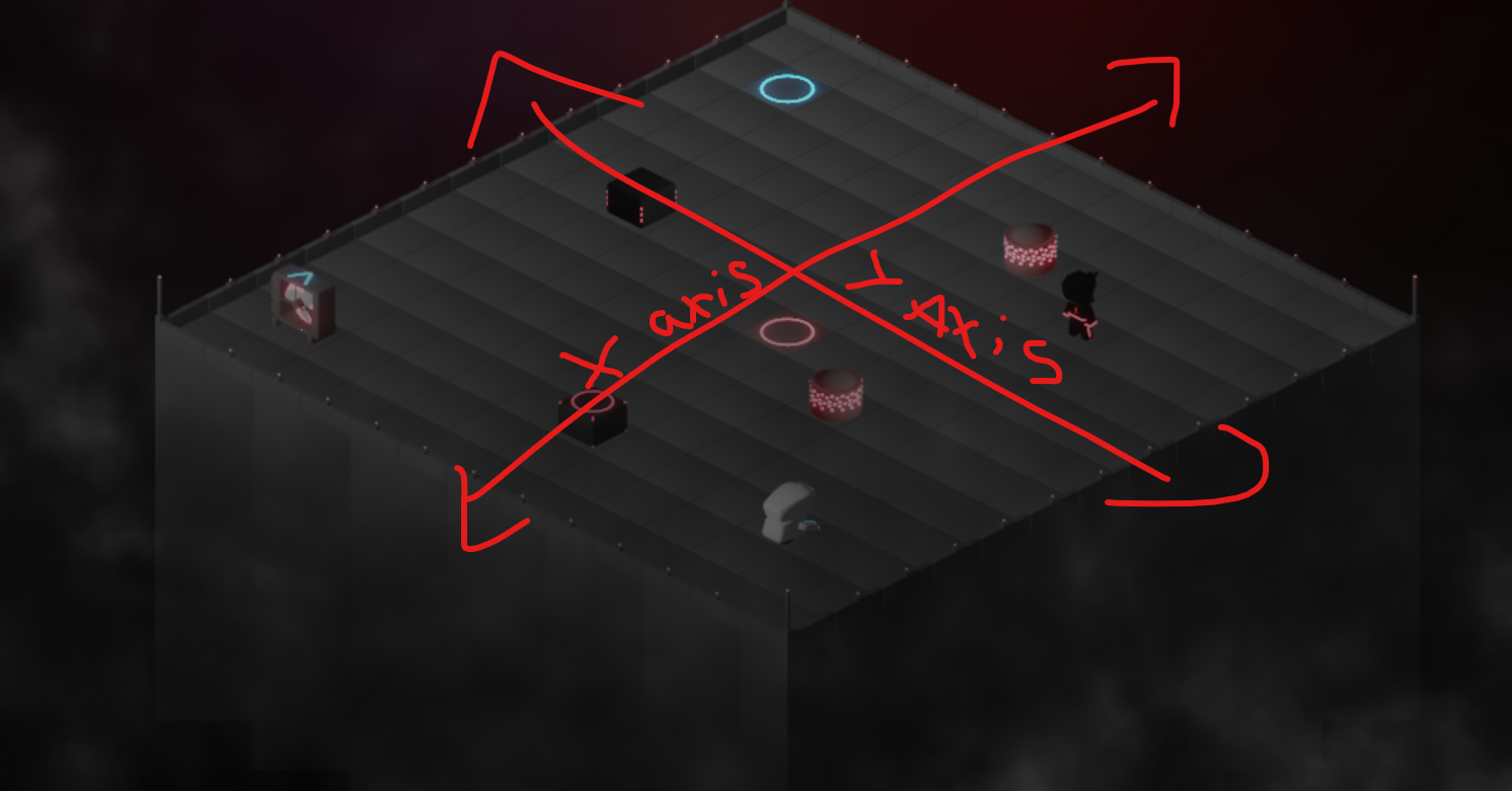
The option to change between is a good idea, but do you think it's that down should correlate to face on the cube that is the darkest? And originally i was working on an image with the dark face on the other side of the cube.

That is a good way to put it into words yes. I see it as down correlates with the dark side of the cubes and left correlates with the lighter shade of the cubes

Great thank you, I can understand why people found it hard to understand now, your help is greatly appreciated

that is good to hear :) glad to help